Migration to 3.0.0 Web ComponentsNew
This guide will help you understand how to transition an existing project from using an older version of Nord Web Components to using the latest 3.0.0 version.
What’s changing?
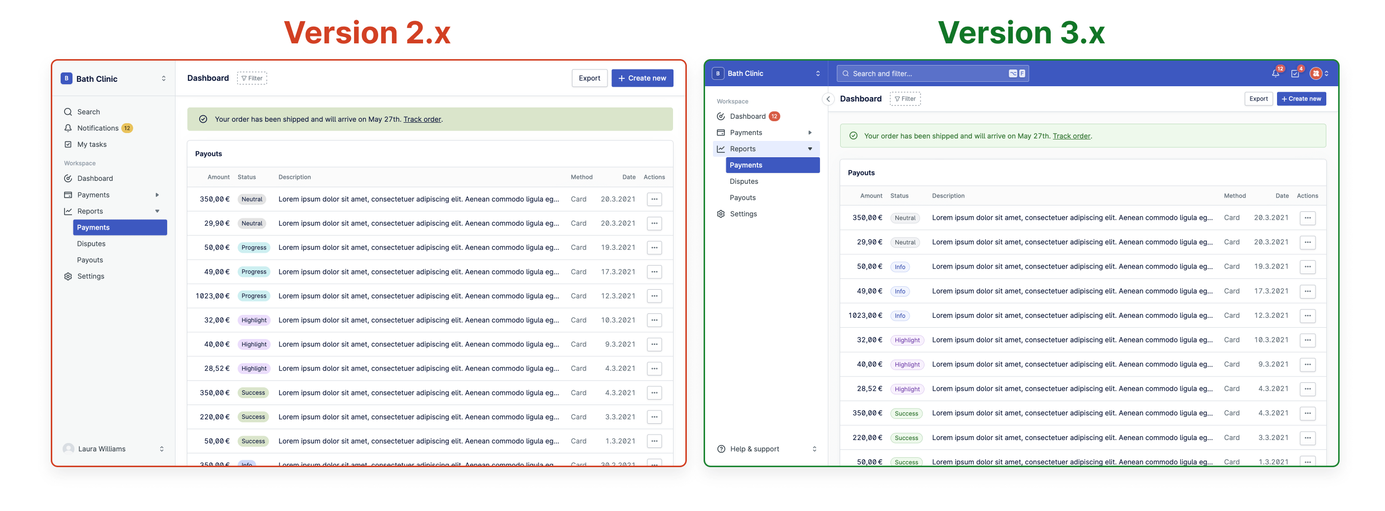
This release brings major changes and improvements to Nord Design System to better support the needs of feature teams and various products using Nord. The main difference is the introduction of a new Layout and Top Bar component which now allow functionality such as search and contextual menus to be placed at the top of the interface instead of the Navigation menu.
We’ve also improved the underlying color system to make it more extensible and better cover the use cases of our different products. This release utilizes the new color system and brings many new styles and variants to components such as Badge and Banner.
While the color system updates introduce some breaking changes, we’ve covered those further down on this page. Most other changes have been kept backwards compatible, and we still support the old style layout as well. Not all of our products need the additional top bar or more advanced utilities, so you can keep using the current layout that your users are already familiar with.
Breaking changes
Below you can find an overview of the breaking changes in this major release. You can view more details about each specific change further down this page, or by clicking one of the “more details” links.
@nordhealth/components
Badge:
- We've deprecated the
typeproperty, replacing it with a newvariantproperty, more details. - The
progressproperty has been removed, more details.
- We've deprecated the
Button:
- Variant
switchhas been removed, more details.
- Variant
Layout:
navToggleproperty has been removed, more details.- Background color has been changed from white to gray, more details.
Stack:
responsiveproperty has been removed, more details.
@nordhealth/tokens
- All status colors have been modified, more details.
var(--n-color-background),var(--n-color-nav-surface)andvar(--n-color-nav-hover)have been modified, more details.
@nordhealth/css
- All status colors have been modified, more details.
var(--n-color-background),var(--n-color-nav-surface)andvar(--n-color-nav-hover)have been modified, more details..n-stackand.n-gapnow have a gap ofvar(--n-space-m), more details.
@nordhealth/themes
- All status colors have been modified, more details.
var(--n-color-background),var(--n-color-nav-surface)andvar(--n-color-nav-hover)have been modified, more details.
Updating package.json and dependencies
The first step towards migrating to the latest Nord packages is to update package.json with the necessary dependencies. You should:
- Update existing
@nordhealth/cssto3.0.0. - Update existing
@nordhealth/themesto8.0.0. - If using Design Tokens directly, update
@nordhealth/tokensto7.0.0. - If using Nordicons directly, update
@nordhealth/iconsto3.0.0. - If using Web Components, update
@nordhealth/componentsto3.0.0. - If using React Components, update
@nordhealth/reactto3.0.0. - If using Vue, install the latest
@nordhealth/vuefor improved TypeScript support. Read more about this experimental feature.
Here’s an example package.json:
{
  "dependencies": {
    "@nordhealth/css": "^3.0.0",
    "@nordhealth/themes": "^8.0.0",
    "@nordhealth/components": "^3.0.0",
  }
}
New internal color scales
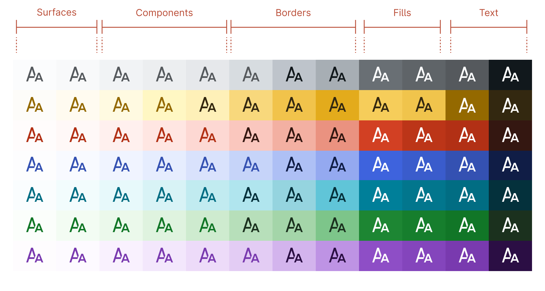
Each internal color scale in Nord now has 12 steps. Each step was designed with a specific use case in mind. It is worth noting that the table below is a simplified overview of the most common use cases we have internally in the system. Most of the colors listed below aren’t surfaced directly in our Design Tokens API, as we want to keep the usage of color tied to specific color roles to keep this simple for the consumers of the system.
| Step | Use case |
|---|---|
| 1 | Surface: App background |
| 2 | Surface: Subtle background |
| 3 | Component: UI element background |
| 4 | Component: Hovered UI element background |
| 5 | Component: Active / Selected UI element background |
| 6 | Border: Subtle borders and separators |
| 7 | Border: UI element border and focus rings |
| 8 | Border: Hovered UI element border |
| 9 | Fill: Solid backgrounds |
| 10 | Fill: Hovered solid backgrounds |
| 11 | Text: Low-contrast text |
| 12 | Text: High-contrast text |
Improvements to theming
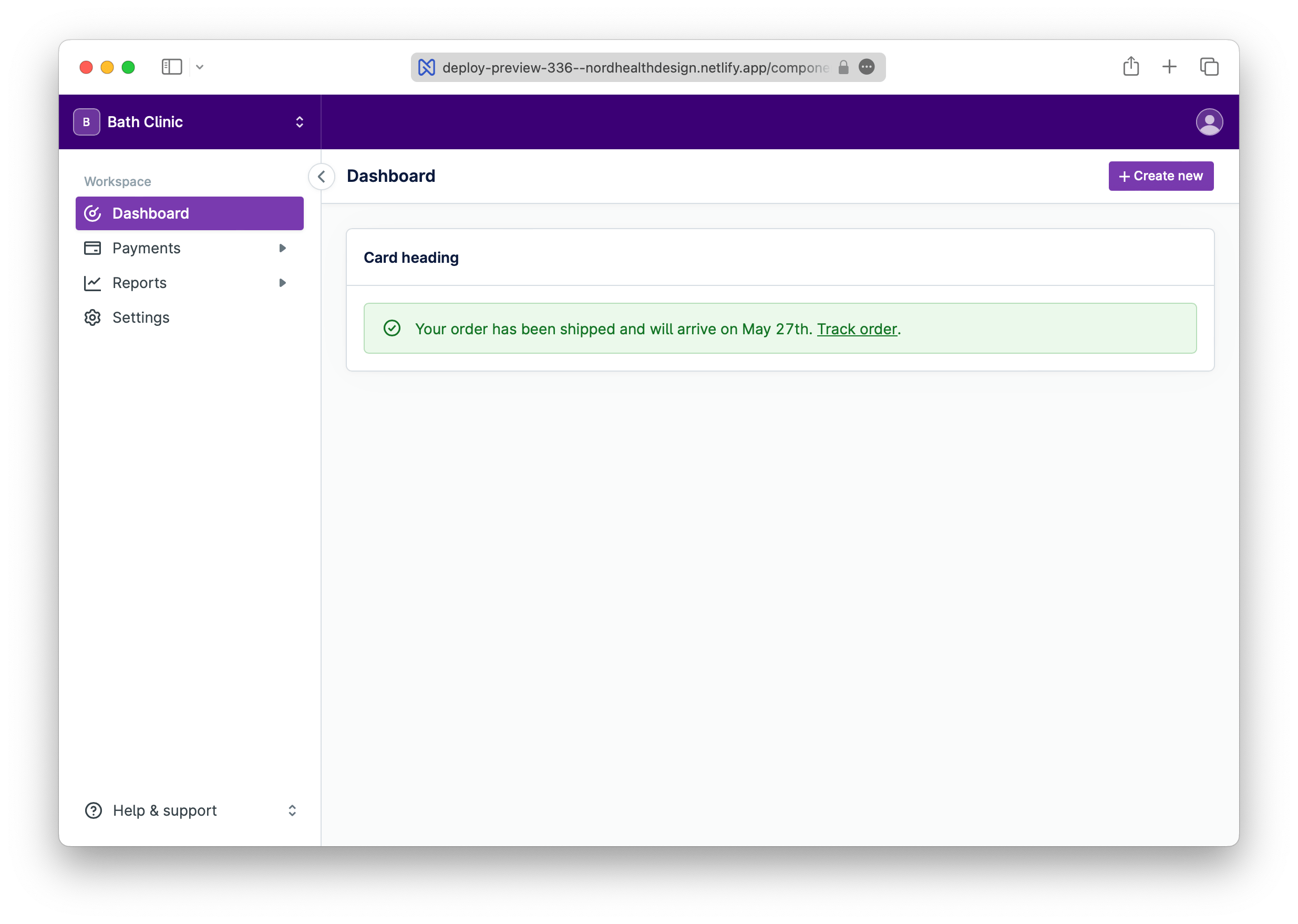
For applications that utilize the new Top Bar component, Nord now provides slightly more control over the visual appearance. In addition to the existing var(--n-color-accent), we now also provide a new secondary supporting color named var(--n-color-accent-secondary). This token can be used to customize the background color of the top bar and navigation header:
To get started using this feature, add the following styles and replace {color} with custom hex values that provide at least 4.5:1 contrast ratio against white text:
<style>
  :root {
    /* CUSTOM ACCENT COLORS */
    --n-color-accent: {color};
    --n-color-accent-secondary: {color};
  }
</style>
You can view a live example in our Layout component docs. To get more control over the theming and text colors, please see themes documentation.
var(--n-color-accent-secondary) aliases var(--n-color-accent) to provide good defaults for those who want to keep the theming simple.
Changes to design tokens
We’ve improved the underlying color system to make it more extensible and better cover the use cases of our different products. If you were previously using any of the following design tokens directly:
- Color Background:
var(--n-color-background) - Color Nav Surface:
var(--n-color-nav-surface) - Color Nav Hover:
var(--n-color-nav-hover) - Color Status Neutral:
var(--n-color-status-neutral) - Color Status Neutral Weak:
var(--n-color-status-neutral-weak) - Color Status Warning Weak:
var(--n-color-status-warning-weak) - Color Status Highlight Weak:
var(--n-color-status-highlight-weak) - Color Status Danger Weak:
var(--n-color-status-danger-weak) - Color Status Success Weak:
var(--n-color-status-success-weak) - Color Status Info Weak:
var(--n-color-status-info-weak) - Color Status Progress Weak:
var(--n-color-status-progress-weak)
You now might need to replace them with:
- Color Background: This color has been changed to gray instead of white. If you rely on it being white, you should search and replace all instances of
var(--n-color-background)withvar(--n-color-surface). To make sure you don't break the theming of the app, please consult the design system team first before doing this change. - Color Nav Surface: This color has been changed to white instead of gray. If you rely on it being gray, you should search and replace all instances of
var(--n-color-nav-surface)withvar(--n-color-background). To make sure you don't break the theming of the app, please consult the design system team first before doing this change. - Color Nav Hover: This color has been changed to a less prominent gray. If the contrast is an issue, you should search and replace all instances of
var(--n-color-nav-hover)withvar(--n-color-surface-lowered). - Color Status Neutral: Please note that this color has been changed from mid gray to white.
- Color Status Neutral Weak: This color has been changed to a less prominent color. If the contrast is an issue, you should search and replace all instances of
var(--n-color-status-neutral-weak)withvar(--n-color-border-neutral). - Color Status Warning Weak: This color has been changed to a less prominent color. If the contrast is an issue, you should search and replace all instances of
var(--n-color-status-warning-weak)withvar(--n-color-border-warning). - Color Status Highlight Weak: This color has been changed to a less prominent color. If the contrast is an issue, you should search and replace all instances of
var(--n-color-status-highlight-weak)withvar(--n-color-border-highlight). - Color Status Danger Weak: This color has been changed to a less prominent color. If the contrast is an issue, you should search and replace all instances of
var(--n-color-status-danger-weak)withvar(--n-color-border-danger). - Color Status Success Weak: This color has been changed to a less prominent color. If the contrast is an issue, you should search and replace all instances of
var(--n-color-status-success-weak)withvar(--n-color-border-success). - Color Status Info Weak: This color has been changed to a less prominent color. If the contrast is an issue, you should search and replace all instances of
var(--n-color-status-info-weak)withvar(--n-color-border-info). - Color Status Progress Weak: This color has been changed to a less prominent color. If the contrast is an issue, you should search and replace all instances of
var(--n-color-status-progress-weak)withvar(--n-color-border-progress).
New color tokens in CSS Framework
We’ve introduced the following new color tokens into Design Tokens and CSS Framework:
-
var(--n-color-text-danger) -
var(--n-color-text-highlight) -
var(--n-color-text-info) -
var(--n-color-text-neutral) -
var(--n-color-text-neutral-strong) -
var(--n-color-text-progress) -
var(--n-color-text-warning) -
var(--n-color-text-warning-strong) -
var(--n-color-border-danger) -
var(--n-color-border-highlight) -
var(--n-color-border-info) -
var(--n-color-border-neutral) -
var(--n-color-border-progress) -
var(--n-color-border-success) -
var(--n-color-border-warning) -
var(--n-color-surface-lowered) -
var(--n-color-status-notification) -
var(--n-color-accent-secondary)
Changes to CSS Framework
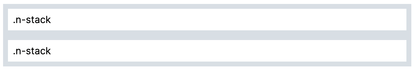
.n-stack and .n-gap now have a gap of var(--n-space-m) by default instead of none, to mirror the Stack component’s default behaviour.
Changes to Badge component
This release changes the way our Badge component works and may require you to communicate to your users about the changes and what is expected:
- We've deprecated the
typeproperty. This will be removed entirely in a future version. - We've introduced a new
variantproperty as a replacement fortype. This makes the Badge component more consistent with other components. - We’ve removed the
progressstyle variant to simplify usage. Please replace withinfovariant instead where needed. - The
progressproperty has been removed. Please use icons directly inside badge’s newiconslot instead for this purpose. View an example. - Badge component now allows any icons inside of it. There is a new slot called
iconfor this purpose. Please note though that you should only use the small variants of icons. View an example. - Badge component has a new
strongstyle that can be used with any badge variant. View an example.
Changes to Banner component
Nord’s Banner component has an improved visual style which uses the newly introduced design tokens and status colors. This is a non-breaking change and requires no changes from your side. New style looks like this:
Changes to Navigation component
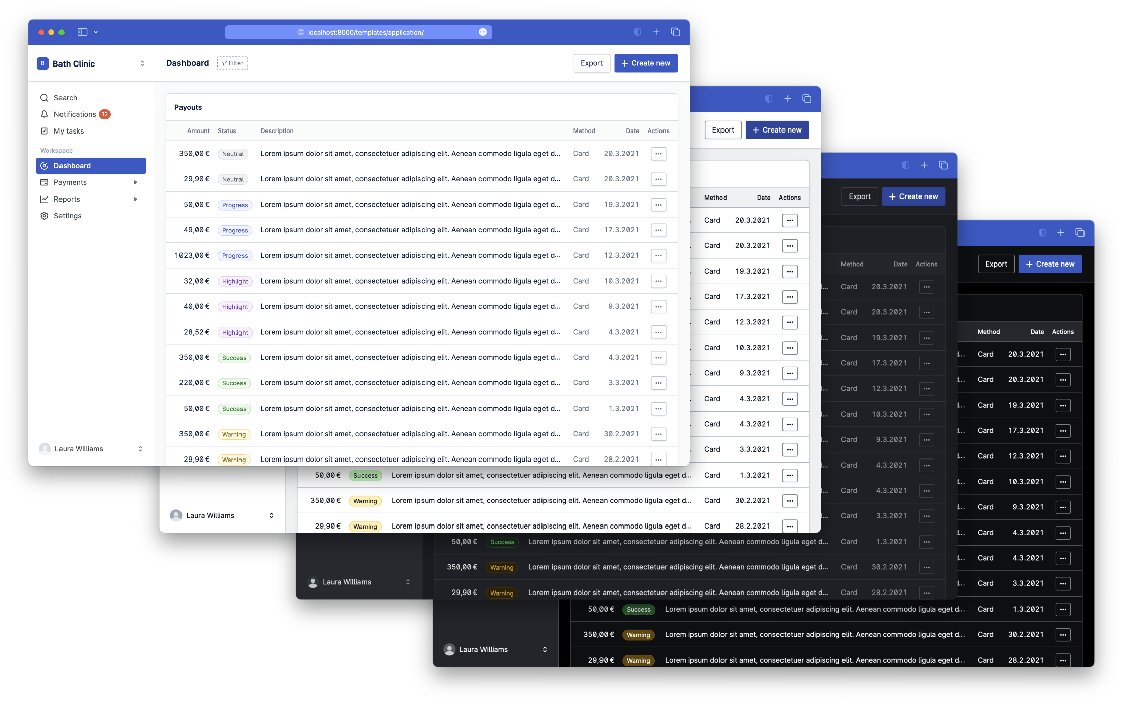
We’ve updated Navigation component’s styles and theming functionality to match new designs and added a new “auto-collapsing” behavior: When a Nav Item is marked as active, its ancestors are opened, and any others are closed.
- Example 1: Navigation component docs
- Example 2: Application template
Additionally, this release includes:
- Adds new custom property
--n-navigation-background-colorto control the background color of the navigation element.
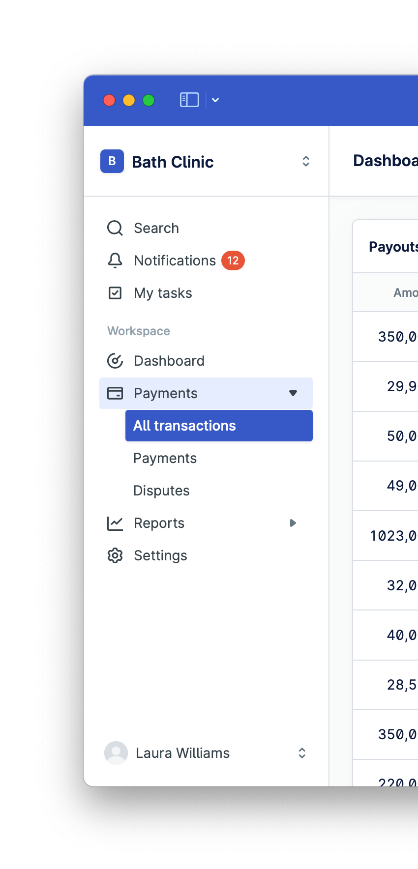
Changes to Layout component
There are multiple changes to the Layout component:
- The Layout component now has a new
top-barslot for the new Top Bar component. Please note this is still in draft stage, and we will be soon introducing more features such as search, notifications and tasks functionality to fully utilize this component. - Adds new collapse button to make collapsing nav easier and more obvious.
- Adds new
var(--n-color-accent-secondary)token to control the top bar and navigation header color, view an example. Please note that by default, this token aliases thevar(--n-color-accent). - We’ve removed the deprecated
nav-toggleproperty. - Border radius is now correctly removed from Tab Group when sticky.
- Improvements to mobile navigation and desktop “peek navigation” mode.
- Improved theming capabilities, which allow you to separately set accent and top bar colors.
Changes to Avatar component
Nord’s Avatar component has an improved visual style, which uses a slightly cooler gray instead of the previous warm gray. This release also adds a new custom property --n-avatar-box-shadow to the Avatar component that allows developers to control the box-shadow around the avatar.
Changes to Button and Input components
We’ve adjusted the small size of Nord’s Button component, Input component and Select component to better match with the latest visual changes and the new Top Bar component. The new height for these components is 28px:
Additionally, this release includes:
- Fixes issues where some custom properties on the Button component would not be inherited correctly.
- Adds new custom property
--n-button-toggle-icon-colorto the Button component to control toggle icon color.
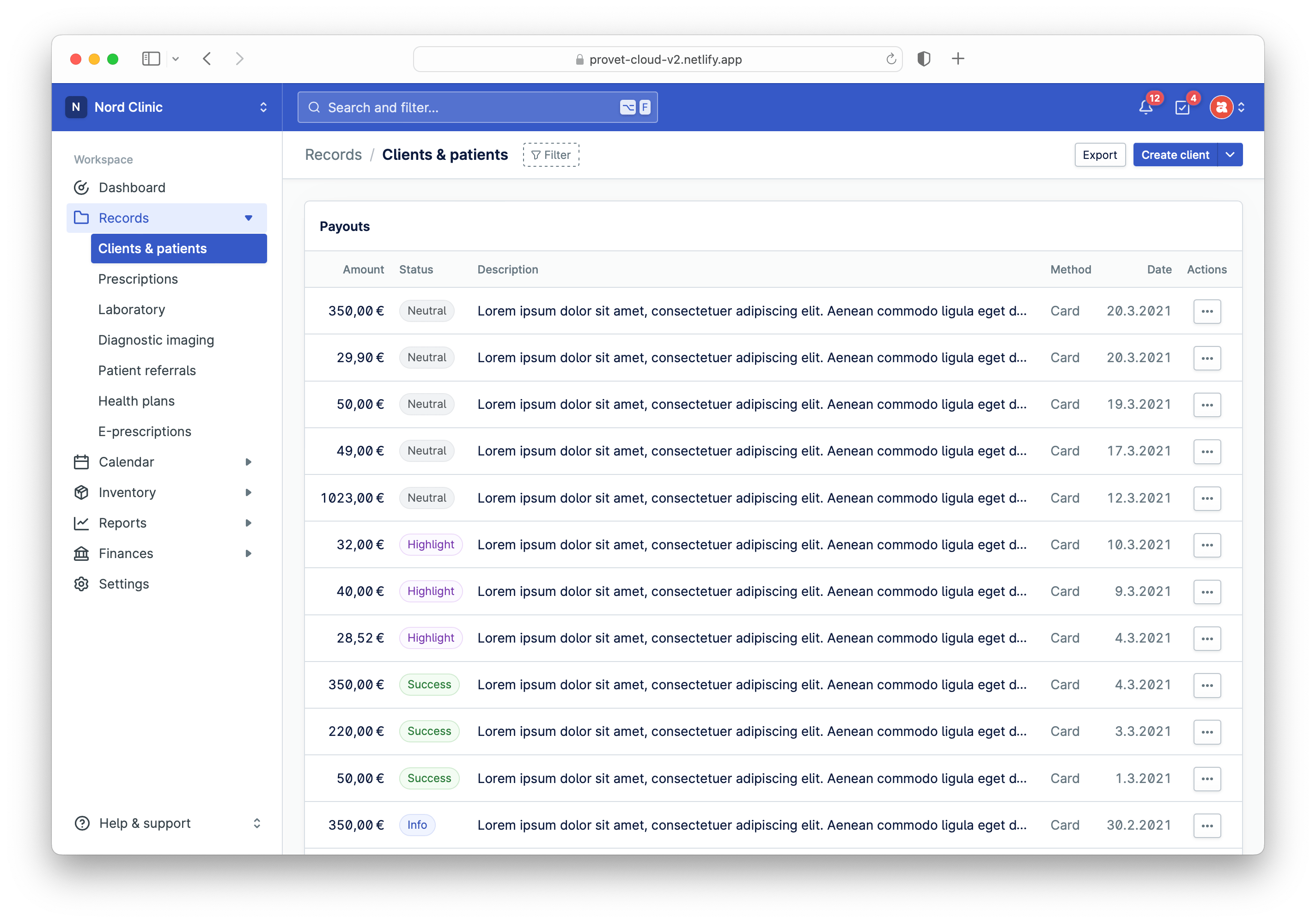
Changes to background colors
Nord’s Layout component has an improved visual style, which uses gray instead of white as the background color for the main content area. This change was introduced to provide better visual separation between blocks of content. This change also prepares the design system parts for new upcoming components such as the Top Bar:
- If your app relies heavily on the sidebar navigation being gray and the background being white, we’ve added an example on how to keep the existing behavior: View an example.
Changes to Error states
Nord’s error states have an improved visual style which use much more prominent and vibrant error colors:
Badge as dropdown toggle
We’ve added a new example which demonstrates how to use a badge inside a dropdown toggle to allow the user to change the status of an object:
New icons
This release introduces 13 new icons called interface-warning-small, file-invoice, file-patient-records, file-treatment-plan, generic-company, generic-farm, generic-hospital, medical-drip, medical-neutered, medical-spayed, medical-surgery, navigation-finances, navigation-reports-2:
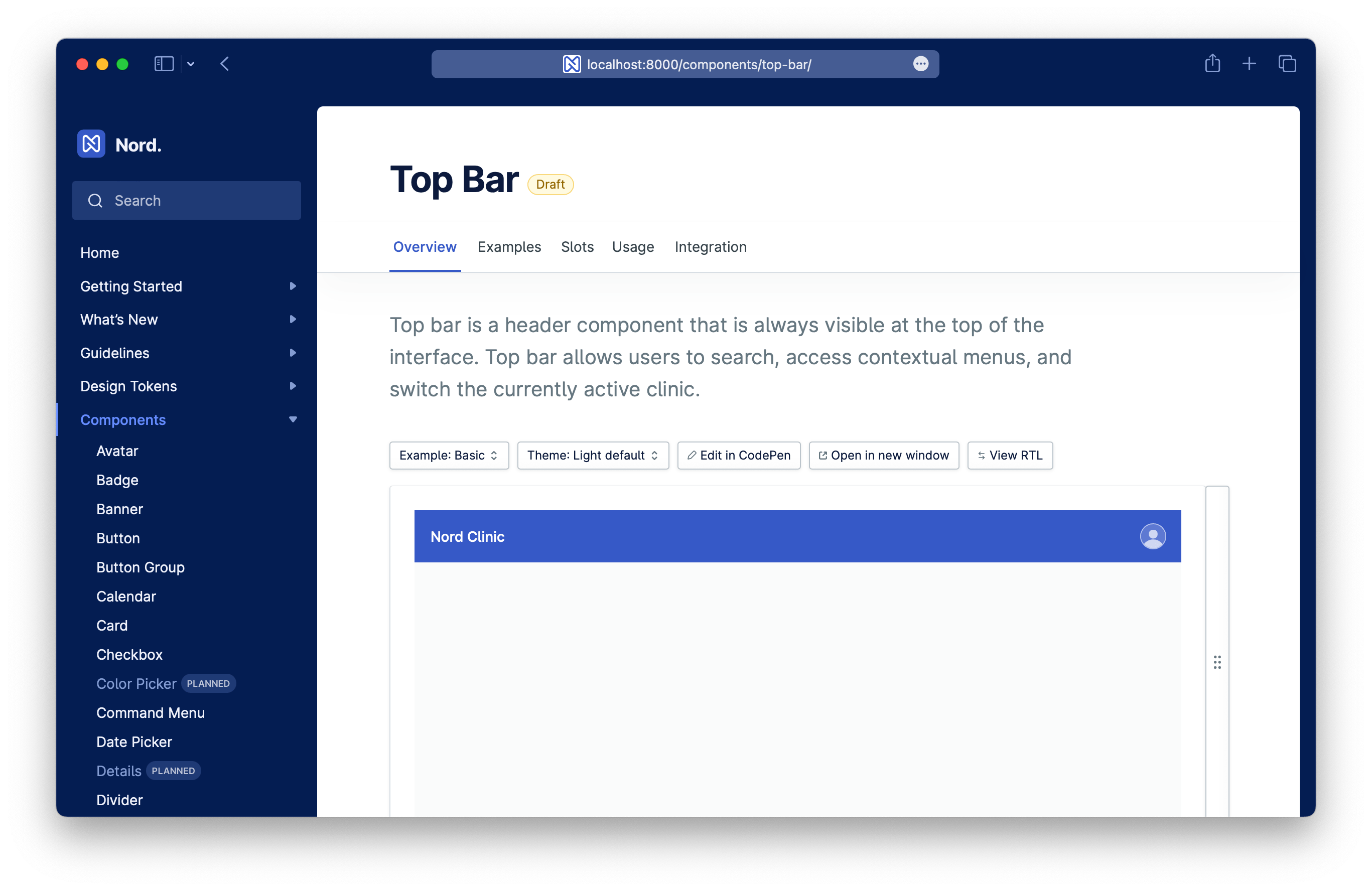
New Top Bar component
This release introduces a new Top Bar component. Please note this is still in draft stage, and we will be soon introducing more features such as search, notifications and tasks functionality to fully utilize this component.
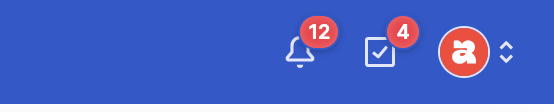
New notification color
We’ve changed the notification indicator color from yellow to red:
Update themes
We’ve reworked and updated each Nord theme with new colors:
- Nord light theme (default)
- Nord dark theme
- Nord high contrast light theme
- Nord high contrast dark theme
New Vue types and editor integration
Nord's components work out of the box with Vue, but they don't provide any TypeScript support or editor integration. To improve the developer experience, we now offer the @nordhealth/vue package. This package only contains types and no code.
To integrate these into your project, install @nordhealth/components as you normally would, along with @nordhealth/vue. Then add the following to your tsconfig.json in a TypeScript project, or jsconfig.json in a JavaScript project:
{
  "compilerOptions": {
    "types": ["@nordhealth/vue"]
  }
}
Now you will get full type checking and auto-completion in your Vue templates.
@nordhealth/components package.
Changes to Command Menu
We’ve moved the placeholder prop to a localization string instead. This change was done to simplify translation for this component, as the rest of translations are set through localization strings. There is a new example added which shows how you can integrate the Nord translations with a localization framework by writing a wrapper around it.
Updated dependencies
We’ve updated all Nord Design System package dependencies to the latest versions, including the following:
- Lit: updated to version
2.7.4 - @lit-labs/react: updated to version
1.1.1 - @floating-ui/dom: updated to version
1.2.7 - TypeScript: updated to version
5.0.4
Getting support
Have a question about migration to 3.0.0? Please head over to the Support page for more guidelines and ways to contact us.