Themes
Nord Design System's parts are themable using CSS Custom Properties. We ship pre-made themes for dark and light mode in addition to providing high contrast variants for each theme.

Integrating Nord's themes into your project is straightforward. To get started, add one of the following link tags to the <head> of your application:
<!-- Light theme (default) -->
<link rel="stylesheet" href="https://nordcdn.net/ds/themes/9.0.9/nord.css" integrity="sha384-SqCxn7Q5+e2kzU7wWzE+mNMFM3sj+NB2hkJ7d5kGl3dLYCp0Xi4sKr4AIqENr9HN" crossorigin="anonymous" />
When using Nord's themes, it's required to include our CSS Framework before the theme link tag to get access to properties such as margin, padding, font sizes, and similar which are not bundled into each theme:
<link href="https://nordcdn.net/ds/css/4.2.0/nord.min.css" rel="stylesheet" />
Please note that the Light Default Theme is bundled into our CSS framework, meaning there is no need to add this theme if you already have the CSS Framework installed and it's the only theme you wish to use.
Installation
While usage through Nord CDN is the fastest way to get started, we also support installing any of the themes locally using npm. Before you move further with this approach, please make sure you have Node.js installed on your machine. You can install the latest version through their website.
If you're planning on using Nord Themes in a project that doesn't yet use npm, you'll first need to create a package.json file. To do this, run npm init and follow the steps provided. Once finished, you can continue the Nord Themes installation by following the instructions below.
Install using npm
Run in your project or website root directory (where package.json lives):
npm install @nordhealth/themes @nordhealth/css --save
Importing a theme locally
Once you've installed our npm packages, you can then import any of Nord's themes into your project as CSS, SCSS, Sass or Less:
/* Import default light theme (bundled into CSS Framework) */
@import "~@nordhealth/css/lib/nord.min.css";
If you're not using Webpack or a similar tool for your build process, you may have to provide the full paths to Node Modules:
@import "/node_modules/@nordhealth/css/lib/nord.min.css";
@import "/node_modules/@nordhealth/themes/lib/nord-dark.css";
Available themes
Below you can find a list of available themes and paths to them inside our Node.js package:
- Light (default):
@nordhealth/themes/lib/nord.css - Light high contrast:
@nordhealth/themes/lib/nord-high-contrast.css - Dark:
@nordhealth/themes/lib/nord-dark.css - Dark high contrast:
@nordhealth/themes/lib/nord-dark-high-contrast.css
- Light (default):
@nordhealth/themes/lib/vet.css - Light high contrast:
@nordhealth/themes/lib/vet-high-contrast.css - Dark:
@nordhealth/themes/lib/vet-dark.css - Dark high contrast:
@nordhealth/themes/lib/vet-dark-high-contrast.css
Themes on Nord CDN
<!-- Light theme (default) -->
<link href="https://nordcdn.net/ds/themes/9.0.0/nord.css" rel="stylesheet" />

<!-- Light high contrast theme -->
<link href="https://nordcdn.net/ds/themes/9.0.0/nord-high-contrast.css" rel="stylesheet" />

<!-- Dark theme -->
<link href="https://nordcdn.net/ds/themes/9.0.0/nord-dark.css" rel="stylesheet" />

<!-- Dark high contrast theme -->
<link href="https://nordcdn.net/ds/themes/9.0.0/nord-dark-high-contrast.css" rel="stylesheet" />
<!-- Light theme (default) -->
<link href="https://nordcdn.net/ds/themes/9.0.0/vet.css" rel="stylesheet" />

<!-- Light high contrast theme  -->
<link href="https://nordcdn.net/ds/themes/9.0.0/vet-high-contrast.css" rel="stylesheet" />

<!-- Dark theme -->
<link href="https://nordcdn.net/ds/themes/9.0.0/vet-dark.css" rel="stylesheet" />

<!-- Dark high contrast theme -->
<link href="https://nordcdn.net/ds/themes/9.0.0/vet-dark-high-contrast.css" rel="stylesheet" />
Examples
- Try theme builder to better understand how our themes work.
- For more examples, view our templates and try adjusting the active theme in the documentation and then refreshing the template viewed.
- You can switch the active theme inside any of our component examples.
- You can switch the active theme in our Design Tokens documentation.
- Finally, our Figma Toolkit supports theming directly in Figma.
Dark mode
Dark mode is a user interface mode that displays light text on a dark background. Dark mode is helpful for those viewing device screens at night, in dark environments or find darker UI more accessible. The reduced brightness can reduce eye strain in low light conditions.
A typical scenario is that we already have a light theme in an application, and want to build support for a darker counterpart. When building this support, one of the themes has to be defined as the default that users get on their first visit. This should always be the light theme, although we can let the user's browser make that choice for us.
When building dark mode support in an application, we should always provide a manual way for the user to switch to the other theme in the platform's settings. This setting should include at least the following options:
Most of the time, we also recommend you to provide the capability for the user to choose one of our high contrast themes:
Changing mode based on user preference
Since Nord offers its themes as separate stylesheets, we can toggle between these stylesheets for each mode. By default, we should have the light stylesheet in the <head> section of the application:
<!DOCTYPE html>
<html lang="en">
  <head>
    <!-- Nord dark theme -->
    <link href="https://nordcdn.net/ds/css/4.2.0/nord.min.css" rel="stylesheet" />
    <link href="https://nordcdn.net/ds/themes/9.0.0/nord-dark.css" rel="stylesheet" />
  </head>
  <body>
    <nord-select label="Interface theme">
      <option value="light">Light theme</option>
      <option value="dark">Dark theme</option>
      <option value="auto">Auto (system preference)</option>
    </nord-select>
  </body>
</html>
When the user switches the mode, we can toggle between these stylesheets:
// Select the menu
const menu = document.querySelector('nord-select')

// Listen for a change event on the menu
menu.addEventListener('change', (event) => {
  // If the selected mode is dark, change to dark theme
  if (event.target.value === 'dark') {
    alert('Change theme to dark')

  // Otherwise, change to light theme
  }
  else {
    alert('Change theme to light')
  }
})
Building support for OS dark mode
Many operating systems let users choose between light and dark mode directly in the system settings. The goal of 'Auto (system preference)' is to allow this type of usage. To support this, we can use a little bit of JavaScript to detect the user's preference:
// Detect operating system dark mode
const darkMode = window.matchMedia('(prefers-color-scheme: dark)')

// If the OS uses dark mode currently, change to dark theme
if (darkMode.matches) {
  alert('Change theme to dark')

  // Otherwise, change to light theme
}
else {
  alert('Change theme to light')
}
Storing user's preference
Ultimately, we also need to carry over this functionality when the user either visits another view in your application or reloads the current view.
To achieve this, we need to save the user's preference so that it will be applied consistently throughout the application and on subsequent visits. To do that, we can save the preference to localStorage:
// Get current mode from localStorage
const currentMode = localStorage.getItem('mode')

// If current mode is "dark", change to dark theme
if (currentMode === 'dark') {
  alert('Change theme to dark')
}

// Listen for a change event on the mode menu
menu.addEventListener('change', (event) => {
  let mode = 'light'

  // If the selected mode is dark, change to dark theme
  if (event.target.value === 'dark') {
    alert('Change theme to dark')
    mode = 'dark'

  // Otherwise, change to light theme
  }
  else {
    alert('Change theme to light')
  }

  // Finally, save the choice into localStorage
  localStorage.setItem('mode', mode)
})
Creating themes
Nord uses CSS Custom Properties (sometimes referred to as CSS variables) to make its parts themable. CSS Custom Properties allow us to have our values stored in one place, then referenced in multiple other places.
While we could argue that you shouldn't create new themes yourself as you lose the built-in accessibility, break the connection with the underlying brand architecture, and lose backwards compatibility, you could still technically do so. Hence our thinking is that it's better to document this than leave it up for our users to guess.
To create a complete theme, you need a new CSS file with a :root CSS pseudo-class which declares global colors, gradients, box-shadows, and color aliases for the theme. This file needs to be referenced after our CSS Framework in the <head> of your app:
:root {
  /* Tell the browser whether it's a light or dark theme
     so that it uses things like light/dark scrollbars: */
  color-scheme: light;

  /* ACCENT COLOR */
  --n-color-accent: {color};

  /* TEXT COLORS */
  --n-color-text: {color};
  --n-color-text-link: {color};
  --n-color-text-weak: {color};
  --n-color-text-weaker: {color};
  --n-color-text-weakest: {color};
  --n-color-text-on-accent: {color};
  --n-color-text-error: {color};
  --n-color-text-danger: {color};
  --n-color-text-success: {color};
  --n-color-text-neutral: {color};
  --n-color-text-neutral-strong: {color};
  --n-color-text-warning: {color};
  --n-color-text-warning-strong: {color};
  --n-color-text-highlight: {color};
  --n-color-text-info: {color};
  --n-color-text-progress: {color};

  /* NAVIGATION COLORS */
  --n-color-nav-surface: {color};
  --n-color-nav-heading: {color};
  --n-color-nav-hover: {color};

  /* BORDER COLORS */
  --n-color-border: {color};
  --n-color-border-strong: {color};
  --n-color-border-neutral: {color};
  --n-color-border-warning: {color};
  --n-color-border-highlight: {color};
  --n-color-border-danger: {color};
  --n-color-border-success: {color};
  --n-color-border-info: {color};
  --n-color-border-progress: {color};

  /* SKIN COLORS */
  --n-color-surface: {color};
  --n-color-background: {color};
  --n-color-surface-raised: {color};
  --n-color-surface-lowered: {color};
  --n-color-overlay: {color};

  /* STATUS COLORS */
  --n-color-status-neutral: {color};
  --n-color-status-warning: {color};
  --n-color-status-highlight: {color};
  --n-color-status-danger: {color};
  --n-color-status-success: {color};
  --n-color-status-info: {color};
  --n-color-status-progress: {color};
  --n-color-status-notification: {color};

  /* STATUS WEAK COLORS */
  --n-color-status-neutral-weak: {color};
  --n-color-status-warning-weak: {color};
  --n-color-status-highlight-weak: {color};
  --n-color-status-danger-weak: {color};
  --n-color-status-success-weak: {color};
  --n-color-status-info-weak: {color};
  --n-color-status-progress-weak: {color};

  /* BOX SHADOW COLORS */
  --n-box-shadow: {box-shadow};
  --n-box-shadow-card: {box-shadow};
  --n-box-shadow-header: {box-shadow};
  --n-box-shadow-modal: {box-shadow};
  --n-box-shadow-popout: {box-shadow};
  --n-box-shadow-nav: {box-shadow};
}
The above example assumes that you will replace any instance of {color}, {gradient} and {box-shadow} with your own values.
Example theme
Below is an example theme that you can use as the foundation for building your own custom themes:
:root {
  /* Tell the browser whether it's a light or dark theme
     so that it uses things like light/dark scrollbars: */
  color-scheme: light;

  /* ACCENT COLOR */
  --n-color-accent: rgb(53, 89, 199);

  /* TEXT COLORS */
  --n-color-text: rgb(12, 26, 61);
  --n-color-text-link: rgb(53, 89, 199);
  --n-color-text-weak: rgb(54, 67, 74);
  --n-color-text-weaker: rgb(102, 118, 128);
  --n-color-text-weakest: rgb(178, 186, 191);
  --n-color-text-on-accent: rgb(255, 255, 255);
  --n-color-text-error: rgb(210, 64, 35);
  --n-color-text-danger: rgb(178, 48, 21);
  --n-color-text-success: rgb(17, 118, 39);
  --n-color-text-neutral: rgb(85, 89, 93);
  --n-color-text-neutral-strong: rgb(17, 24, 28);
  --n-color-text-warning: rgb(148, 105, 0);
  --n-color-text-warning-strong: rgb(51, 40, 16);
  --n-color-text-highlight: rgb(121, 58, 175);
  --n-color-text-info: rgb(52, 81, 178);
  --n-color-text-progress: rgb(1, 109, 131);

  /* NAVIGATION COLORS */
  --n-color-nav-surface: rgb(255, 255, 255);
  --n-color-nav-heading: rgb(143, 161, 170);
  --n-color-nav-hover: rgb(246, 248, 248);

  /* BORDER COLORS */
  --n-color-border: rgb(216, 222, 228);
  --n-color-border-strong: rgb(188, 197, 204);
  --n-color-border-neutral: rgb(215, 220, 224);
  --n-color-border-warning: rgb(248, 216, 124);
  --n-color-border-highlight: rgb(227, 204, 244);
  --n-color-border-danger: rgb(250, 199, 190);
  --n-color-border-success: rgb(183, 223, 186);
  --n-color-border-info: rgb(198, 212, 249);
  --n-color-border-progress: rgb(176, 229, 238);

  /* SKIN COLORS */
  --n-color-surface: rgb(255, 255, 255);
  --n-color-background: rgb(250, 251, 251);
  --n-color-surface-raised: rgb(250, 251, 251);
  --n-color-surface-lowered: rgb(230, 232, 235);
  --n-color-overlay: rgba(144, 152, 152, 0.4);

  /* STATUS COLORS */
  --n-color-status-neutral: rgb(255, 255, 255);
  --n-color-status-warning: rgb(246, 205, 90);
  --n-color-status-highlight: rgb(142, 78, 198);
  --n-color-status-danger: rgb(210, 64, 35);
  --n-color-status-success: rgb(29, 134, 51);
  --n-color-status-info: rgb(62, 99, 221);
  --n-color-status-progress: rgb(0, 127, 153);
  --n-color-status-notification: rgb(231, 84, 54);

  /* STATUS WEAK COLORS */
  --n-color-status-neutral-weak: rgb(241, 243, 245);
  --n-color-status-warning-weak: rgb(255, 250, 225);
  --n-color-status-highlight-weak: rgb(249, 241, 254);
  --n-color-status-danger-weak: rgb(255, 240, 238);
  --n-color-status-success-weak: rgb(235, 249, 235);
  --n-color-status-info-weak: rgb(240, 244, 255);
  --n-color-status-progress-weak: rgb(231, 249, 251);

  /* BOX SHADOW COLORS */
  --n-box-shadow: 0 1px 3px rgba(12, 12, 12, 0.09);
  --n-box-shadow-card: 0 0 0 1px var(--n-color-border), 0 1px 5px rgba(12, 12, 12, 0.05), 0 0 40px rgba(12, 12, 12, 0.015);
  --n-box-shadow-header: 0 1px 5px rgba(12, 12, 12, 0.05);
  --n-box-shadow-modal: 0 24px 38px 3px rgba(12, 12, 12, 0.16), 0 9px 86px 8px rgba(12, 12, 12, 0.1), 0 11px 15px -7px rgba(12, 12, 12, 0.1), 0 0 0 1px rgba(0, 0, 0, 0.05);
  --n-box-shadow-popout: 0 4px 12px rgba(12, 12, 12, 0.15), 0 0 0 1px rgba(0, 0, 0, 0.05);
  --n-box-shadow-nav: 0 0 0 1px var(--n-color-border), 0 5px 17px rgba(12, 12, 12, 0.14);
}
Accent color
Most of the time you shouldn't create a complete theme, but instead provide a slightly branded experience for your users. This can be helpful when offering for example customer portals that our client's client would have access to.
For this, Nord provides a concept called accent color that supports both Nord light and Nord dark themes. We've created a tool called Theme Builder that shows how this works.
To get started with using accent color, first remove all themes from the <head> section of the application and only leave CSS Framework which includes the default light theme that we'll use as a basis:
<!-- CSS Framework that comes with light default theme -->
<link href="https://nordcdn.net/ds/css/4.2.0/nord.min.css" rel="stylesheet" />
Next, after the CSS Framework, add the following styles and replace {accent-color} with a custom hex value and {text-on-accent-color} with a hex value that offers the necessary 4.5:1 contrast ratio for text that sits on top of the accent color:
<style>
  :root {
    /* CUSTOM ACCENT COLORS */
    --n-color-accent: {accent-color};
    --n-color-text-on-accent: {text-on-accent-color};
  }
</style>
We recommend you to set the text as #0c1a3d for light accent colors and #fff for dark accent colors so that they match the default Nord light and dark themes.
If you're working on an interface that allows the user to pick the accent color themselves, we recommend programmatically picking the right text color, instead of leaving this to the user. You can use the getTextColor utility function found from @nordhealth/color package to do this:
import { getTextColor } from '@nordhealth/color'

const textColor = getTextColor('#fafafa')
The above utility function can also be utilized on a regular HTML page by importing the color package directly. In the below example, we set the new theme colors into :root CSS pseudo-class whenever the color input value changes:
<label for="color">Accent color</label>
<input id="color" type="color" value="#3559c7" />

<script src="@nordhealth/color/lib/index.min.js"></script>
<script>
  const input = document.querySelector("#color")
  const root = document.documentElement

  input.addEventListener("input", () => {
    const color = input.value
    const textColor = NordColor.getTextColor(color)

    root.style.setProperty("--n-color-accent", color)
    root.style.setProperty("--n-color-text-on-accent", textColor)
  })
</script>
You can try the above example in our theme builder.
Top Bar theming
For applications that utilize the Top Bar component, Nord provides slightly more control over the visual appearance. For this purpose, we have a CSS Custom Property named var(--n-color-accent-secondary). This token can be used to customize the background color of the top bar and navigation header:

To get started using this feature, add the following styles and replace {color} with a custom hex value that offers at least 4.5:1 contrast ratio against white text:
<style>
  :root {
    /* CUSTOM SECONDARY ACCENT COLOR */
    --n-color-accent-secondary: {color};
  }
</style>
Please note that the text and interface elements inside the top bar and navigation header always use white text. For this reason, it is a good idea to always make var(--n-color-accent-secondary) slightly darker than var(--n-color-accent). An example:
<style>
  :root {
    /* CUSTOM ACCENT COLORS */
    --n-color-accent: #793aaf;
    --n-color-accent-secondary: #3b0075;
  }
</style>
You can view the above example in our Layout component docs.
var(--n-color-accent-secondary) aliases var(--n-color-accent) to provide good defaults for those who want to keep the theming simple.Logo usage
Showing a custom logo can be helpful when you want to provide more ways for your users to customize their experience in addition to accent color. We support two different styles for displaying a logo in the header of an application.
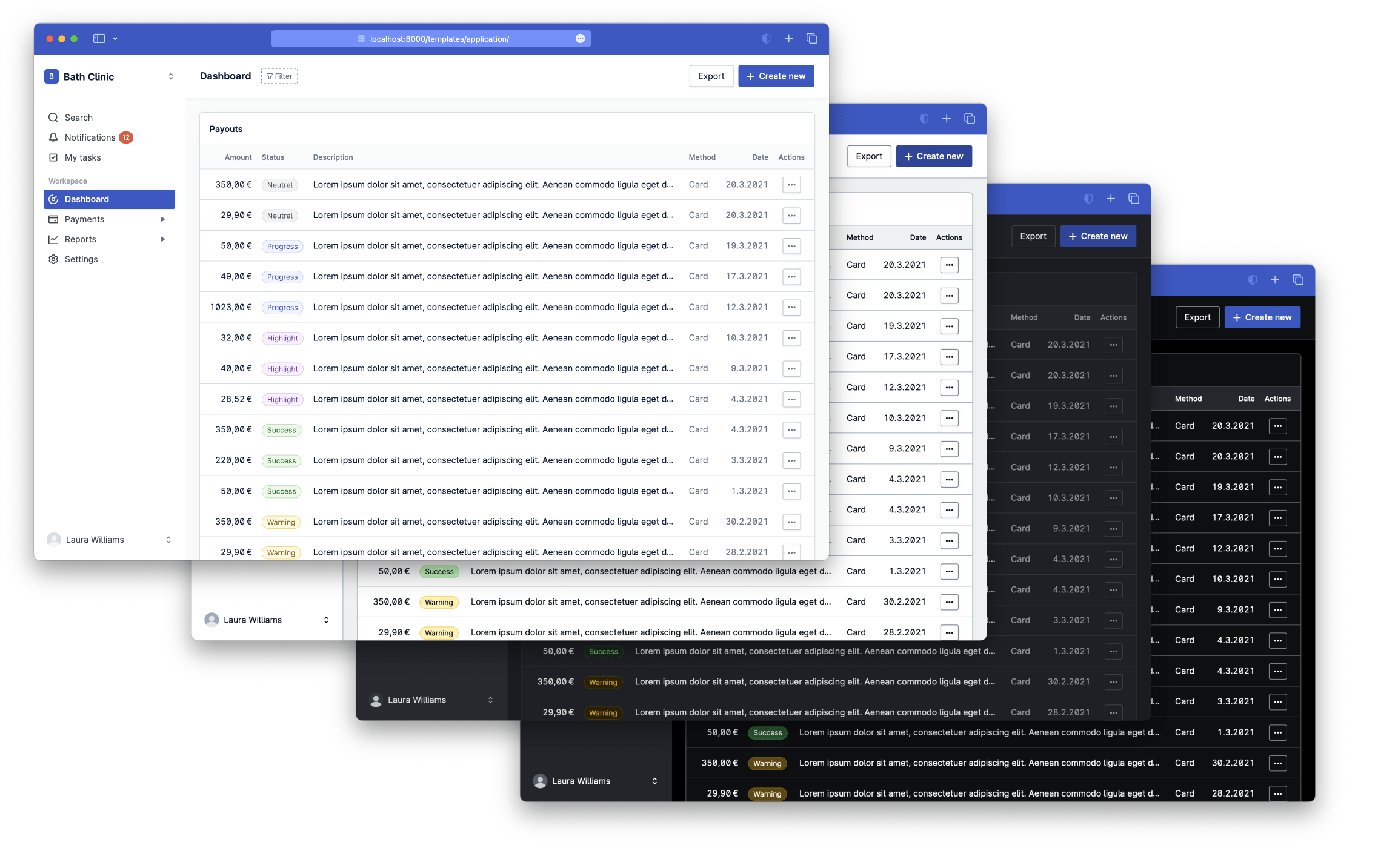
The primary style is to display a logo in a square format inside the navigation header in the top left corner of the app. The required minimum size for the image is 64×64px. We call this style unambiguously the square logo:
The secondary style replaces the dropdown in the header completely and shows only the logo. We call this style the standalone logo:
This style can be helpful when offering customer portals that our client's client would have access to. We don't recommend this style for any other use case. The required minimum width for an image in this case is 360px and you should aim to use a horizontal logo given the limited space.
You can try both of these styles by uploading a logo in a correct format using our theme builder which provides a setting for changing between these two logo styles.
Theming in Figma
Nord Figma Toolkit supports theming natively in Figma using Figma Variables. To get started with theming, follow the below instructions.
- In the right sidebar, click the "Apply variable mode" button (swatch icon).
- Select the "Tokens" variable collection.
- Choose your desired theme from the dropdown.
Theme Builder
Try theme builder to better understand how our themes work.
Nord Theme Builder
Updated 17.10.2022
Can I use themes in my own project?
Nord Design System is solely meant for building digital products and experiences for Nordhealth. Please see the terms of use for full license details.
Getting support
Need help with our themes? Please head over to the Support page for more guidelines and ways to contact us.