September, 2021
You’re reading the fourth Nord Design System monthly update. This month we’ve been working on making sure that everyone at Nordhealth understands how and why we’re building a design system.
We started the design systems work at Nordhealth in late 2020. The way I usually recommend starting this work is via user research, which helps us to figure out what are the challenges on organization, team, and people level that we should be solving. We do this because all companies are different and there isn’t one solution that fits everyone when it comes to design systems.
Back then we interviewed ~60 different persons from different teams, with different backgrounds, and with different levels of experience. The result of this research was an organizational challenges heatmap that highlighted organization level problems.
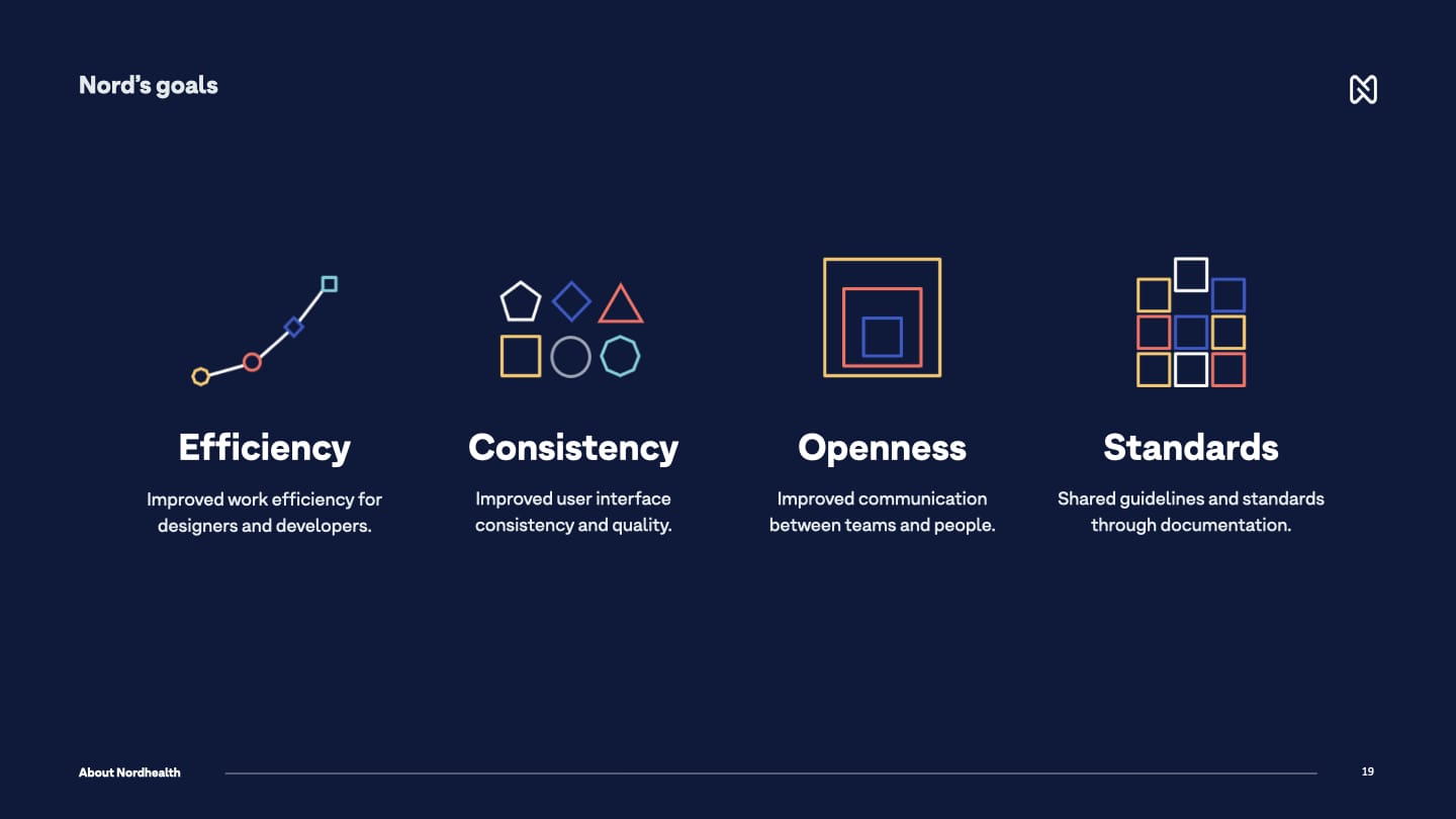
Now that we had a clear list of challenges that we wanted to start solving, it was a matter of creating fundamental principles and goals for the system that we should follow to start solving these issues. We came up with these four goals for Nord:
At the same time, we also created design principles for the design systems work that would form the foundations for Nord and guide our team when working on the different parts of the system and help us do better and more informed decisions. These are the six design principles we created for Nord:
1. Put user needs first
We care for the people who use our products. We’re here to make their day-to-day and long-term work better and more pleasant through great user experience.
2. Strive for consistency, not uniformity
We should use the same language and design patterns wherever possible. This helps people get familiar with our services. Same holds true for the system and its developer experience.
3. Default to openness
We should share what we’re doing whenever we can. Building our services transparently increases their visibility and accountability and makes us push towards higher quality.
4. Make it accessible
Our services are for everyone. We make sure people with different needs can use our products and that they meet the accessibility standards outlined in WCAG 2.1.
5. Provide a good developer experience
Providing a good developer experience is very important to us. Developers should be able to start using our tools in minutes, not hours, days or weeks.
6. Automate everything you can
We value the time of our colleagues, users, and our future selves over our own. We are always proactively looking for ways to automate repetitive tasks and testing.
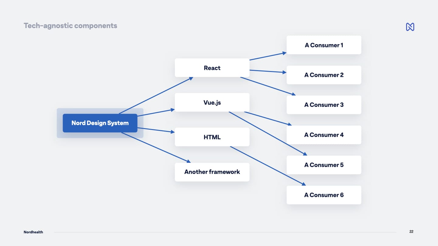
Whenever I talk about Nord Design System, one of the first things that I like to mention is that we’re building a system that is tech agnostic, not tech specific. Meaning that you can take any component from Nord and use it with any framework. That could be Angular, React, Preact, Vue.js, plain HTML, your old PHP application, or any future framework.
We achieve this by building on top of existing web standards (Web Components to be exact), instead of choosing a specific framework to go with. This is really important for us for a few reasons;
Tech-Agnostic Instead Of Tech-Specific
In order to create modular interfaces, a design system needs to be technology-agnostic instead of technology-specific. Web Components offer this benefit and make it easier to reduce our design system’s complexity and improve its reusability.
Future Proofing With Web Standards
Web Standards are more future proof than any given JavaScript framework. I’ve seen different frameworks come and go during my almost two decade long career on the web, but Web Standards keep thriving and evolving.
Any Framework Or No Framework
Web Components can be used with any JavaScript framework or no framework at all. This means we’re able to support all our product teams from a single codebase. This makes it possible for our small design system team to be very efficient.
Full Encapsulation
Shadow DOM allows components to have their own DOM tree that can’t be accidentally accessed from the main document. For us this means that “everything just works” when the components are implemented onto different environments and platforms. Most styles cannot penetrate a component from the outside, and styles inside a component won’t bleed out.
Nord’s tech-agnostic thinking isn’t limited to only components either, all our styles are agnostic as well. We use design tokens instead of hard coded values to ensure a better UI consistency across different platforms. Be that a web application, a native application, a mobile application, a VR solution, or something new that doesn’t even exist today.
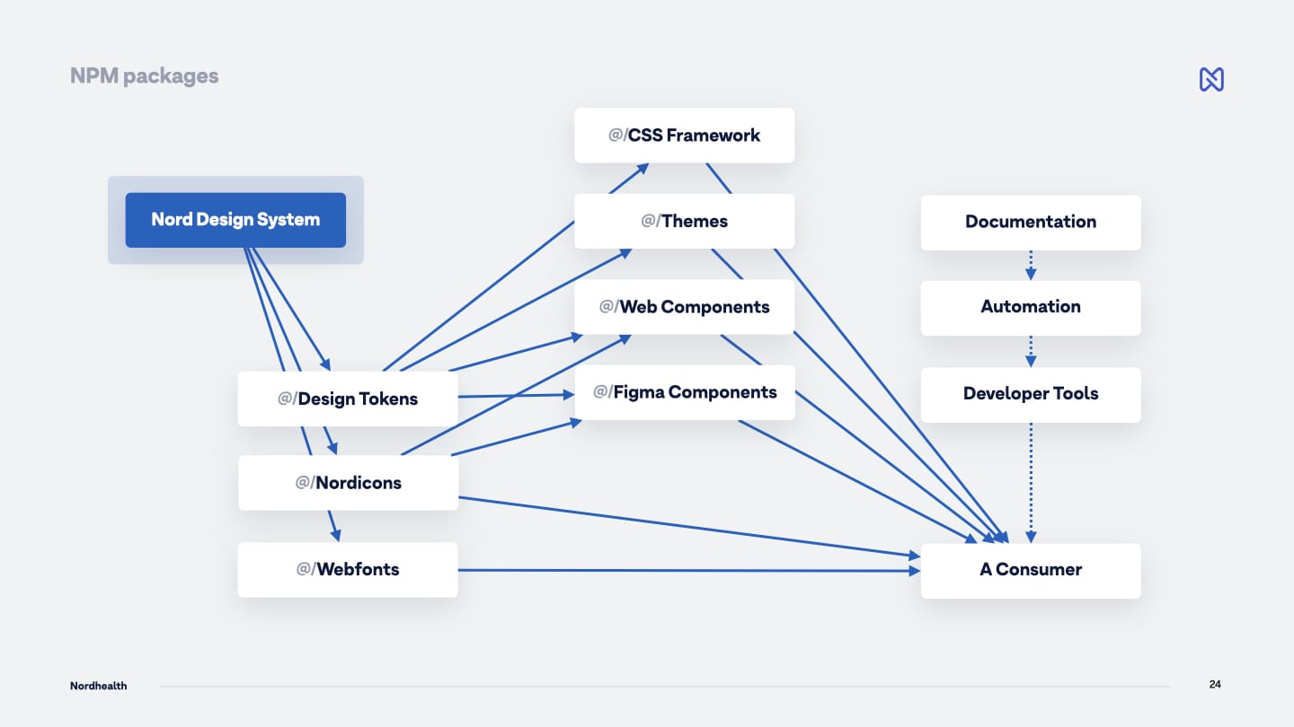
Looking at the way Nord itself is structured, looks somewhat like shown in the picture above. The most important thing about the architecture is that we aren’t really talking about one gigantic design system, but multiple small modular systems that can be used either standalone or together depending on specific team’s needs.
So on a high-level we have design tokens which are the base building blocks of our design language. There we define things like colors, fonts, spacing, shadows, and other properties that create the visual look. Then on the second level we have packages such as Nord’s CSS Framework, Theme system, Web Components, and Figma components.
What ties it all together is our documentation and guidelines at nordhealth.design which is getting more and more automated as we move along.
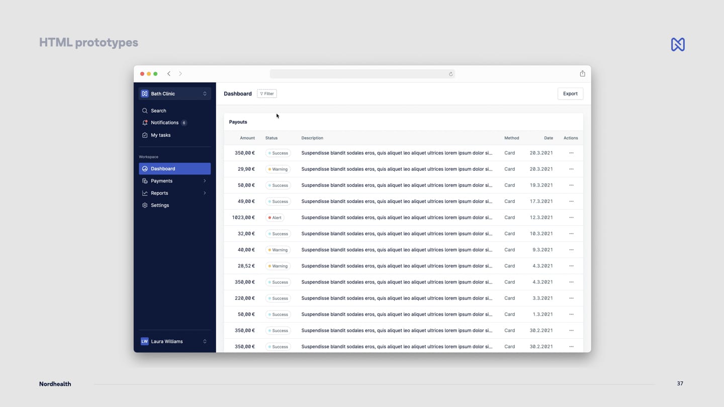
The last thing I perhaps want to share in this update, is an early prototype of Nord’s UI components. We’ve been moving back and forth between Figma and HTML prototypes to be able adjust the micro interactions and how the UI feels in real use in real environment, which is the web browser. Things will definitely still change quite a lot as we’re rapidly iterating on the design and theming, but take a peek of what’s under work.
Until the next time! — Ariel
P.S. Subscribe to our RSS Feed to follow the latest updates from Nord team.