October, 2021
You’re reading the fifth Nord Design System monthly update. This month we’ve gained great momentum and have published four new packages, and made many improvements to Nord documentation.
As Nord Design System is still quite young, we feel like it’s a good idea to once in a while repeat why we are building these tools and what’s really the scope of our work. To us, a “design system” is a collection of reusable components and tools, guided by clear standards, that can be assembled together to build digital products and experiences.
What this means, is that we aren’t really designing the workflows and features of each product. Instead, our goal is to provide the best possible tools, components, and guidelines for our designers and developers working in each product team to be able to build more consistent products at scale, faster, and with better outcomes.
The ultimate end goal for us is to provide tools that allow us, as a company, to better serve our end users and that is really at the center of everything we do. We want to transform our culture, processes, and practices to support this mission and the design system is an important tool to help us with this transformation.
The fundamental purpose of Nord is to elevate our design and frontend development practices in-house, bring those disciplines closer together, improve the consistency between products, and also improve the working efficiency for everyone in the long run.
We’re here to make your life easier, let us know how we can help your team.
New this month
As mentioned earlier, we’ve published quite a few new packages and features this month, so we’re listing all of them below and linking to their respective documentation pages for detailed information about usage and such.
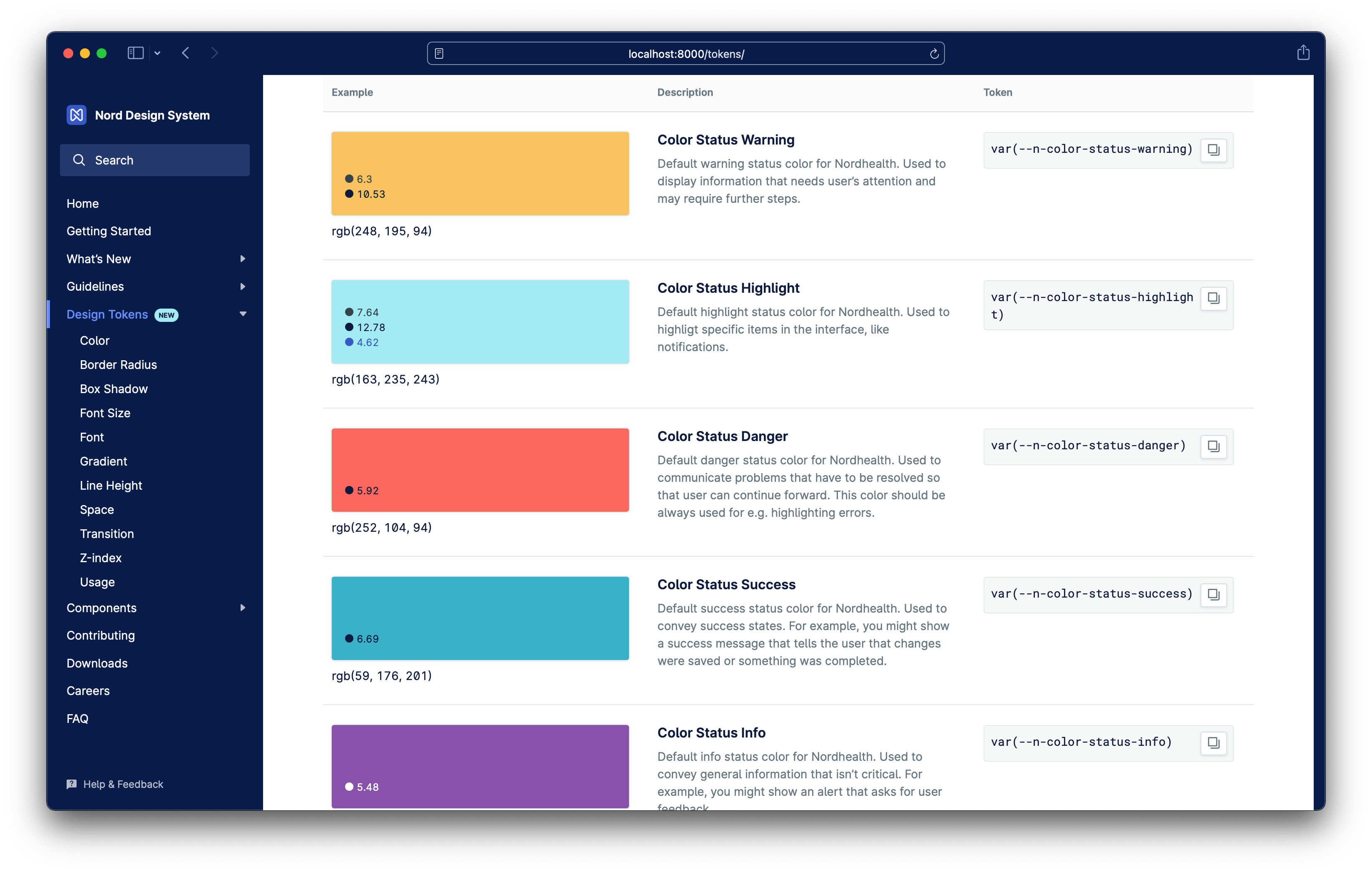
Nord Design Tokens 1.0.0
Design tokens are a tech-agnostic way to store variables. We use tokens instead of hard coded values to ensure a better UI consistency across different platforms. Design tokens reached stable state this week and they’re now ready for production usage.

Nord Themes 2.0.0
Nord’s parts are themable using CSS Custom Properties. We ship pre-made themes for Nordhealth, Veterinary and Healthcare. You can utilize these themes through our Themes package which reached stable state this week and is now ready for production usage.
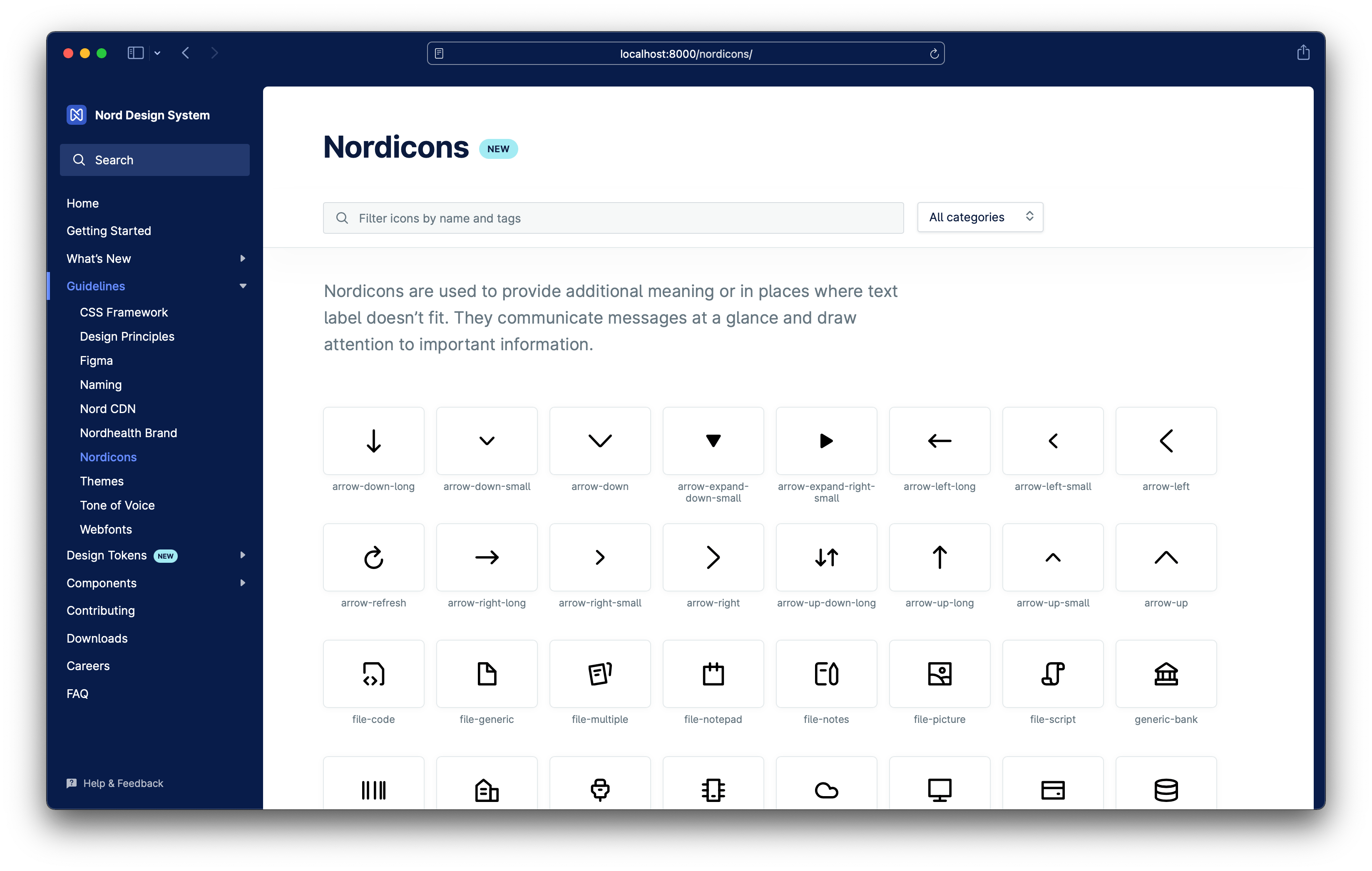
Nordicons 1.0.0
Nordicons are used to provide additional meaning or in places where text label doesn’t fit. They communicate messages at a glance and draw attention to important information. Nordicons package reached stable state this week and is now ready for production usage.

Nord Webfonts 2.0.0
Nord Design System provides an npm package that makes it straightforward to use our webfonts. This package ships with all the necessary font files in addition to Sass, Less, and CSS for self-hosting. Nord’s Webfonts package reached stable state this week and is now ready for production usage.

Nord CDN
We now serve all of Nord’s packages via a new Content Delivery Network for better performance and stability. Nord CDN also makes it faster to implement and use our packages in production.
<!-- Light default theme -->
<link rel="stylesheet" href="https://nordcdn.net/ds/themes/9.0.0/nord.css" integrity="sha384-0Cfi7HuwGy+wburyclpPdLl1Djoqk3OD3YVxD0Y6eHSe0JB0wYCq5MWjQagEwBcE" crossorigin="anonymous" />
<!-- Dark default theme -->
<link rel="stylesheet" href="https://nordcdn.net/ds/themes/9.0.0/nord-dark.css" integrity="sha384-4mfQkitA1YUssjHukrfVhopnhPw9eM2tX8Z05rZ/5NJRmDJN1fQp2gGfwydx2SzL" crossorigin="anonymous" />Improved documentation
We’ve worked on improving our documentation platform and added a handful of new features to make the daily usage nicer for everyone. The biggest changes include:
- We’ve moved from global theming into a local theming. You can see this in action above and on e.g. our Design Tokens documentation or on Stack component page. No more hiding of content per theme, so all content is easier to discover.
- All code examples now include “copy to clipboard” functionality. You can see this in action above and on e.g. Themes documentation. Additionally, we’ve also added this functionality to the Design Tokens documentation.
- The search in the docs has been improved and it should now work much more reliably to make it quicker to find and discover content. Please note that when you search you can use arrow up/down keys and enter to select a result you want to open.
- We’ve added a new visual style to highlight specific content from the rest when needed. There’s an example shown above this list.
- The documentation itself is now using Nord Web Components so in a way we’re dog fooding ourselves with our own product to find issues and make it more robust.
- There’s a lot of new content, including usage guidelines for Design Tokens, Themes, Webfonts, Nordicons, Nord CDN and more…
Until the next time!
— Ariel
P.S. Subscribe to our RSS Feed to follow the latest updates from Nord team.