How we use Figma
You’re reading the seventh Nord Design System monthly update. This month we’ve worked on improving the system’s architecture, added new components and worked on refining Nord Figma Toolkit.
Nord’s Figma Toolkit is a resource for exploration and collaboration. It contains the building blocks for designing with Nord. Our goal is to create a toolkit that anyone at Nordhealth can use to prototype ideas. The toolkit is in progress at the moment, but will launch by the end of March. We’ve gathered some generic guidelines we follow below:
Base components for variant sets
Components can contain many variations or repeating elements. It's not uncommon to have 100+ variations of an input for example. Imagine realizing that you misaligned a text box and updating each one by hand.
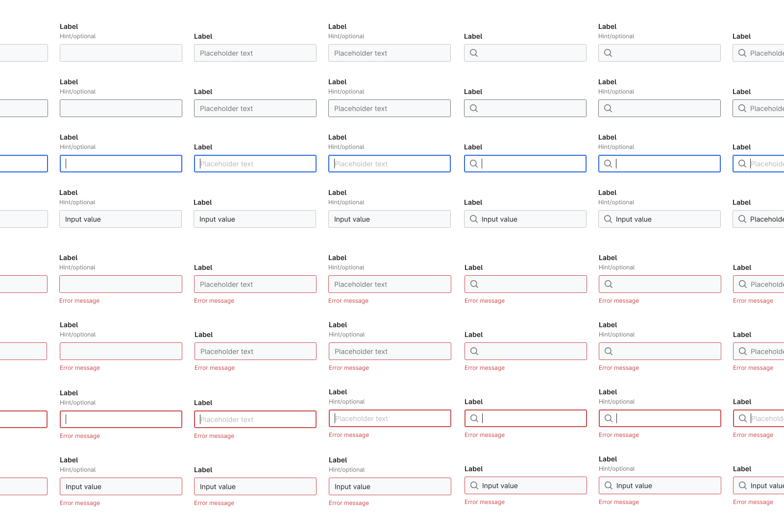
By making changes to a base component instead of each instance, we can make an adjustment once and it will update across all of our variants.
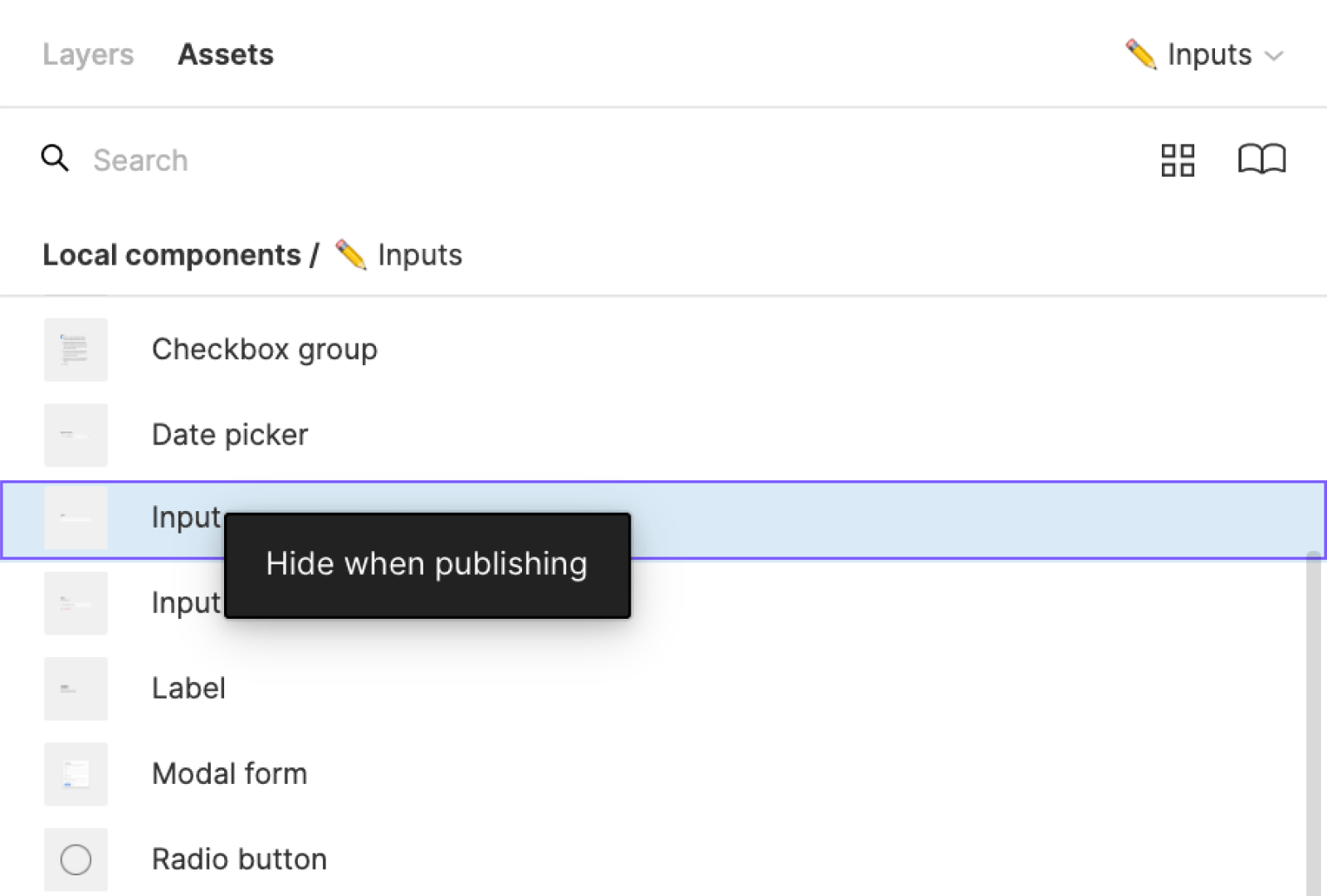
When exporting a component to the team library, we hide the base components since they wont be needed. You can do this by going to the Assets Panel in the source Figma file, right-clicking, and selecting Hide when publishing.
Consistency with styles
In Figma, Styles are a lot like Components. Styles allow you to define properties such as colors, font, and box shadows. If you want to update a color for example, you can modify the Color Style and it will automatically update wherever that Color Style is used.
An additional benefit of using Styles is that they can be applied to theming directly in Figma. In our library we theme by using the slash naming convention Nord Light / Accent and the plugin Themer.
Nord uses Design Tokens to store variables for the elements of our design system. These tokens store values for Color, Font, Box Shadow, and many other base styles. In the Nord Figma Toolkit, we use these tokens when defining our Styles to ensure consistency across platforms.
Components that are effortless to play with
A design system should provide flexible components to designers that are effortless to manipulate and update with new content. If a component breaks when a designer applies it their use case, then two things might happen. They may either unlink it from the Team Library or create a custom component. We'd like to avoid both of those cases. By creating variant sets with Auto-Layout and Constraints we can make updates easier, and save designer’s time. It's also useful for communicating reflow behavior to developers.
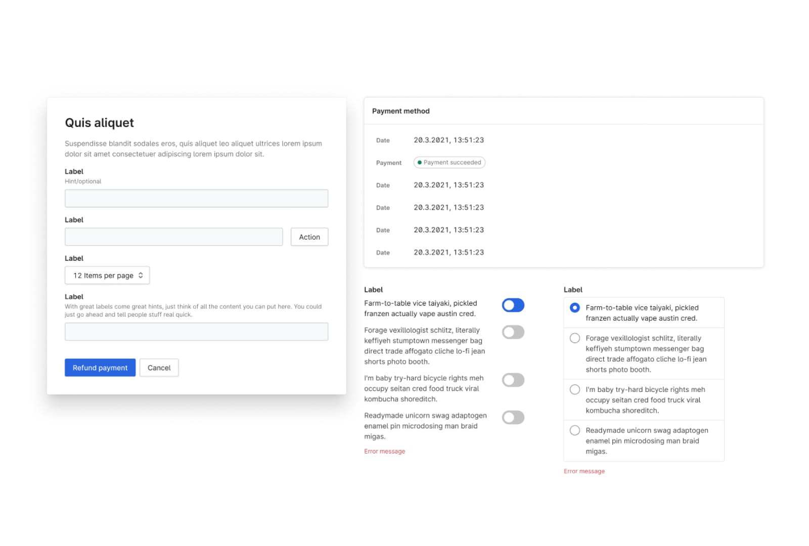
At a basic level we've created components like buttons that automatically resize when you update the contents. You can also stretch this component to create full-width buttons when needed.
By using auto-layout in content blocks, we can make it easier to maintain the correct spacing and layout. You can resize and update content without having to revisit the documentation.
We also support complex behavior in larger components such as our table. Here we've allowed for horizontal and vertical resizing, 3 content density settings, fixed-width or fill-width cell resizing, desktop and mobile versions, as well as 8 content types for table cells and headers.
In context components
The Components of Nord are primarily base level Components. In order to show how Components can be used and how they form larger patterns we’ve created Component Groups and Interface Templates.
Component Groups might include patterns such as a Radio Button Group. Radio buttons are always grouped together, so we've added this group to the library to make it simpler to create a form.
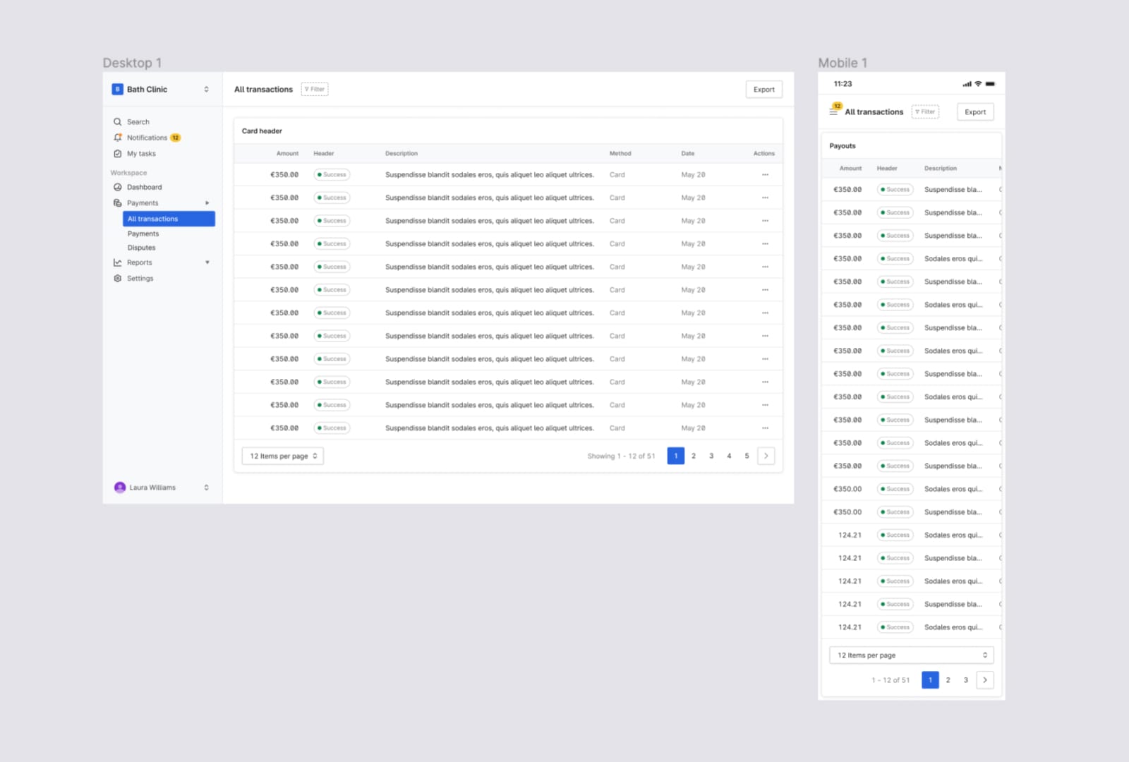
Interface templates show how Nord can be used to compose an entire page or application.
Curating the library
We've curated the Nord library to make design approachable to anyone at Nordhealth. We keep everything in one library for the sake of simplicity.
1. Hide base components
By hiding base components and atoms for each component, we only surface complete components in the library. For example, we wouldn't want the base component for a form input to show in our library. We only surface the final form component which contains the component variants such as hover, active, input, and error states.
2. Use variant sets to provide components
Variants allow us to consolidate states into a single component. The button component for example contains 1334 variants, which would be overwhelming to show in the Nord Figma Library. Instead, we surface a single dynamic button component using variants.
3. Applying an approachable naming convention
Figma defines component names in a library based on Page name, Frame name, then Component name in that order. In order to keep the library easier to understand we removed frames from the structure and use the naming convention Page name > Component name. We typically house 1-5 components per page so a 2 level navigation structure will work best at the moment.
Making it approachable
There are a few things we can do to make our Figma Library approachable.
1. Add a cover photo
This is a quick change and makes the Nord Design System file approachable. When you're looking at a sea of draft files, the Nord Library is easier to find. If you'd like to add a cover photo to your design file you can follow the instructions from Figma. You can also use our File Thumbnail as a template to create your own.
2. Create a sticker sheet of components
In the Nord Design File we've organized a scannable sticker sheet of components. You can also copy and paste a component from the sticker sheets in the Nord Design System Figma File. Personally, I prefer this workflow over using the Assets panel in Figma. Each component has clear sections for the component, variants, and building blocks which we call atoms.
3. Create approachable component pages
We've categorised our components using pages in Figma. We combine the names with emojis to make them easier to scan.
Create link between Figma and docs
With design systems in general, we want to centralize as much as possible. When it comes to documentation our approach is for documentation to exist on nordhealth.design and not in Figma. There are two ways we can create links between Figma and the Nord documentation.
Add a View documentation link in the header of each component. You can create links to a url directly in figma by highlighting the text you want to link, type Cmd+K, enter your url and then hit return.
If you're using a Nord component in your own design file, you can also link to documentation from Figma. Selelct a component and open the inspect panel. Click the View documentation button and you'll be redirected to the component page on nordhealth.design.
Until the next time!
— Eric
P.S. Subscribe to our RSS Feed to follow the latest updates from Nord team.