Redesigning Nordicons Icon Library
Brand Designer Ilkka Janatuinen has been drawing on computers since the 1980s and is now designing brands, drawing UI and tweaking the tiniest design details at H23 Agency. Ilkka Helped Nordhealth to redesign the Nordicons icon library in 2022.
A good, well executed set of icons is one of the cornerstones of brand visuals among other elements like the logo, typography and colors. It serves the functional purpose of making the application more intuitive to use, but there’s also the aesthetic part of being pleasing to look at and fit the rest of the brand visually.
Late last year, we started discussing about updating the icon library to better serve its purpose. Some of the icons were slightly outdated, or needed a redesign for functional reasons. We also had some challenges with the icon library’s license which wasn’t suitable for our needs. Our conclusion was that the easiest way to solve these problems would be to design a new icon library.
As we weren’t anymore limited by the previous icon library’s design, we first ran a few workshops to define a new icon style and sizing. We went through different options and tested them in all possible use cases. Designing for healthcare domain also meant that we had to keep in mind older low DPI screens, so not completely forgetting the rules of pixel perfect design either.
One of the key ingredients we wanted to concentrate on throughout the process, was to keep the designs as unambiguous as possible. We did this to be able to more effortlessly assist people to design more Nordicons with very clear guidelines.
My drawing tool of choice was Adobe Illustrator. I’ve used it for years and have set up the system to draw large sets of icons quickly. We tested the icons first in Figma, using the Nord Design System’s components available in our Figma Toolkit.
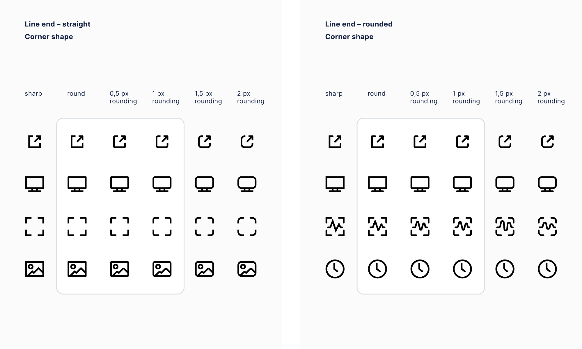
First, we defined the general icon style. We had already made the decision to keep the line icon style, as it’s a clear and versatile, so we started by trying different corner radiuses and line end variations.
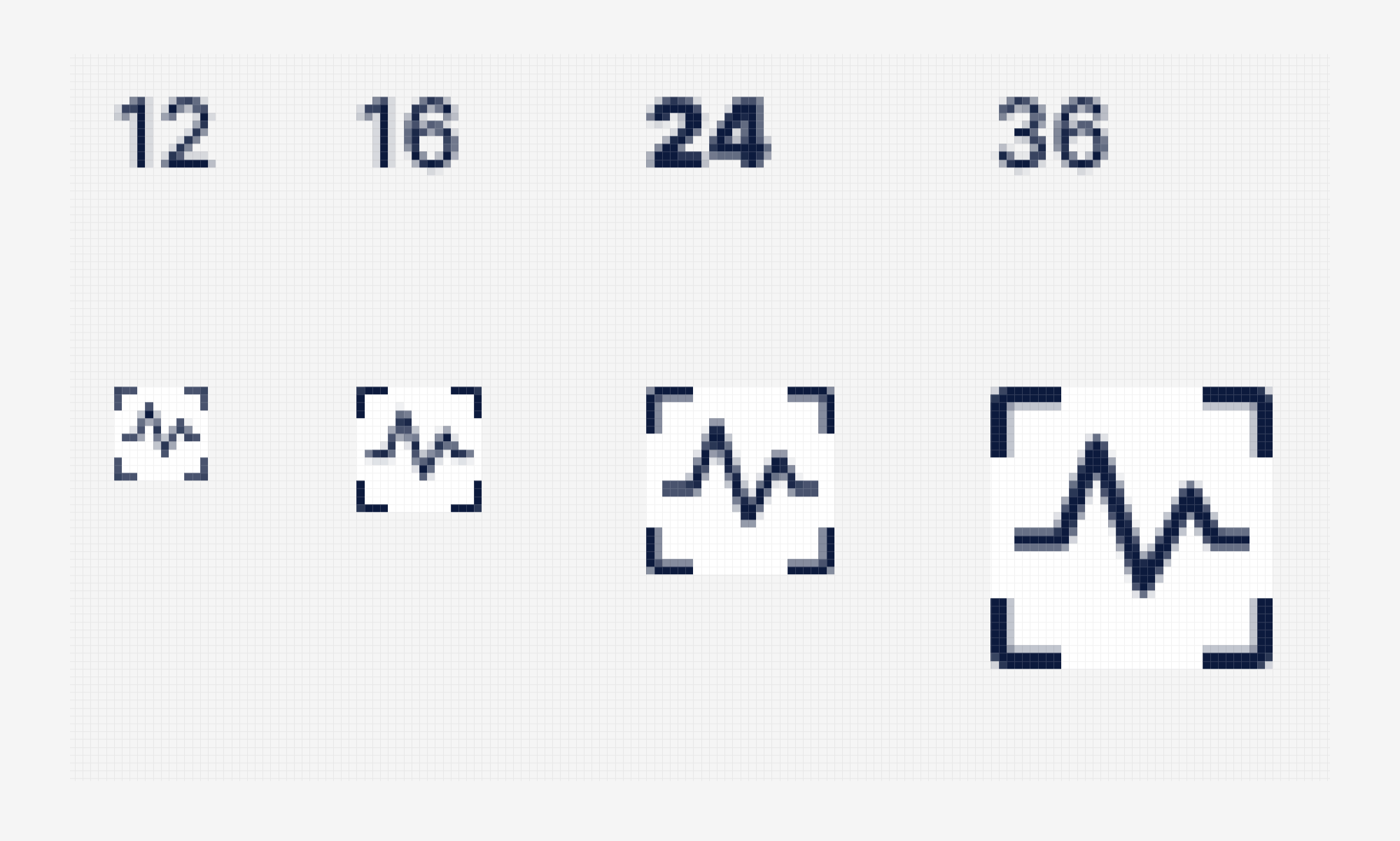
There was quite a bit of testing done in this phase, as we were looking for the perfect sizes and dimensions for the icons. The aim was to design icons that would work well in different sizes and screen resolutions.
We tested mainly 10x10, 12x12, 20x20 and 24x24 pixel grids. Even 11x11 at one point, but in the end we settled on 10x10 as it seemed to look the best next to Inter typeface used throughout the design system.
I personally prefer 12px icon size that scales up to 24/36/48px and stays pixel perfect all the way, but as Nord Design System has much bigger variety of sizes, it didn’t seem like an ideal solution in this case.
We needed something more universal and keeping the icons plain and cohorent in a 10px grid seemed to work the best for our purpose. If we can’t fit all we need into that grid, then we shouldn’t have an icon for that purpose. To solve a design problem, keeping things simple seems to work most of the time.
At one point, we also explored an idea to draw three or four different sizes for most of the icons, but that was soon discarded.
As the icon styles and dimensions were agreed on, it was time to start drawing all the icons. We had a couple of meetings along the way and had a half day workshop in Nordhealth Helsinki office to make the final decisions on the designs.
The end result is a great, versatile set of icons and a well tested way to design new icons in the future. You can have a closer look of the whole icon library here: https://nordhealth.design/nordicons/
TL;DR
- This redesign moves our icon style closer to the Nordhealth brand. All icons now closely follow the brand guidelines and have strong affiliation with our logomark and design language.
- With this update we’re overcoming issues with the old icon style which was somewhat limiting our creativity and possibilities.
- This update allows us to get rid of licensing issues with the previous iconset as it prevented us from sharing any of our work in Figma community or GitHub.
Until the next time!
— Ilkka
P.S. Subscribe to our RSS Feed to follow the latest updates from Nord team.