Nord Design System architecture
You’re reading the eigth Nord Design System monthly update. This month I wanted to give a little more insight into how we’ve architectured Nord’s packages and how they’re interconnected.
One of the recent major changes in Nord is that we’ve re-designed the underlying package architecture. The reason why we decided to do such a big fundamental change this close to our official release, is that we felt like the original structure was too complex to use and that there were too many dependencies between the different packages overall.
In early January we decided to do something about this and simplify the architecture. Originally, if you wanted to utilize any of the components, you had to first install and link our Design Tokens, then install and link Webfonts, then our CSS Framework, Themes, and finally the Web Components themself. That’s quite a few steps, huh?!
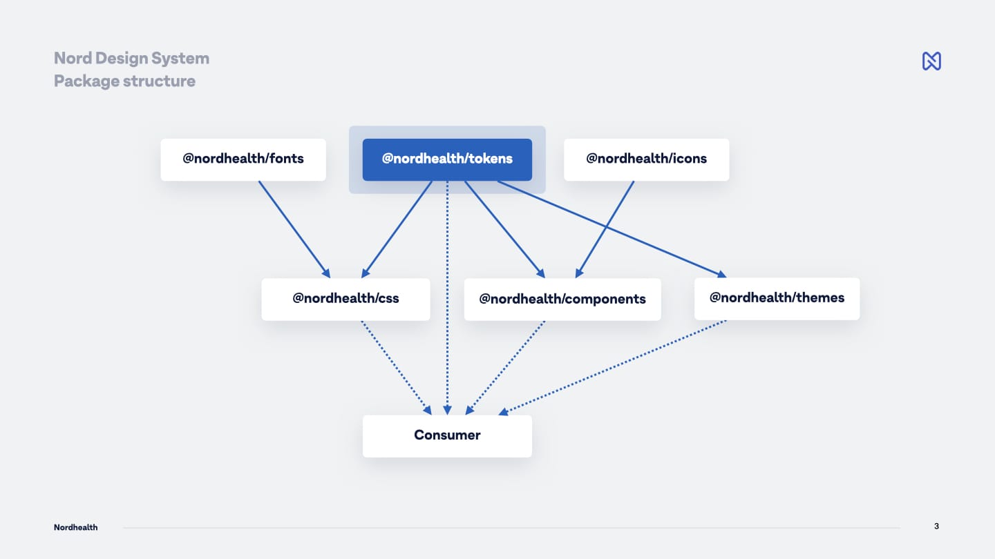
In the re-designed architecture we have two different levels to the packages:
On the first level, we have packages called Webfonts, Design Tokens, and Nordicons (illustrated below). These packages are like atoms of the systems as they don’t have external or internal dependencies into any other packages in the system.
On the second level, we have CSS Framework, Web Components, and Themes (illustrated below). These packages internally depend on the first level packages, but we wanted to hide these dependencies for the end user, Frontend Developer in this case, meaning that you’d more or less always install one or more of the second level packages only into your app to consume parts of the system:
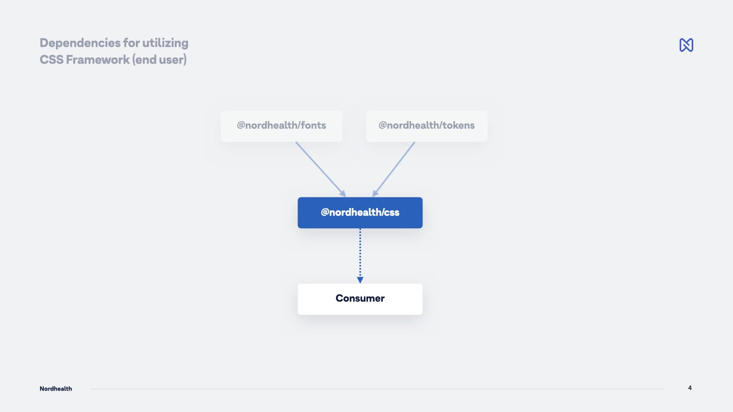
As an example, if you would like to use our CSS Framework, you would only install that specific NPM package and that’s really it. You don’t have to care, as a user, that internally this package also also uses our Webfonts and Design Token packages:
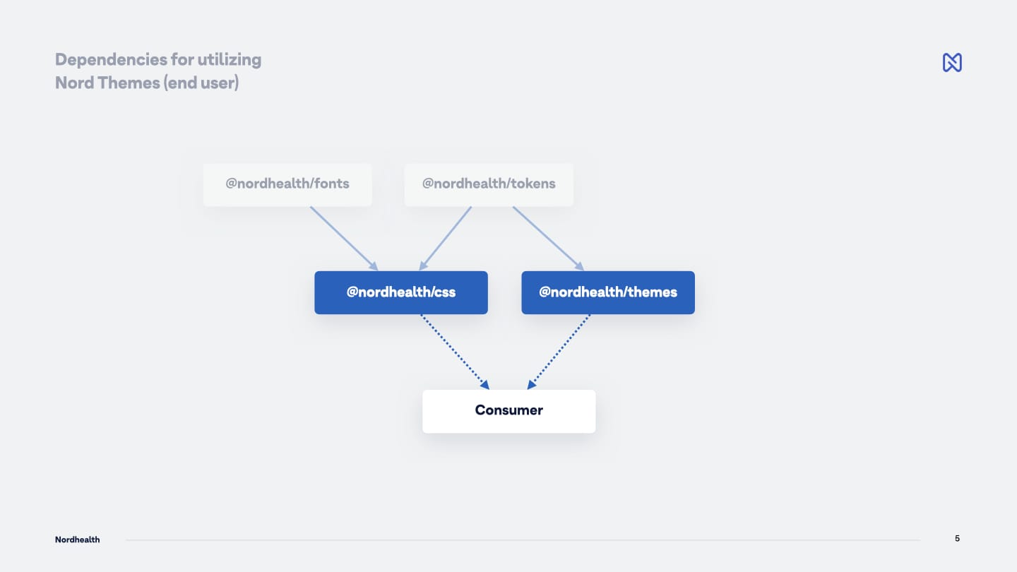
Another example could be that if you’d want to skin your application with one of our themes, you’d also add the Themes package and choose a theme to use from it. Again, internally, we still use both Webfonts and Design Token packages, but as a user, you don’t have to care about those:
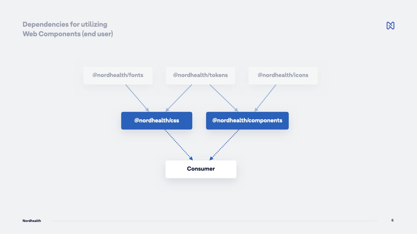
Finally, in the below example, we show all three first level packages being used internally (Webfonts, Design Tokens and Nordicons), but for the end user, only CSS Framework and Web Components will be relevant in this case:
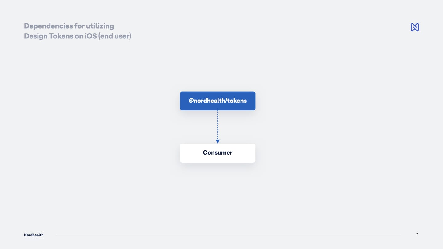
You could also directly utilize one of the first level packages, like the Design Tokens if you’re working on a native iOS application and want to pull in the base colors and similar styles in XML format:
While the above is still possible, we wanted to avoid the user having to install a lot of different dependencies to be able to use a utility class from the CSS Framework, or a component from the Web Components package.
All of this seems quite evident in hindsight, but our original thinking was to strive for modularity to reduce the complexity and improve our system’s reusability by breaking it into small, easier to consume parts.
This modularity eventually increased the complexity for the users because we didn’t consider the API carefully enough, especially when it comes to CSS Custom Properties and the complex theming system we’ve got.
In the new architecture we’ve still kept the same level of modularity inside the system, but simplified it for our users and now offer a better and simpler API. These changes also nicely align with one of our key design principles which states that “developers should be able to start using our tools in minutes, not hours, days or weeks.”
Until the next time!
— Ariel
P.S. Subscribe to our RSS Feed to follow the latest updates from Nord team.