Migration to 2.0.0 Web Components
This guide will help you understand how to transition an existing project from using an older version of Nord Web Components to using the latest 2.0.0 version.
Updating package.json and dependencies
The first step towards migrating to the latest Nord packages is to update package.json with the necessary dependencies. You should:
- Update existing
@nordhealth/cssto2.0.0. - Update existing
@nordhealth/themesto7.0.0. - If using Design Tokens directly, update
@nordhealth/tokensto6.0.0. - If using Web Components, update
@nordhealth/componentsto2.0.0. - If using React Components, update
@nordhealth/reactto2.0.0.
Here’s an example package.json:
{
  "dependencies": {
    "@nordhealth/css": "^2.0.0",
    "@nordhealth/themes": "^7.0.0",
    "@nordhealth/components": "^2.0.0",
  }
}
Changes to status colors
We’ve redesigned the underlying color system to make it more extensible and better cover the use cases of our different products. The latest version of Design Tokens introduces a few fundamental changes to the way Nord’s status colors work. If you were previously using any of the following design tokens directly:
- Color Status Warning:
var(--n-color-status-warning) - Color Status Highlight:
var(--n-color-status-highlight) - Color Status Info:
var(--n-color-status-info)
You may now need to replace them with:
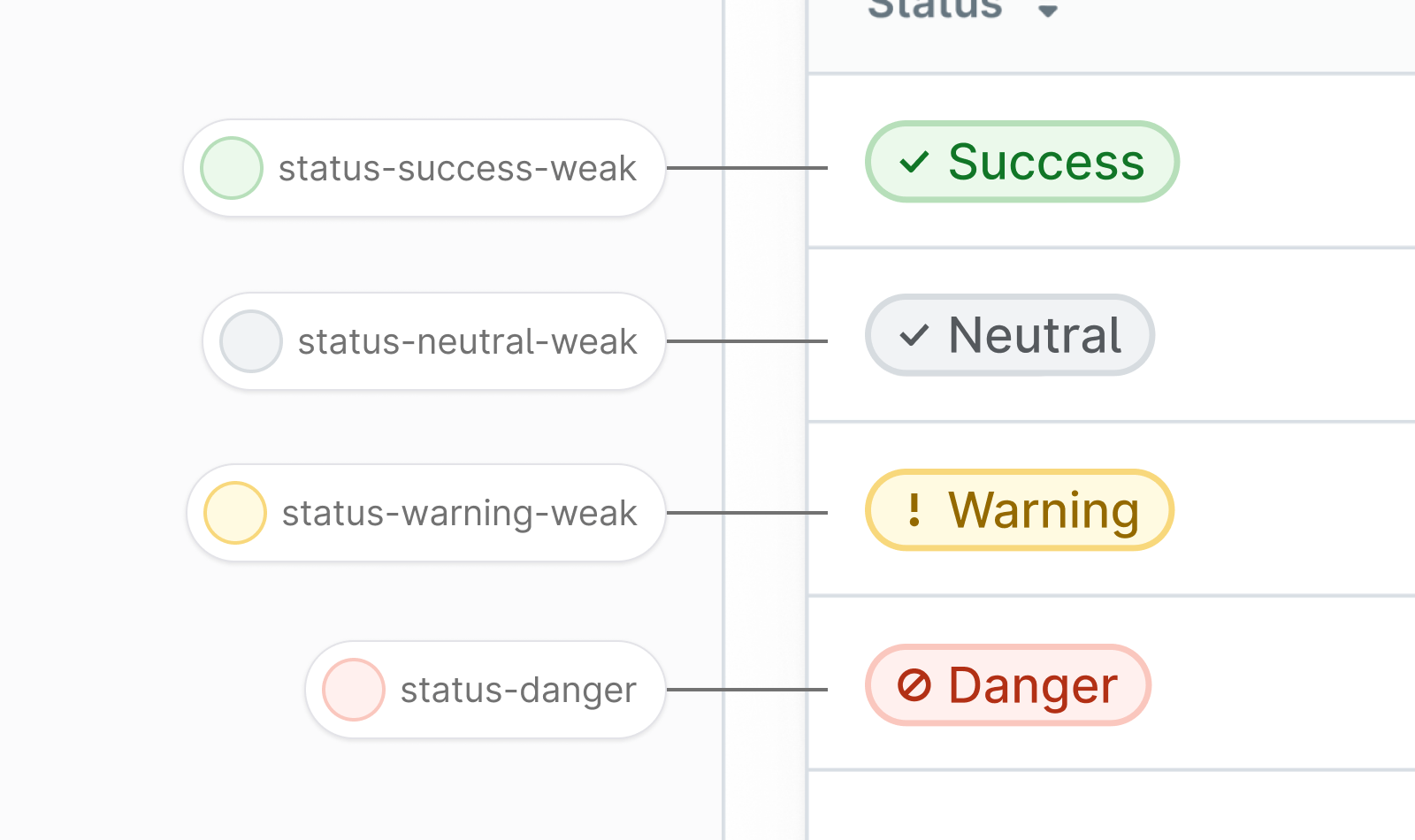
- Color Status Warning: The orange color doesn’t exist anymore since it didn’t provide enough contrast between the yellow and red we already use. For this reason, we’ve replaced the old
var(--n-color-status-warning)with yellow color. No changes are required from your team, but you might have to communicate to your users about the status color changes in the Badge component. The previous hex code for the orange was#f9821a. - Color Status Highlight: This functional highlight color has been changed from yellow to purple. If you’re using
var(--n-color-status-highlight)for illustrative purposes and your product relies on it being yellow, you should search and replace all instances ofvar(--n-color-status-highlight)withvar(--n-color-status-warning). On the other hand, if you’re using this color to indicate status in the product, no change is needed in addition to updating the package. Please note that you should communicate to your users about the status color changes in the Badge component. - Color Status Info: This functional info color has been changed from purple to our accent blue. If you’re using
var(--n-color-status-info)for illustrative purposes and your product relies on it being purple, you should search and replace all instances ofvar(--n-color-status-info)withvar(--n-color-status-highlight). On the other hand, if you’re using this color to indicate status in the product, no change is needed in addition to updating the package. Please note that you should communicate to your users about the status color changes in the Badge component.
Changes to Badge component
This release changes the way our Badge component works and may require you to communicate to your users about the status color changes and what is expected. The main difference is that we’ve switched away from white badges with tiny circular indicators to more noticeable badge style with colored background. The main differences are:
- There’s now a much more clear scale for positive and negative Badge statuses that can be seen here.
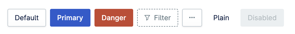
- Badge component’s default style has been changed from
infotoneutral. If you rely on the default badge style being blue, please addtype="info"to each instance of the component. - Highlight color is now purple instead of the slightly negative yellow it used to be. If you need the yellow style, use
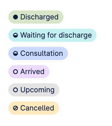
type="warning"instead. - The redesigned Badge component also introduces a new way to indicate progress in addition to status. Please see an example.
- Overall, we’ve done this change to make the badges more prominent and to provide more options for our product teams to indicate status in addition to progress.
Changes to Button component
Nord’s Button component now automatically sets the correct icon color for each style variant so that you don’t have to do this manually anymore. We’ve done this to improve the developer experience and simplify the usage. This is a non-breaking change and requires no changes from your side.
Introducing CSS Custom Properties API
Our Web Components now offer CSS custom properties to allow for fine grained control over their presentation. These aren’t offered as an alternative to properties, you should use properties whenever possible, but more as an “escape hatch” for when a component needs to meet an edge case.
Component custom properties are prefixed with --n- followed by the name of the component and the property in question. For example consider this nord-banner component that we want to add a box-shadow to:
<nord-stack>
  <nord-banner variant="warning">
    Default banner presentation
  </nord-banner>

  <nord-banner variant="warning" style="--n-banner-box-shadow: var(--n-box-shadow-card)">
    Banner with the box-shadow added
  </nord-banner>
</nord-stack>Custom properties are inheritable as well which means they can be applied to any parent, or even the :root element, and their respective component will inherit the value(s).
<nord-stack class="custom-property-banners">
  <nord-banner variant="info">
    Example banner
  </nord-banner>
  <nord-banner variant="warning">
    Example banner
  </nord-banner>
  <nord-banner variant="danger">
    Example banner
  </nord-banner>
</nord-stack>

<style>
  .custom-property-banners {
    --n-banner-box-shadow: var(--n-box-shadow-card);
  }
</style>You can see all the available custom properties for the banner component on its respective docs page. Custom properties differ from component to component, refer to the component’s documentation for a complete list of available custom properties.
--_n-. Please refrain from using private properties as they are always subject to change and intended for internal component use only.
Getting support
Have a question about migration? Please head over to the Support page for more guidelines and ways to contact us.