Color System
Nord Design System uses a color system to guide our users, create a branded look-and-feel, draw attention to important information, and make content more accessible for everyone.


When designing digital products you can use Nord Design System’s color system to pick color combinations that work harmoniously, adapt based on usage, and provide support for different appearance modes like light and dark.
Principles
Use sparingly and intentionally
Nord Design System uses functional coloring that supports products designed to be run on workstations. Color is used to communicate not to decorate. We use color sparingly and intentionally in order to emphasize important information. The color system facilitates all-day use while minimizing visual fatigue.
Utilize color roles
We offer a curated palette of colors that are intended for specific roles within Nord Design System. For example, we apply consistent coloring to components such as text, status, buttons, and navigation. This helps users to identify a component and understand its relationship to its environment.
Make it accessible
When the color system is applied, it will be in compliance with color accessibility standards. We support WCAG 2.1 level AA which requires 4.5:1 contrast for text. We never rely solely on color for communication in Nord Design System. Accessibility ensures that our product works for people with visual impairments and improves legibility for all users.
Applying colors to interface
Nord Design System uses common patterns of color application to create consistency and convey meaning. The below sections explain in detail how to use and apply Nord Design System’s colors in different contexts.
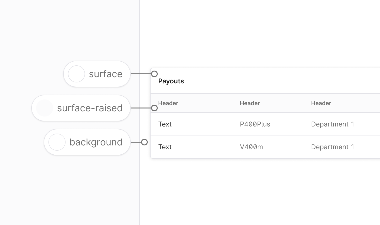
Surface colors
Surface colors are the default UI surfaces for applications. Surface colors are used for pages, modals, tables, headers, and cards. Surfaces live on top of backgrounds. All content such as text, buttons, forms, and icons should be placed on a surface.
The basic structure of an application in Nord Design System is Background > Surface > Content.
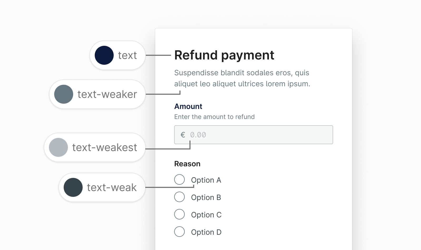
Text colors
Text always appears on a surface and contains modifiers to indicate hierarchy, status, and importance.
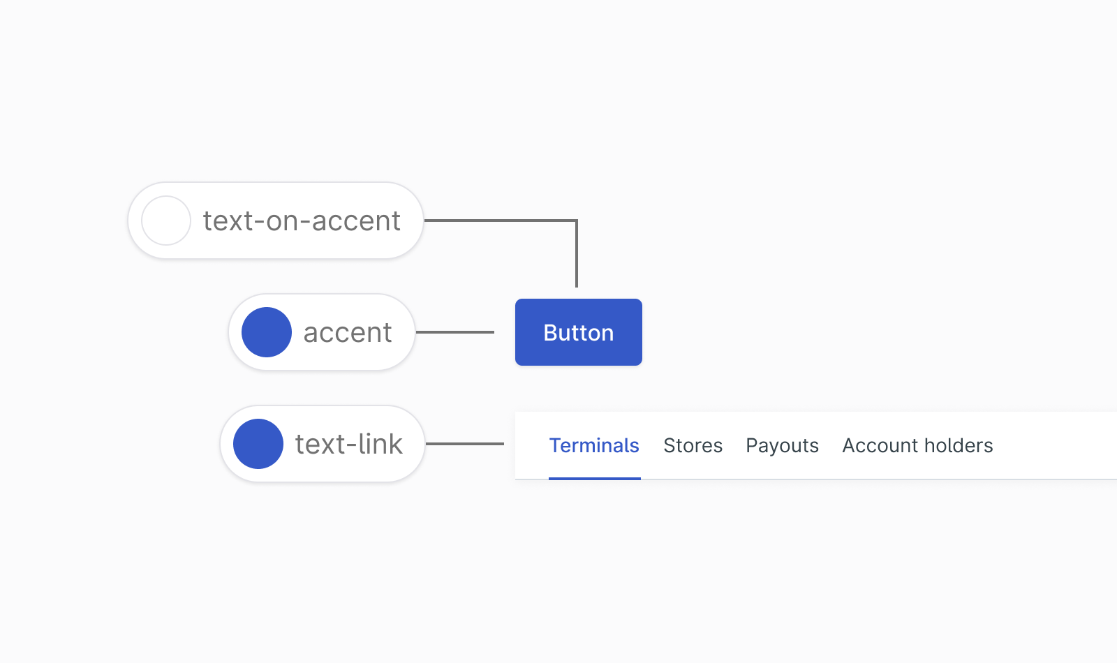
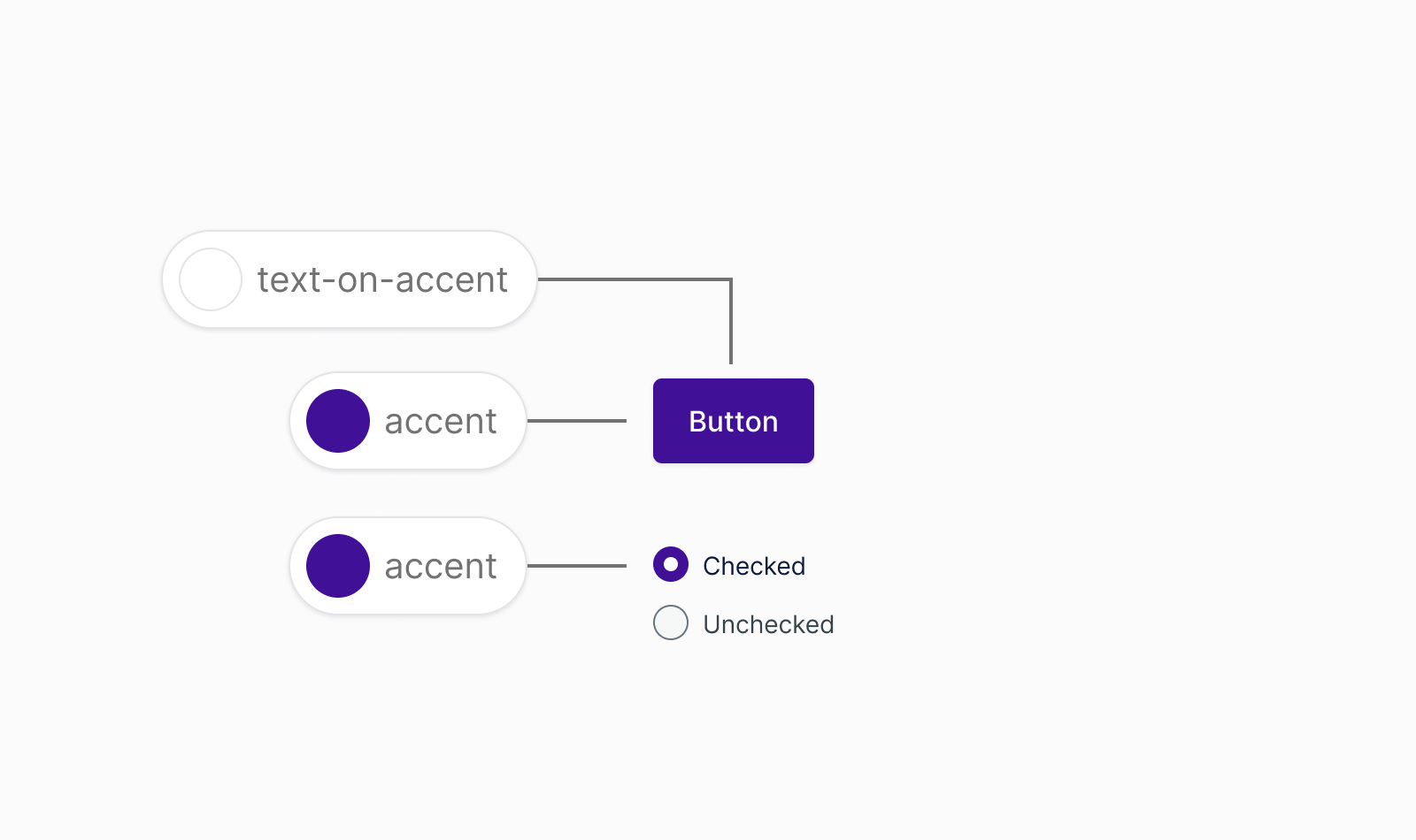
Accent colors
This is the accent color for a design. It is used as primary button background, hero area backgrounds, selected states, and such.
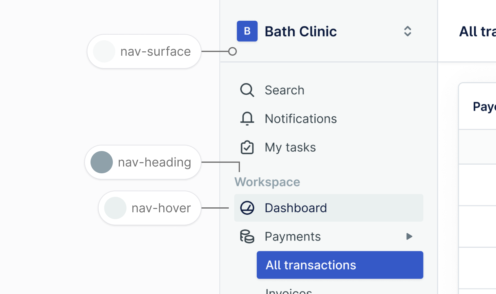
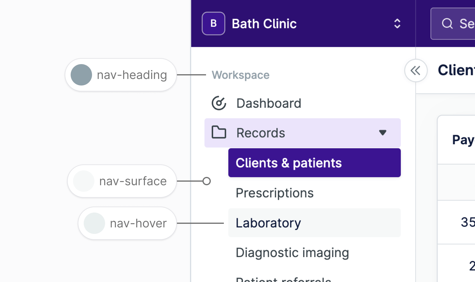
Navigation colors
This is the color for sidebar navigation. The sidebar color helps to distinguish navigation from other surfaces.
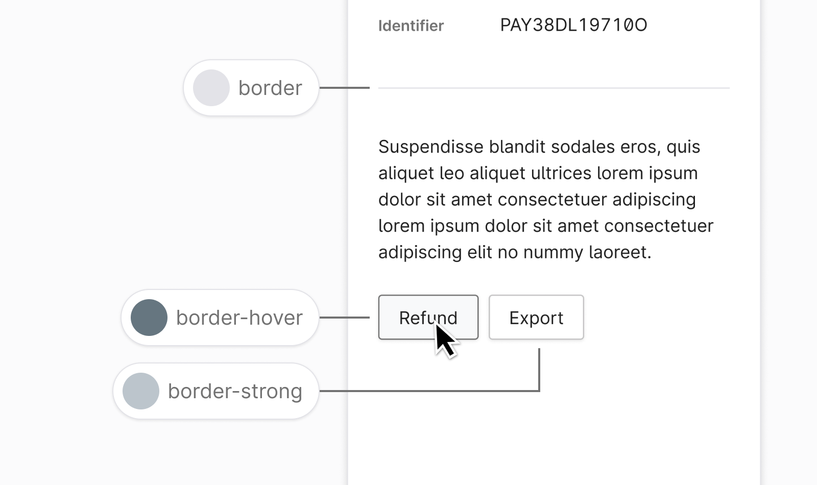
Border colors
Borders can define the edges of a component or separate content areas.
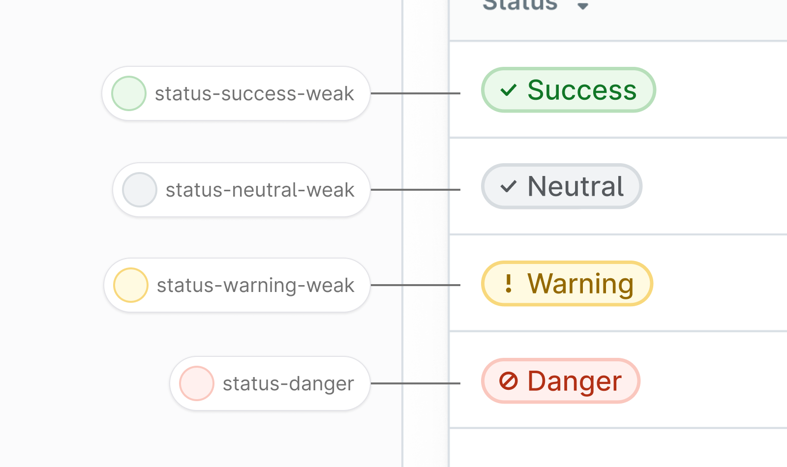
Status colors
Color can be used to highlight important information by giving it a status. For example the green success status indicates a strong positive state.
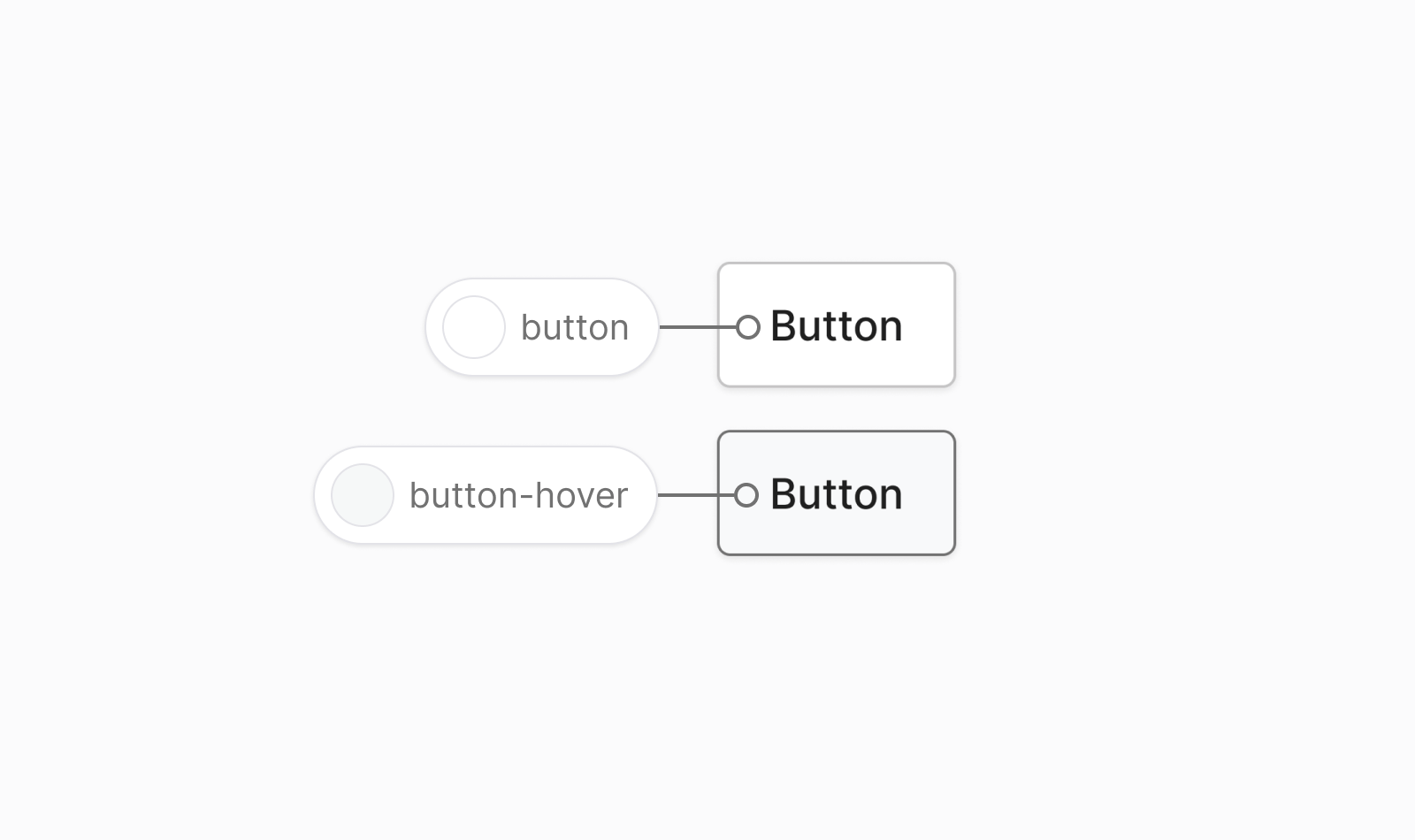
Button colors
Button colors are used to define the default button style and states in Nord Design System.
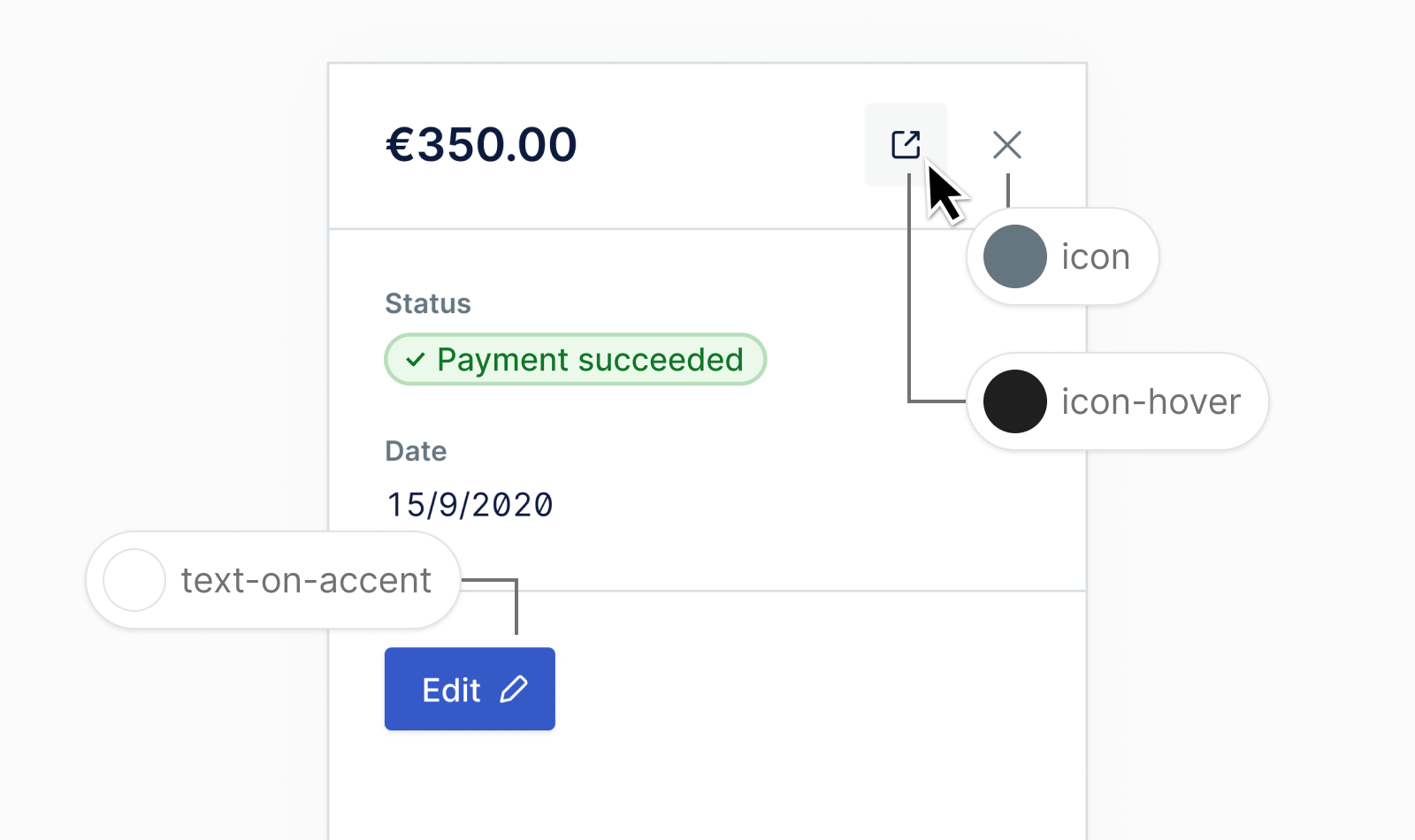
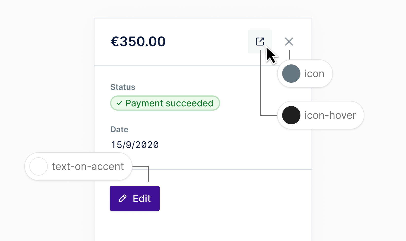
Icon colors
Icon colors should be used when an icon is placed on a surface. If an icon appears on the accent color, use the text-on-accent color in place of the default icon color.
Figma usage
You can find the color variables for all our themes in the Figma Toolkit.
Getting support
Have a question about color usage? Please head over to the Support page for more guidelines and ways to contact us.