Nordhealth Brand
Welcome to Nordhealth’s brand guidelines. Here you’ll learn how to express our brand and follow our design philosophy to uniquely distinguishing us from the competitors.
We like to think that we’re not your traditional healthcare software provider. For starters, we have strong Nordic roots. That drives us to challenge the status quo with modern design thinking and innovation. We want our brand to reflect this.

Our logo
The Nordhealth logo is composed of the “together” logomark and a logotype set in Armin Grotesk Ultrabold. The horizontal version is the primary logo and should be used in all external applications. Always use the logo files provided in our downloads section. Do not try to re-create the logo yourself.

Logomark
Nordhealth logomark is visually based on the N from our company name. But if you look closer it shows two individual elements coming together to form a solid structure.
This is where the idea of togetherness comes into play. Two sides working as one. On a business level it represents a key driver for Nordhealth, acquisition. For the customer and end users it expresses the seamless use of our products to improve productivity and communication. It brings healthcare professionals closer to their patients. It defines you and your teams working as a strong unit.
On a deeper level it illustrates a bigger idea, change and innovation on the global healthcare stage. We make our products available to the patients where it makes the biggest difference.

Getting creative with logo
The Nordhealth logomark can be re-created for a particular event or to emanate an idea. This is strictly for internal use only and should be led by the marketing and brand team.

Logo minimums
Small logo rules apply when the logo is below 100px wide for digital and 26mm wide for print. The logo lockup should not go below 50px/14mm wide. The singular mark can go as small as 25px × 25px or 7mm × 7mm and for a favicon, 16px × 16px.

Logo usage on backgrounds
The Nordhealth logo should only be used as a solid white on strong backgrounds. The blue combination variation can be used on white or very light backgrounds.

One color use for Logo
For applications that don’t require color or need to be knocked back use either a solid black version or the secondary navy blue.

Partnership logo
When using the lockup with other logos be sure to apply the right amount of safe space so the logo can still be legible.

From Nordhealth logo
When you need to indicate that another product is made by Nordhealth, use the following logo variation that is available on our downloads page.

Logo misuse

Colors
Our primary and secondary colors are Sky Blue and Navy Blue. They should be used in all applications within the brand with more weight than any other tertiary color.

Tertiary palette
Our tertiary colors should be used less frequently. They should be applied as a highlight or to create variation. They are used across the brand in underlines, illustrations, highlighted numbers, backgrounds and many more touchpoints.

Gray palette
Grays are essential for any brand. They are used as backgrounds, secondary text, disabled states and in illustrations.

Gradients
Gradients add depth when we want to keep some touchpoints simplistic and not too colorful. Only use in digital applications.

Accessible color combinations
It’s essential that the brand colors used in conjuction with text are at least AA compliant when used on any digital application.

Color design tokens
Nord offers color design tokens which are a tech-agnostic way to store variables. We use tokens instead of hard coded values in all digital user interfaces to ensure a better consistency across different platforms.
Typography
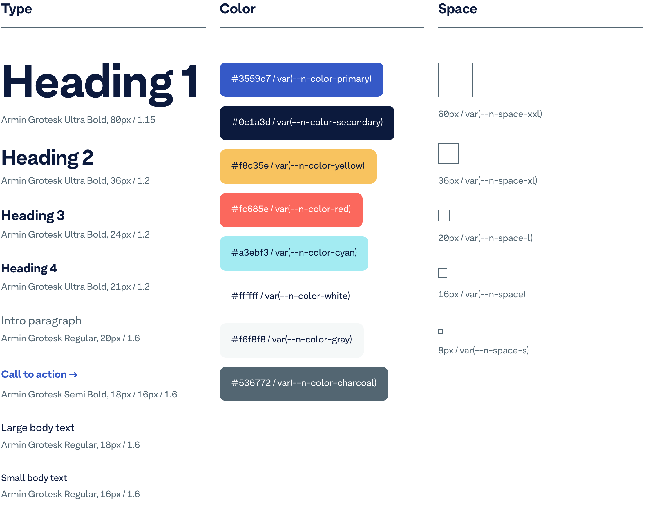
The Nordhealth typeface is called Armin Grotesk. It’s used in all aspects of the brand. In headings, body copy, captions and numbers.

Type hierarchy

Number style
We have two number styles. Style 01 is for larger number pullouts and style 02, which is more legible, is used for paragraphy and caption styles.

Ideal stack

Underlining
The underline is used to highlight specific words from large statement text’s only. Use sparingly to pullout a handful of words. No more than 2-4 per text block.

Illustrations
Our illustrations are inspired by process and product wireframe visuals used in software design processes. Style 01 illustrations all share the line element from the logomark. They are minimalistic in approach and idea but should be well drawn and use a minimum of 3 colors.
Line thickness can vary depending on scale. Extra small illustrations should start at 2px in stroke weight. As they increase in size they go up in 2px increments. Use your design eye.

Icons
Icons follow the same style as the illustrations. We have an extensive library of icons for any use which is based on Streamline iconset. We use them across all digital applications. Stroke weight is fully adjustable.

Photography
We have two main styles of photography. For head shots we use a cutout with a colored background from our extensive color palette. For images that show our people and environments we should adopt a more reportage style that captures the tone of our culture.

Our mission
Our mission statement communicates the brand’s purpose, objectives and how we plan to serve our audience.
Nordhealth’s mission is to redefine digital healthcare.

Our vision Draft
Our vision brings to the surface what’s behind the brand. What inspires us, our employees and our customers. A vision gives us a clear direction into the future.
Nordhealth’s vision is to make healthcare more universal, efficient and secure through data and technology.

Our values
With every ambition, comes a set of values. Ones that shape our day to day culture, define who we are, what we do, and how we push forward.
1. Put customers first
Never overlook what really matters. Great service, ease of use, honest pricing, and respect for our customer’s time, money, and trust.
2. Take ownership
Think long-term and take initiative. Care about the outcome. Be accountable. Do the right thing for us, our customers, and the team.
3. Do more with less
Simplicity is the key to great results. Create fewer features, but make them great instead of merely good. Dare to say “no” to prevent the core from being lost in the noise.
4. Be stronger together
Engage beginners and attract experts to grow excellent teams. This isn’t something we do on our own — it’s all about sharing and exchanging ideas.
5. Embrace change
Challenge the status quo. Seek out and embrace continuous change, evolution, and improvement.
Brand personality
Brands are like peoples and people exhibit emotions through personality. As a brand we want to stay true to our personality in everything we do. The following personality traits express us:
- Innovative
- Efficient
- Caring
- Passionate
- Trustworthy
- Customer oriented
Examples
Brand with two tones
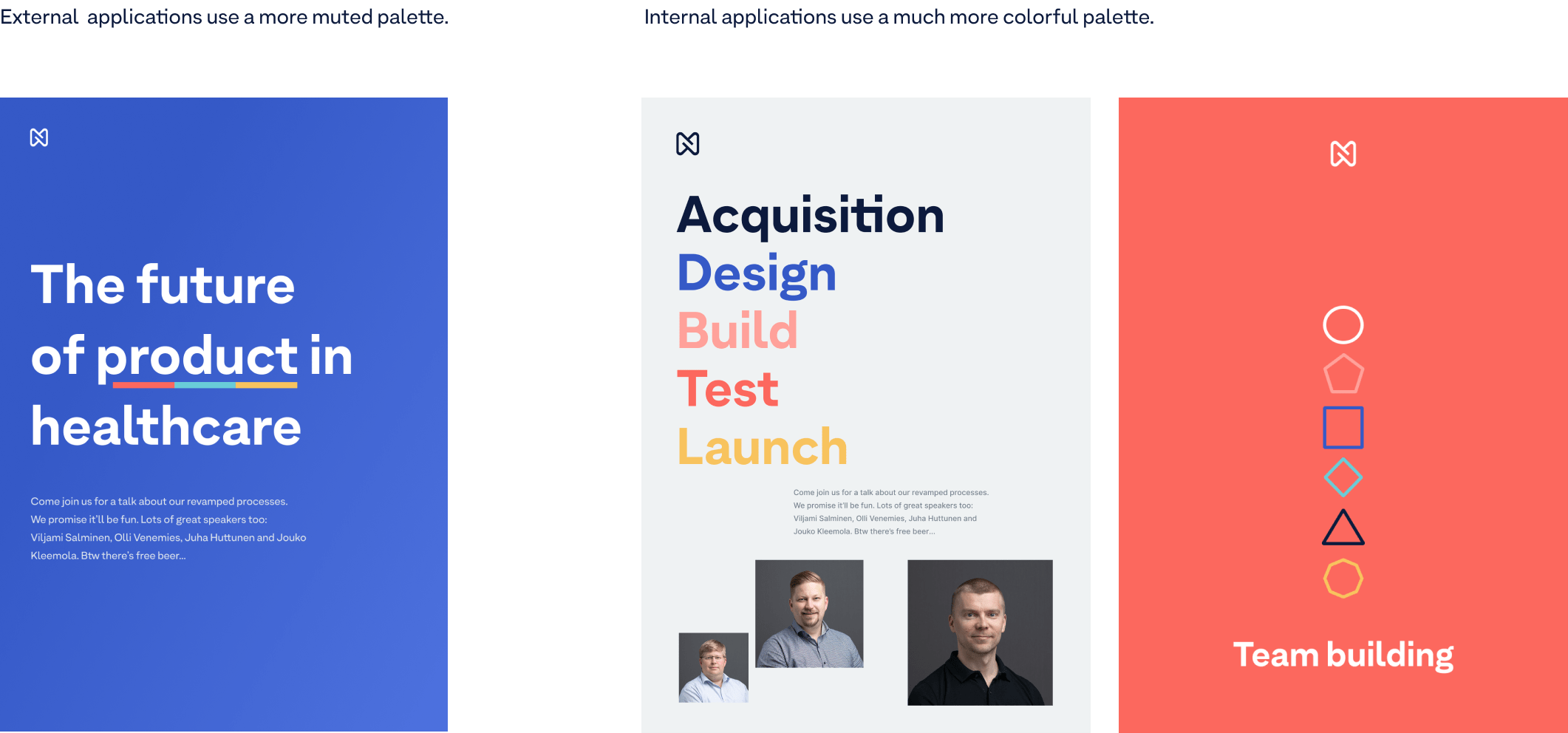
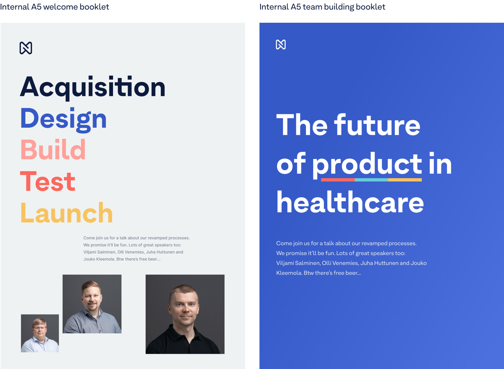
We have two sides to our brand. Internally we apply the brand in a colorful, conversational and creative manner. External applications can be more monotone, to the point and business focused.
Website
You can find our website’s living style guide under nordhealth.com/styleguide. Additionally, if you press “g” on your keyboard at nordhealth.com, you’ll be able to view our design grid.
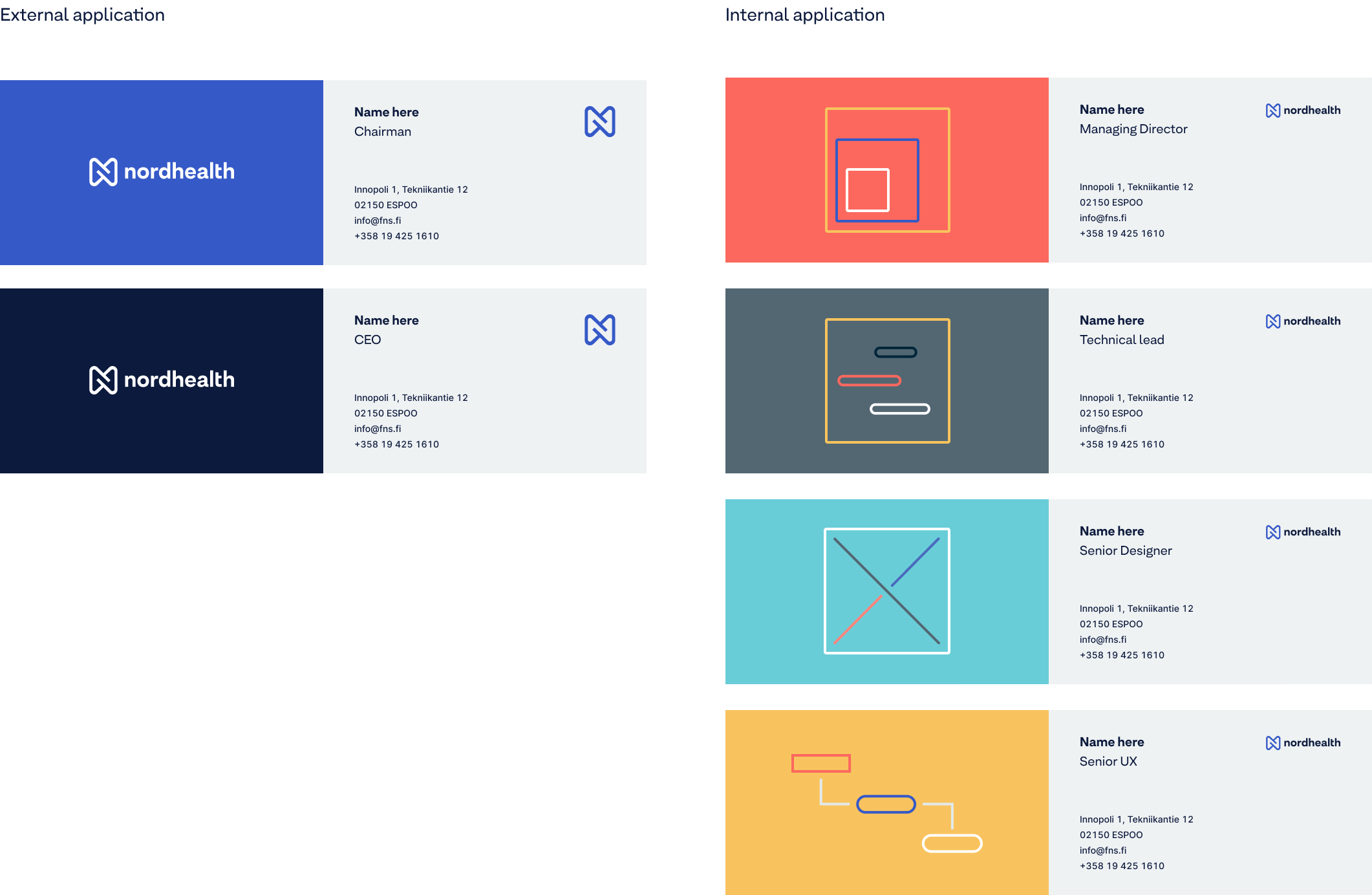
Business cards
Business cards can be printed using the templates provided. Get creative for internal applications and more monotone for external.
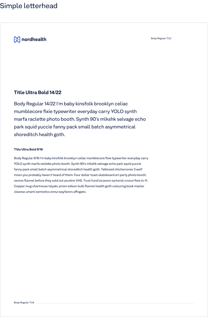
Letterheads
Letterhead can be used for multiple applications from writing paper to invoices. Make sure the logo is always positioned in the top left hand corner and type sizes are consistent.
Posters
Posters are both for internal and external use. Be more creative and colorful for anything internal. For external applications use the more monotone approach.
Presentations
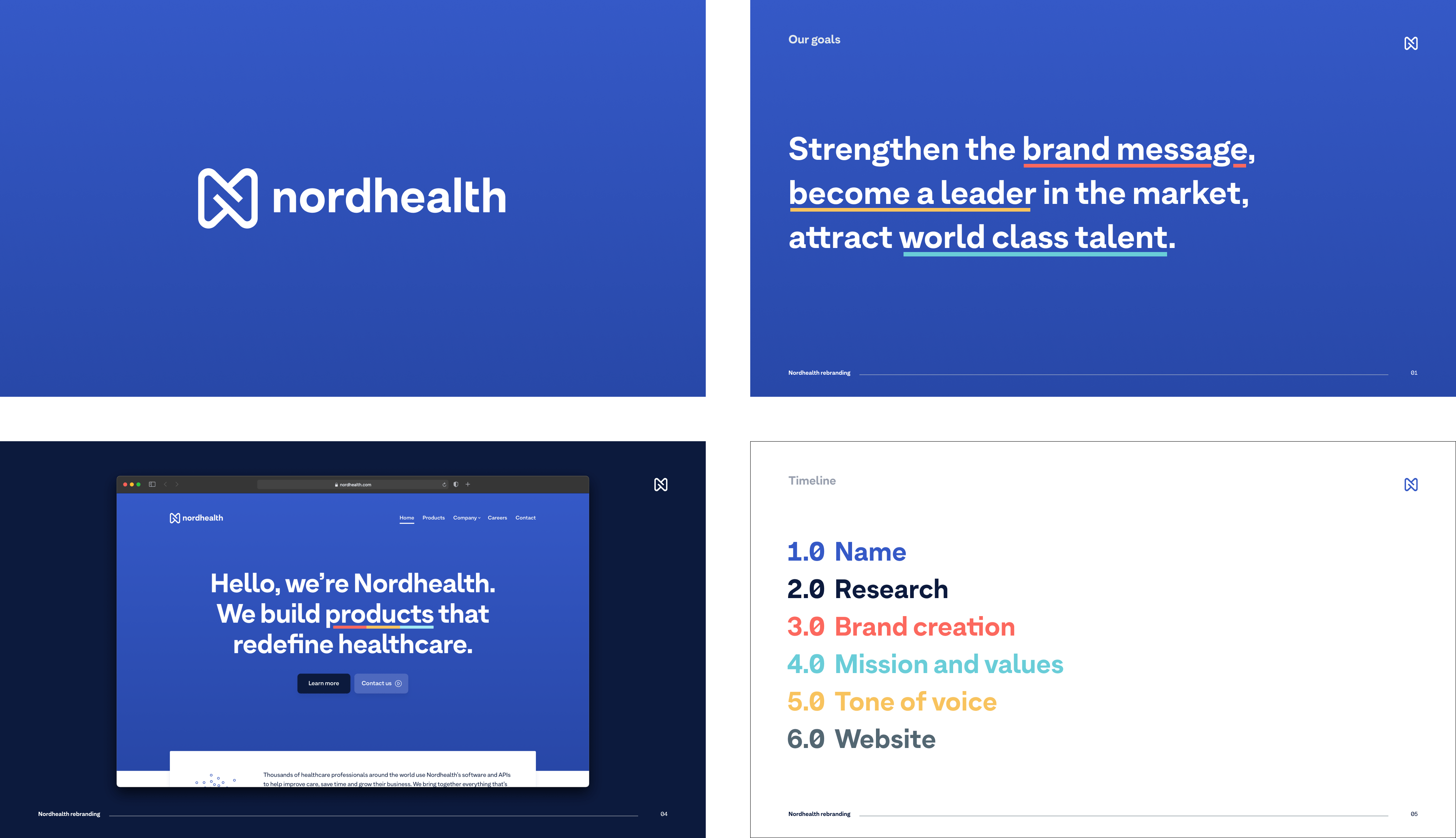
Presentations should be large format, simplistic and clear in their creation. Use large type sizes and keep the slides clean but on brand.
Social media
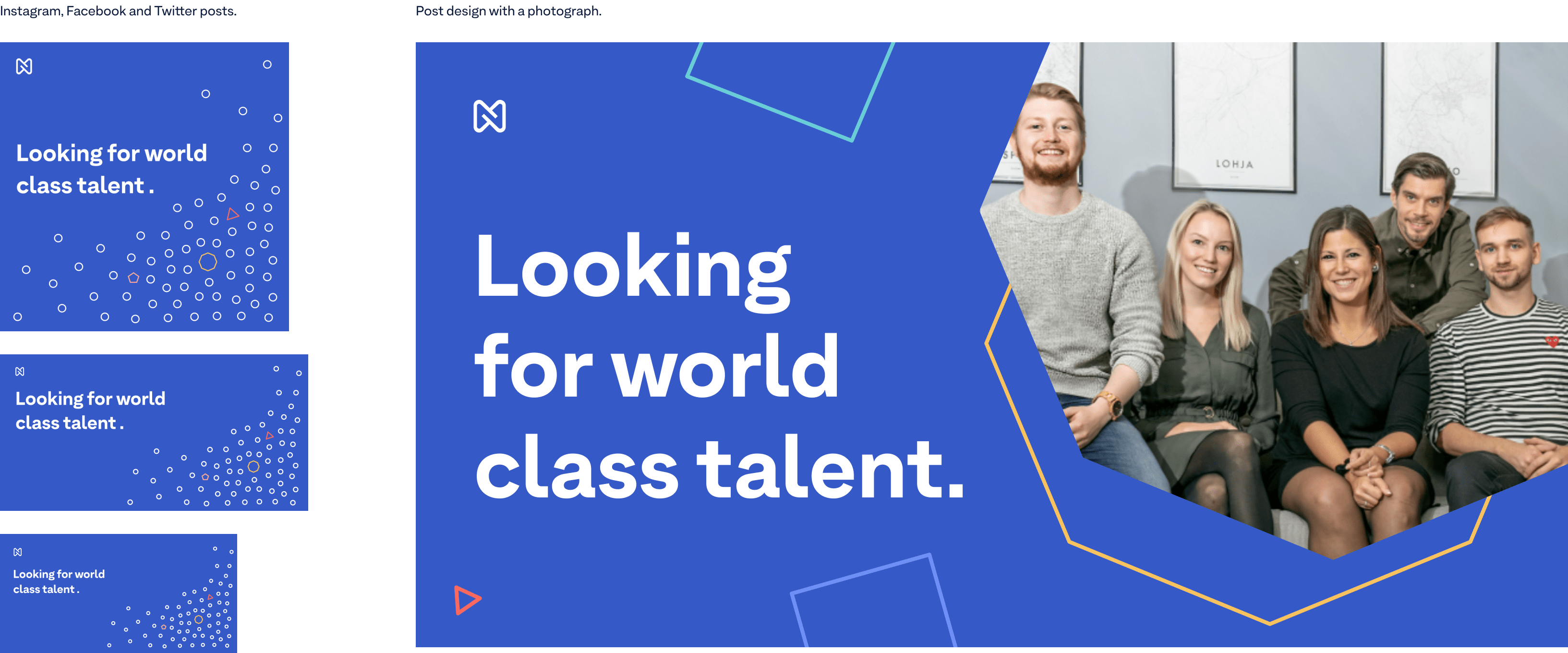
Try to keep social applications impactful and simplistic. They can be colorful or monotone and use either our illustrations or photos of people.
Merchandise
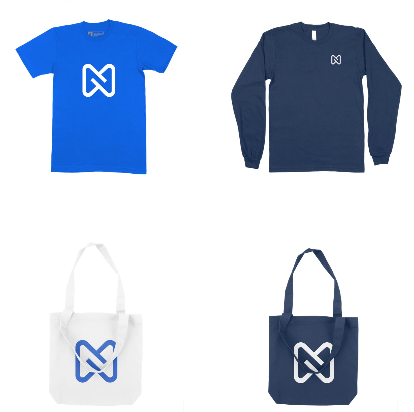
When designing merchandise keep it simplistic but creative. The brand works well with solid colors and illustrations. Combine the two with a subject matter for a great result.
Email signature
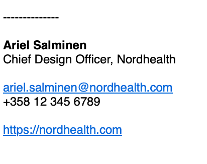
Nordhealth’s email signature is simplistic and to the point. It does not include images or any other assets. Copy and paste the below template to your email application to edit the details.
Ariel Salminen
Chief Design Officer, Nordhealth

your.name@nordhealth.com
+358 00 000 0000

https://nordhealth.com
When adding the signature into your email application, please pay attention to the formatting. The name of the person should be in bold and the text set in Sans Serif, Helvetica, or Arial typeface. An example:
Getting support
Need support producing new brand assets? Have questions on how to express our brand? Please head over to the Support page for ways to contact us.