About Nord
Nord Design System is a collection of reusable components and tools, guided by clear standards, that can be assembled together to build digital products and experiences.
The goal of Nord Design System is to improve UI consistency and quality, while making our software design and development processes more efficient. Nord also helps to establish a common vocabulary between everyone in our organization and ease collaboration between different teams and disciplines.
Nord Design System has a core team of designers and developers inside Nordhealth who are dedicated to building and supporting the system. The core team includes Elwin van Eede.
Our documentation is public as it makes sharing and collaboration between different teams and third party vendors much easier as it increases the system’s visibility and accountability. This also makes us push towards higher quality and enables us to be more transparent. Finally, it also serves as an amazing tool that we can leverage in recruiting.
You can reach out to the team by heading over to our support page.
Nord Design System package architecture, read more from our blog.
Relevant reading
- Launching Nord Design System article
- How Nord team uses Custom Properties in Web Components
- Nord Statistics for the first year
- How Nord team uses Figma
- Nord Design System documentation
How we started
Looking back in time, we started our design system journey at the end of 2020 with initial user research. We did this because we wanted to first better understand the challenges we're trying to solve at Nordhealth and how the design system might help.
Back then, we interviewed around 60 different persons from different teams, with different backgrounds, and with different levels of experience. The result of this research was an organizational challenges heatmap that highlighted organization level problems.
Once we had this data, we continued the research with a series of workshops. These workshops were meant to reveal a lack of alignment and personal biases across teams. The final output from these workshops was a set of prioritized actions that directly informed the backlog of the design system.
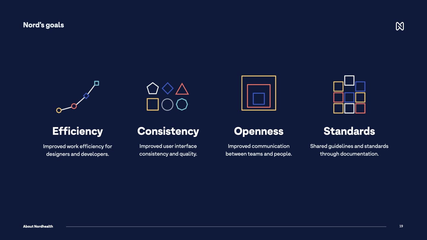
Once we knew what the challenges were, it was a matter of creating fundamental principles and goals for the system that we should follow to start solving these issues. We came up with these four goals for Nord:
At the same time, we also created design principles for the design systems work that would form the foundations for Nord and guide our team when working on the different parts of the system and help us do better and more informed decisions. These are the six design principles we created for Nord:
1. Put user needs first
We care for the people who use our products. We're here to make their day-to-day and long-term work better and more pleasant through great user experience.
2. Strive for consistency, not uniformity
We should use the same language and design patterns wherever possible. This helps people get familiar with our services. Same holds true for the system and its developer experience.
3. Default to openness
We should share what we're doing whenever we can. Building our services transparently increases their visibility and accountability and makes us push towards higher quality.
4. Make it accessible
Our services are for everyone. We make sure people with different needs can use our products and that they meet the accessibility standards outlined in WCAG 2.1.
5. Provide a good developer experience
Providing a good developer experience is very important to us. Developers should be able to start using our tools in minutes, not hours, days or weeks.
6. Automate everything you can
We value the time of our colleagues, users, and our future selves over our own. We are always proactively looking for ways to automate repetitive tasks and testing.
Technical architecture
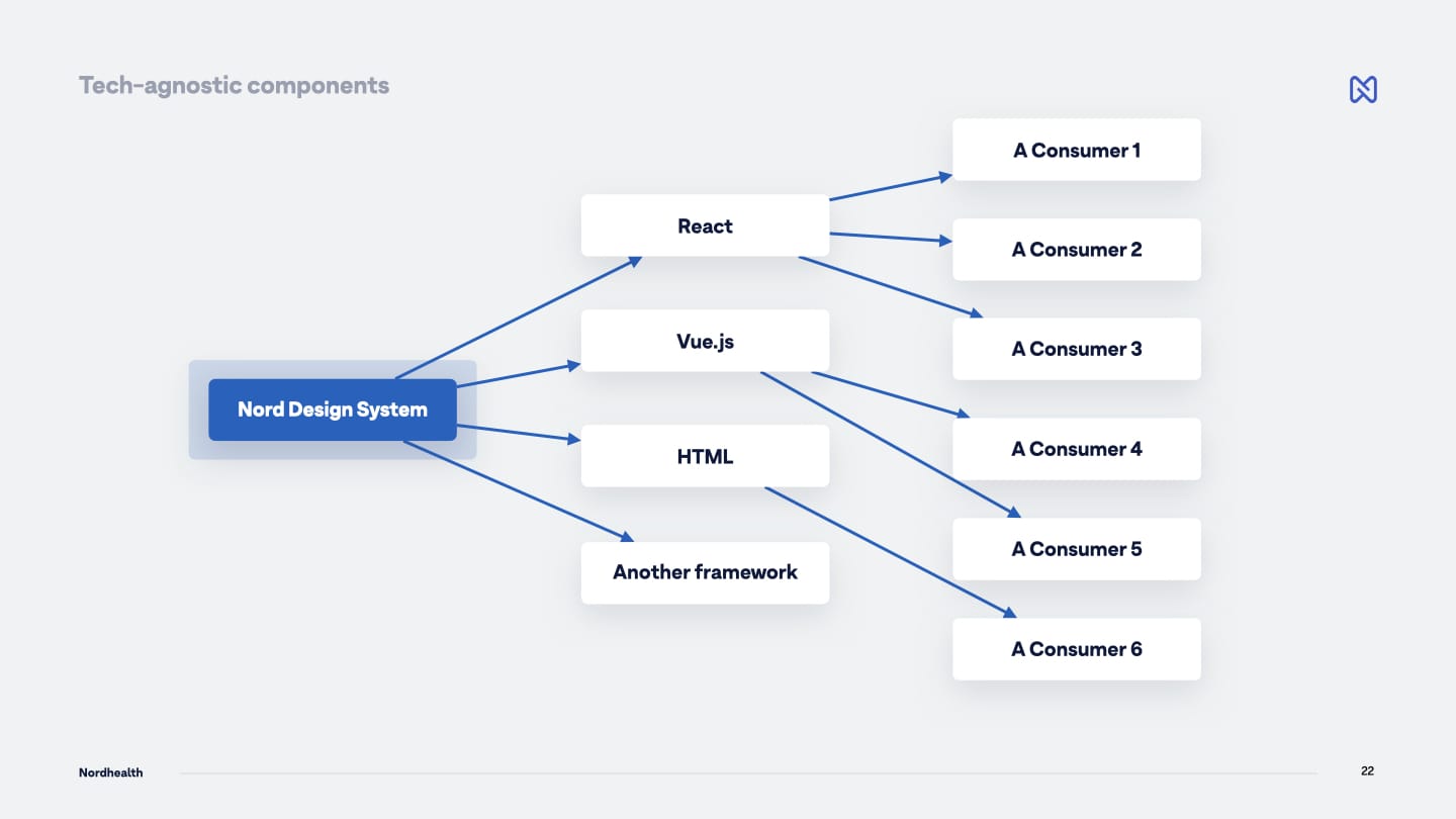
Whenever we talk about Nord Design System, one of the first things that we like to mention is that Nord is tech agnostic, not tech specific. Meaning that you can take any component from Nord and use it with any framework. That could be Angular, React, Preact, Vue.js, plain HTML, your old PHP application, or any future framework.
We achieve this by building on top of existing web standards (Web Components to be exact), instead of choosing a specific framework to go with. This is really important for us for a few reasons;
Tech-Agnostic Instead Of Tech-Specific
In order to create modular interfaces, a design system needs to be technology-agnostic instead of technology-specific. Web Components offer this benefit and make it easier to reduce our design system's complexity and improve its reusability.
Future Proofing With Web Standards
Web Standards are more future proof than any given JavaScript framework. I've seen different frameworks come and go during my almost two decade long career on the web, but Web Standards keep thriving and evolving.
Any Framework Or No Framework
Web Components can be used with any JavaScript framework or no framework at all. This means we're able to support all our product teams from a single codebase. This makes it possible for our small design system team to be very efficient.
Full Encapsulation
Shadow DOM allows components to have their own DOM tree that can't be accidentally accessed from the main document. For us this means that "everything just works" when the components are implemented onto different environments and platforms. Most styles cannot penetrate a component from the outside, and styles inside a component won't bleed out.
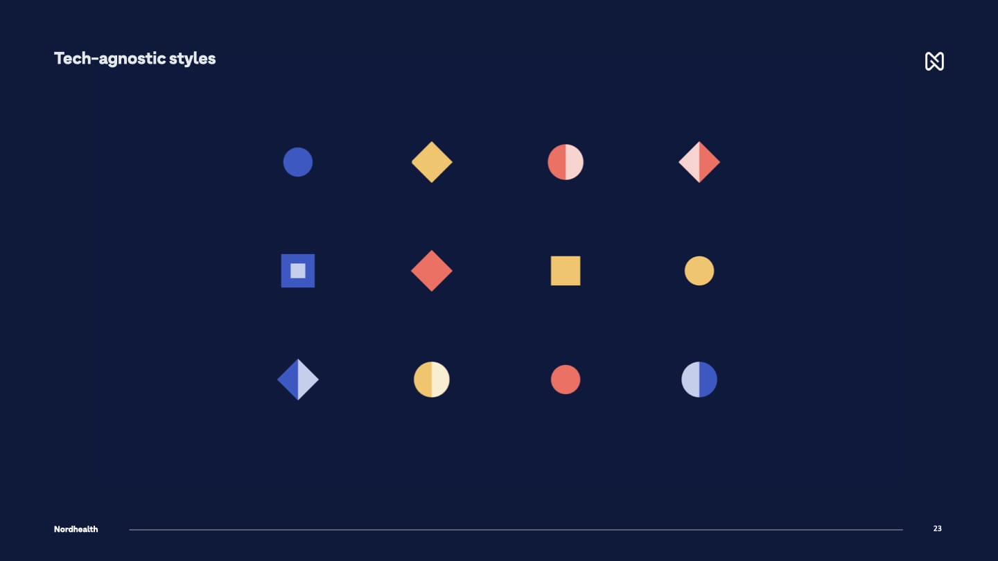
Nord's tech-agnostic thinking isn't limited to only components either, all our styles are agnostic as well. We use design tokens instead of hard coded values to ensure a better UI consistency across different platforms. Be that a web application, a native application, a mobile application, a VR solution, or something new that doesn't even exist today.
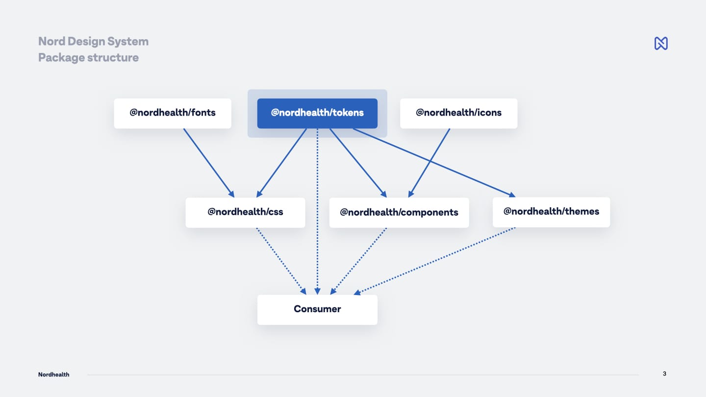
The way Nord itself is structured, looks somewhat like shown in the picture below. The most important thing about the architecture is that we aren't really talking about one gigantic design system, but multiple small modular systems that can be used either standalone or together depending on specific team's needs.
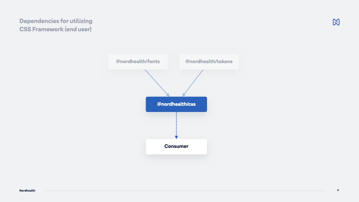
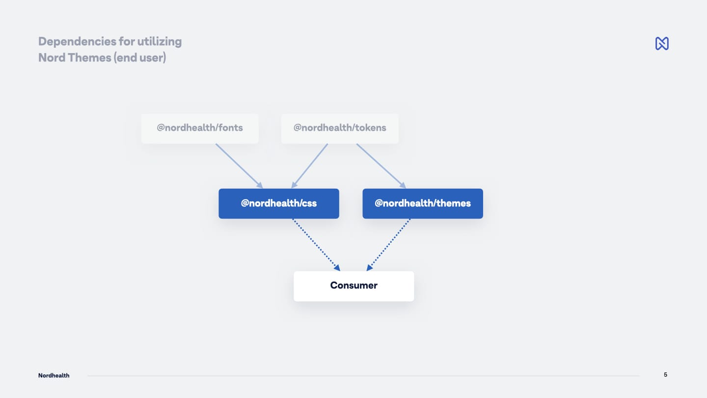
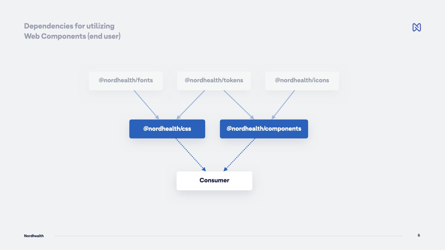
On the first level, we have packages called Webfonts, Design Tokens, and Nordicons. These packages are like atoms of the systems as they don't have external or internal dependencies into any other packages in the system.
On the second level, we have CSS Framework, Web Components, and Themes. These packages internally depend on the first level packages, but we wanted to hide these dependencies for the end user, Frontend Developer in this case, meaning that you'd more or less always install one or more of the second level packages only into your app to consume parts of the system.
As an example, if you would like to use our CSS Framework, you would only install that specific NPM package and that's really it. You don't have to care, as a user, that internally this package also uses our Webfonts and Design Token packages:
Another example could be that if you'd want to skin your application with one of our themes, you'd also add the Themes package and choose a theme to use from it. Again, internally, we still use both Webfonts and Design Token packages, but as a user, you don't have to care about those:
Finally, in the below example, we show all three first level packages being used internally (Webfonts, Design Tokens and Nordicons), but for the end user, only CSS Framework and Web Components will be relevant in this case:
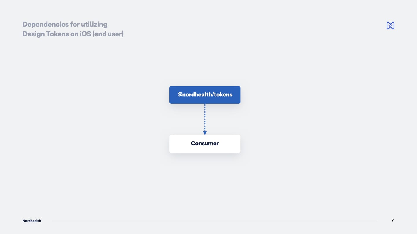
You could also directly utilize one of the first level packages, like the Design Tokens if you're working on a native iOS application and want to pull in the base colors and similar styles in XML format:
While the above is still possible, we wanted to avoid the user having to install a lot of different dependencies to be able to use a utility class from the CSS Framework, or a component from the Web Components package.
So while we strive towards having modularity to reduce the complexity and improve our system's reusability by breaking it into small, easier to consume parts, we also want to make sure this modularity doesn't become too burdensome for our users.
To learn more about the Nord Design System, how it works, and our release in 2022, please also read Launching Nord Design System article.
Important information
- Name of the project: Nord Design System
- Companies involved in design: Nordhealth, Ariel S. Design, Iijii (icons)
- Companies involved in implementation: Nordhealth, Ariel S. Design
- Client: Nordhealth
- Category: Best design system
- Link to the project: https://nordhealth.design
Further material
- Launching Nord Design System article
- How Nord team uses Custom Properties in Web Components
- Nord Statistics for the first year
- How Nord team uses Figma
- Nord Design System documentation
How we work
The following set of fundamental rules allows us to get to the highest level of productivity while benefiting both the company and our team members.
- We avoid meetings as much as possible. Instead of having them, we communicate asynchronous to each other via Linear, GitHub, Notion, Figma, and (occasionally) Slack, expecting responses within 24 hours.
- We don’t do team wide standups or sync meetings, except one meeting at the start of every cycle. Here we walk through the tasks and also discuss about how the team feels, what motivates them right now, and what would they want to change.
- Most collaboration and discussion happens in feedback loops, using the above mentioned tools, which requires clear and thoughtful communication from everyone.
- We don’t have strict deadlines. We ship incrementally as we move through the backlog and launch new things as they become ready.
- Our team members should be able to work on what they think is fun, or rely on their intuition when picking tasks from the backlog. Our roadmap on Linear holds us accountable.
- We focus on persistent iteration over flashy launches.
Our goals
Efficiency
Improved work efficiency for designers and developers.
Consistency
Improved user interface consistency and quality.
Openness
Improved communication between teams and people.
Standards
Shared guidelines and standards through documentation.