Grid
The grid helps us achieve visual balance and makes the user interface easier to scan. With the grid we can create consistent layouts that work across devices, screen sizes, and environments.
Grid anatomy
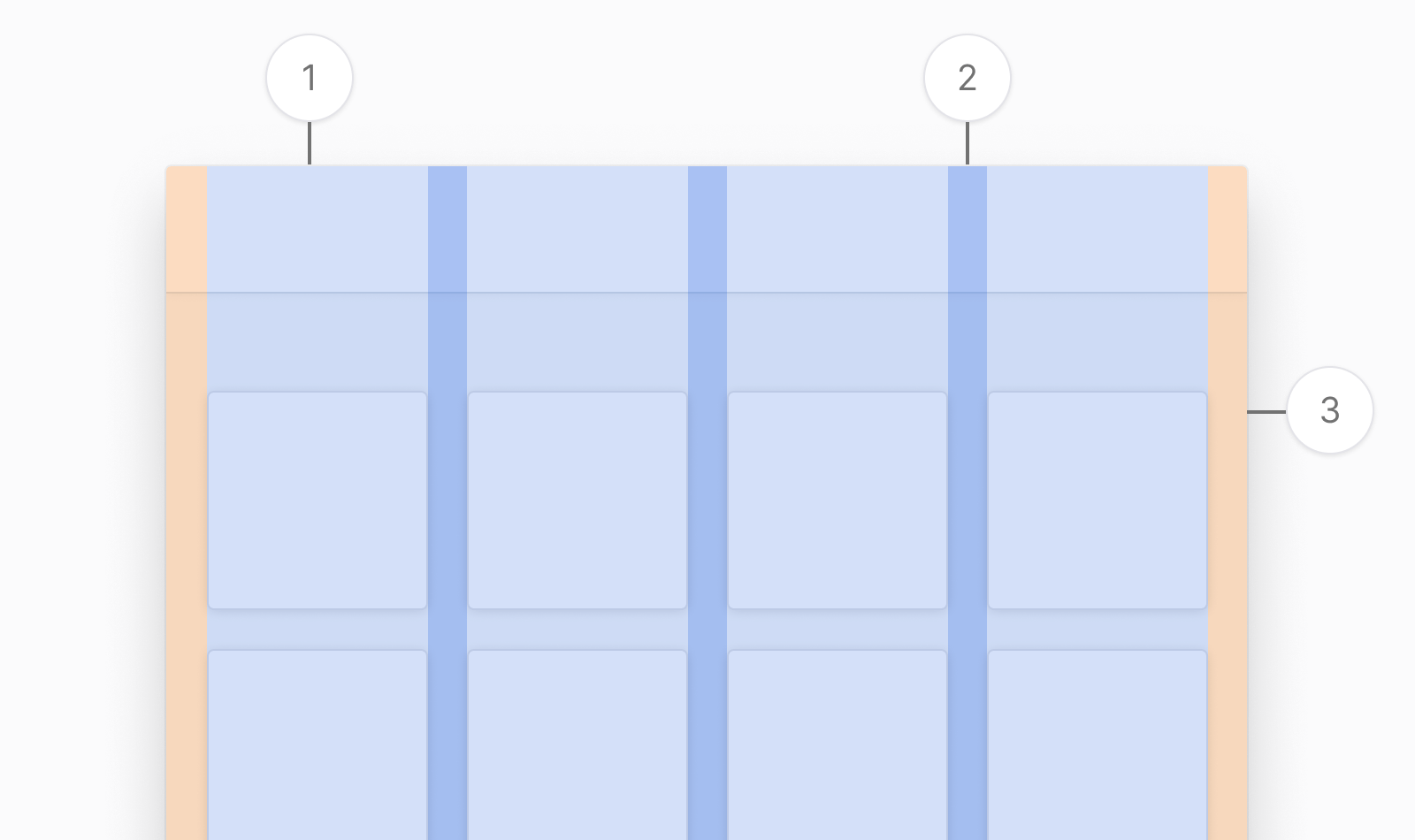
Grids in Nord Design System contain columns (1), gutters (2), and margins (3).
Columns
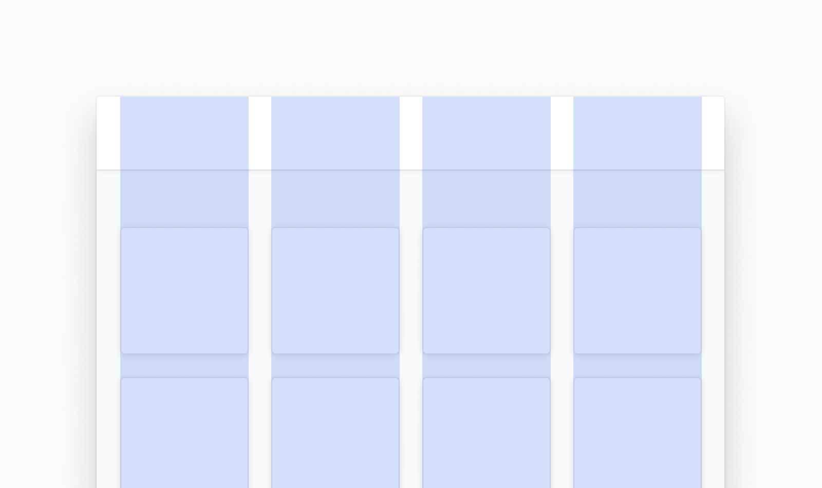
Columns define the areas of a design that contain content. The column widths are defined by percentages, and will resize based on the viewport. The number of columns available will also be affected by the viewport. A general rule of thumb is to allow the content to determine the breakpoints and how many columns to show at each viewport size.
Gutters
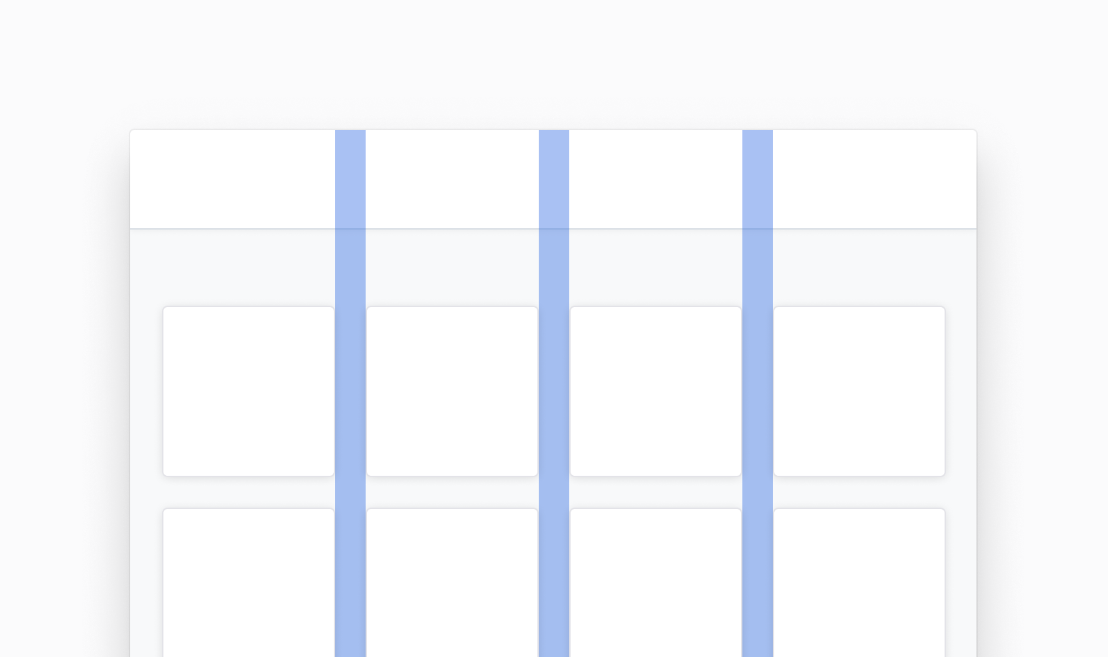
Gutters are fixed-width spacing between columns that separate content. We use our space tokens to define the gutters for the grid.
Margins
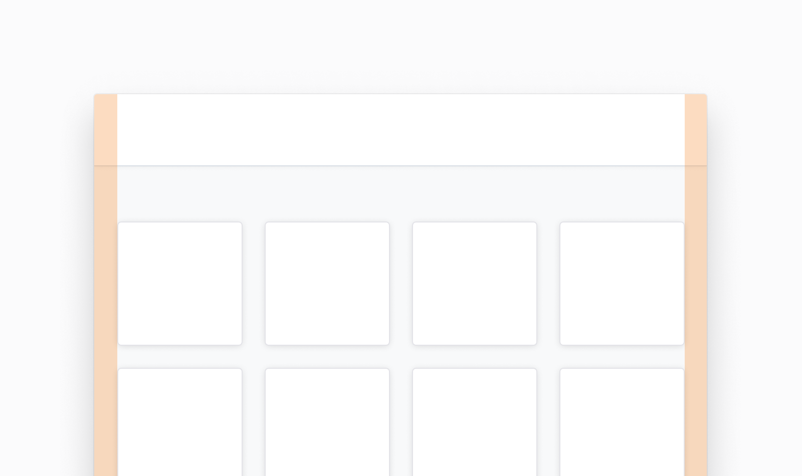
Margins separate content from the left and right edges of the grid. Margins are fixed-width and defined by using our space tokens. In general, wider margins are more suited for larger screens. Margins should either be the same width, or wider than the gutter width.
Applying the Grid
Nord Design System offers options for customizing the grid. We support up to 12 column layouts that can be fixed or fluid.
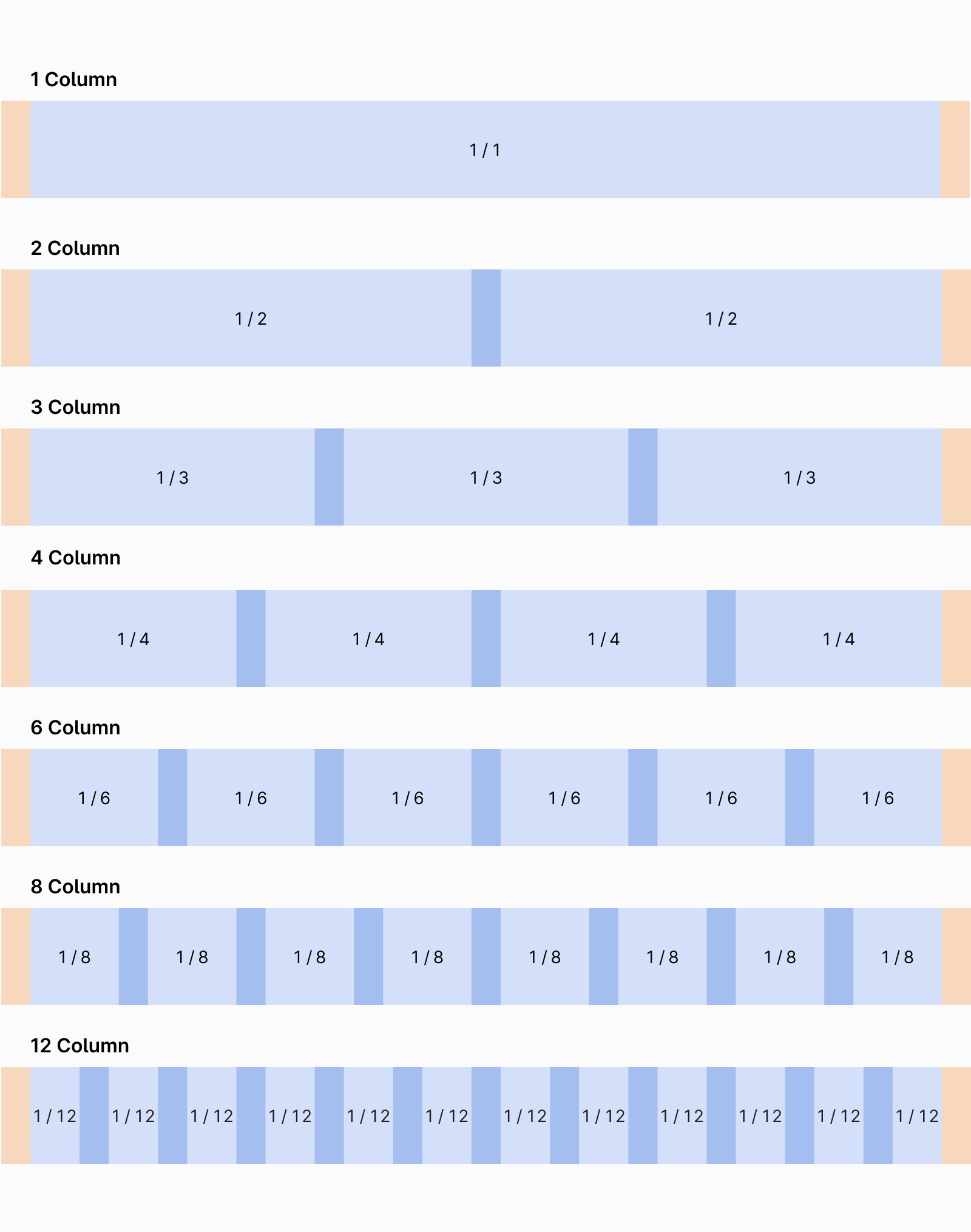
Layout across columns
Content can span multiple columns or use a subset of columns in a grid.
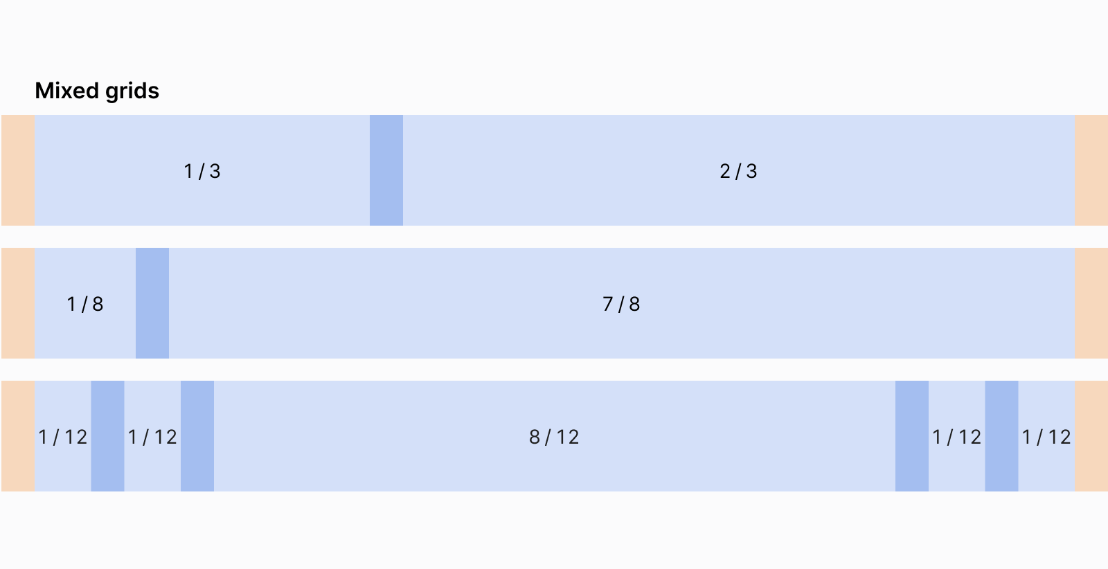
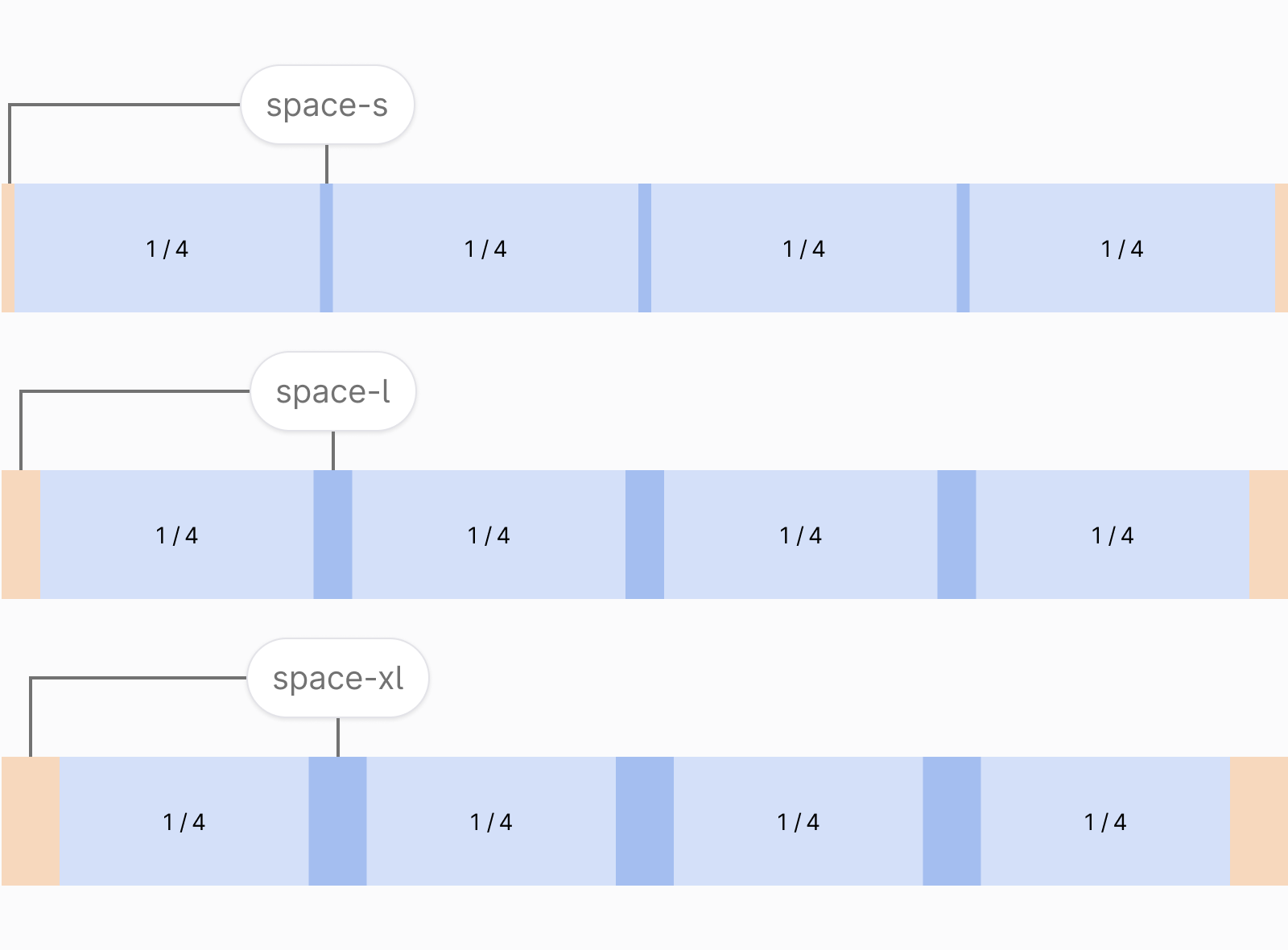
Gutter and margin spacing
We offer three types of spacing for gutters and margins: S, L, and XL. These options align with our space tokens. Typically, larger spacing makes sense on larger screens.
Fixed-width or fluid grid
You can apply a fixed-width or a fluid grid to your design. The fixed-width grid works well when dealing with long pages of content (fixed grid behaves like fluid grid when the viewport is smaller than the grid’s max-width):
The fluid grid work well when you’re dealing with screens that require lots of interaction or large datasets:
Layout
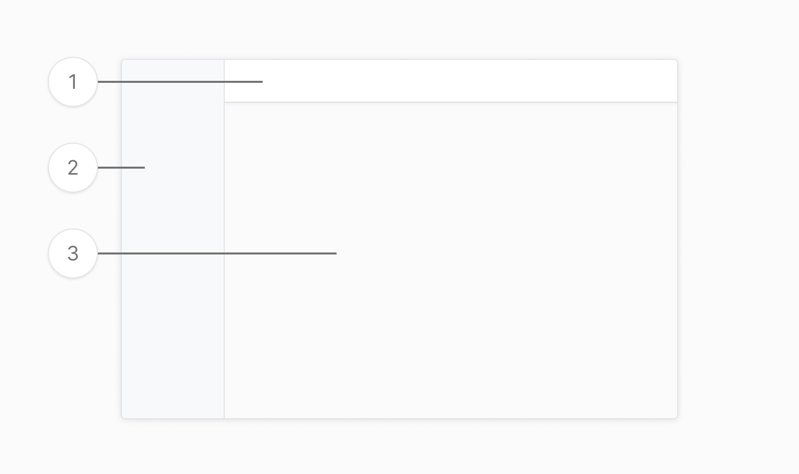
For laying out applications, we place navigation (2) on the left and page header (1) across the top of the screen. The grid is applied to the content area (3).
Figma usage
You can find the different grids from our Figma Toolkit.
Getting support
Have a question about grid usage? Please head over to the Support page for more guidelines and ways to contact us.