Clickto expand
Explore and Create Themes for Your Team
The new Themes gallery gives designers a place to explore different directions for their product. Choose a starting point, shape it in the theme playground and copy the CSS when you're ready to use it.
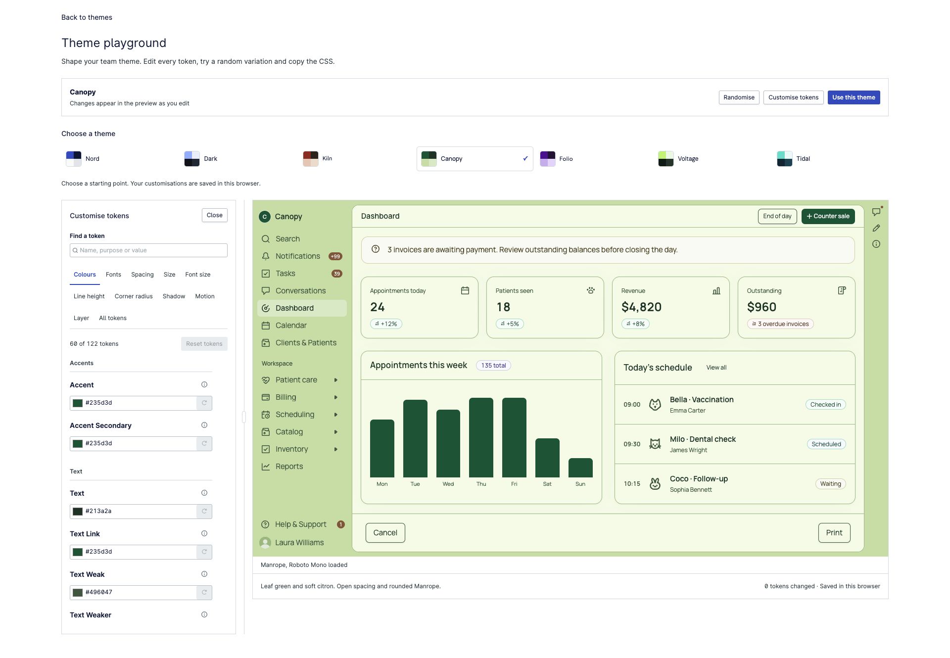
Start with a theme
Themes change more than the accent colour. Typography, backgrounds, spacing, borders and corner shapes all contribute to how an interface feels.
The gallery brings those choices together in presets with distinct styles. Preview them in an app shell with dashboard cards, tables and notifications, so you can judge a theme in context.
Make it your own
Open the theme playground to refine a preset. The preview comes first; open Customise tokens when you want to make more detailed changes.
- Colours: adjust surfaces, text, accents, borders and status colours with colour pickers and editable values.
- Typography: browse Google Fonts with typeface previews, then see your choice applied to the example interface.
- Spacing and sizes: use sliders and compact inputs to tune the density and proportions of the layout.
- Shape and detail: adjust corners, borders and shadows to bring the theme together.
Token groups stay visible as tabs, related controls sit together, and the editor panel can be resized. Each token has a description beside its label and a reset action if you want to undo an individual change.
For a fresh direction, try Randomise. It varies fonts, colours, backgrounds, spacing and shape, including darker palettes and borderless styles. Treat the result as a starting point: check readability and interaction states before using a theme in your product.
Your customisations are saved in the current browser, so you can return to your draft later.
Take the CSS into your project
Choose Use this theme to inspect and copy the theme's CSS custom properties. Apply them in your application's stylesheet, and include any Google Fonts import provided with the theme. There is no JSON conversion step.
The theme preview helps you explore the direction; your application's content and workflows are the next place to check it.
Keep exploring components
The top-level Playground opens Storybook, where you can try individual components and their controls. Themes has its own home at /themes, with the theme editor linked from the gallery.