Clickto expand
Introducing Storybook and the New Playground Experience
Nord Design System now ships with Storybook 10, bringing a powerful new playground experience to every component page. Explore components interactively with controls, test across themes and viewports, run accessibility audits, and export to CodePen — all without leaving the docs.
Why Storybook?
Our previous documentation examples were static HTML snippets rendered in iframes. They showed what a component looked like, but not how it behaved when you changed its properties, resized the viewport, or switched themes. Developers had to read the API docs separately and piece things together manually.
With Storybook, every component now has a living, interactive playground backed by the same source of truth as our component library. This means:
- Instant feedback — change a prop and see the result immediately.
- Single source of truth — stories are written alongside the component source code, so examples are always up to date.
- Extensible tooling — we can add new testing and documentation addons as the ecosystem evolves.
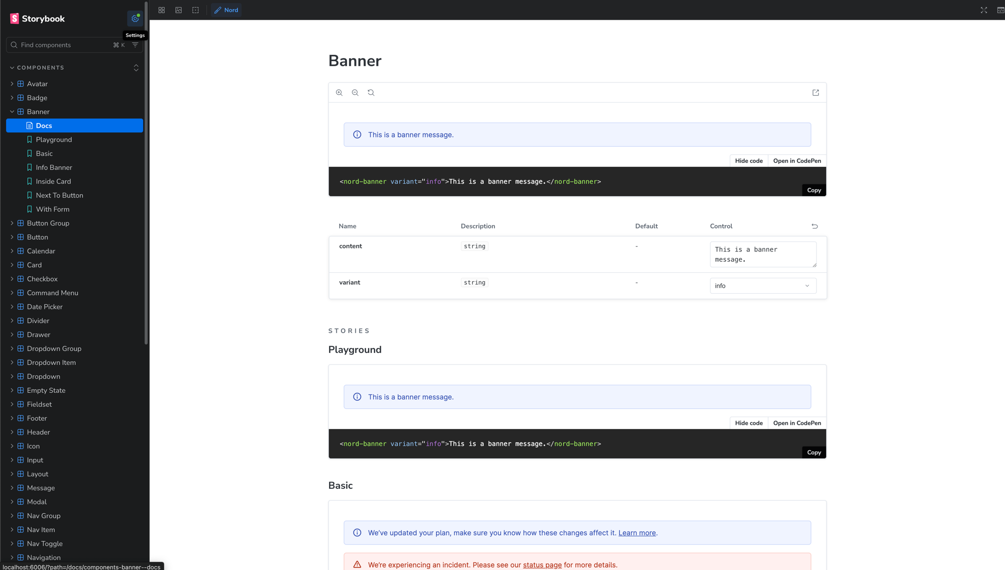
The Playground
Each component page now features a Playground story as the default example. The Playground embeds Storybook directly into the docs site with the controls panel open, so you can tweak every property, slot, and variant without leaving the page.
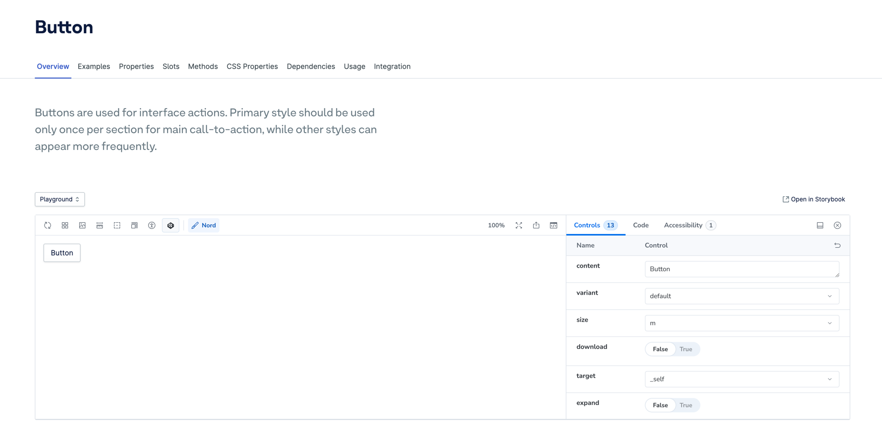
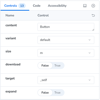
Controls panel
The controls panel is generated automatically from the component's custom elements manifest. Every property, attribute, and slot is represented as an interactive control — selects for enums, toggles for booleans, text inputs for strings, and more.
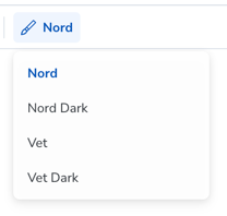
Theme switching
A theme selector in the toolbar lets you preview components across all four Nord themes:
- Nord (default light)
- Nord Dark
- Veterinary
- Veterinary Dark
Theme switching works in both the embedded playground and the standalone Storybook.
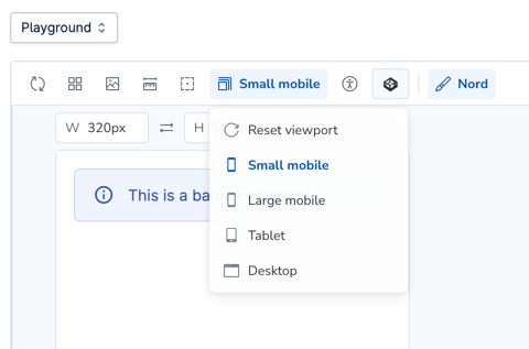
Viewport testing
Storybook's built-in viewport tool lets you preview components at different device sizes — from mobile to desktop — directly in the canvas. This is especially useful for responsive components like Layout, Navigation, and Popout that adapt their behaviour based on screen width.
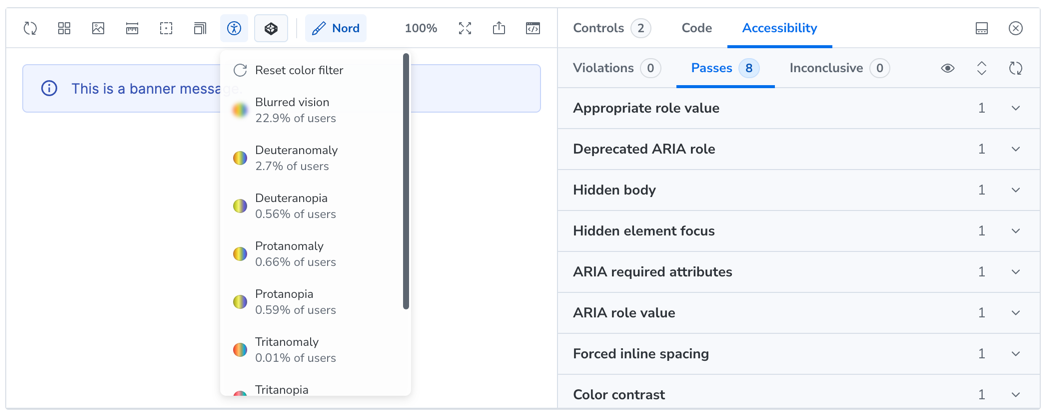
Accessibility testing
Every story is automatically audited using the Accessibility addon powered by axe-core. Open the Accessibility panel to see a live report of any violations, incomplete checks, or passed rules for the current story state.
Autodocs
Storybook generates a full documentation page for each component, combining a live preview of every story with an auto-generated property table extracted from the custom elements manifest. This serves as a quick reference alongside our handwritten component guides.
CodePen integration
Want to take an example further? Every story includes an Open in CodePen button — both in the docs site example viewer and in the Storybook toolbar. It exports the rendered HTML along with the correct CDN links for Nord CSS, themes, and components, so you get a working sandbox in seconds.
For contributors
Stories live alongside their component source in packages/components/src/<component>/. Adding a new story is straightforward:
export const MyNewExample: Story = {
  render: () => html`
    <nord-button variant="primary">Hello</nord-button>
  `,
}
Run npm run storybook in the components package to start the development server. All 55+ components already have stories covering their key states and variants.
What's next
This is the foundation we'll continue building on:
- Visual regression testing with Storybook's snapshot capabilities
- Interaction testing for complex component workflows
- Design token documentation within Storybook
- Figma integration linking stories to their design counterparts
We're excited about how Storybook transforms the way you explore and adopt Nord components. Try it out on any component page or open the standalone Storybook directly.