Clickto expand
18 New Components, 56 Component Parts, and a Redesigned Docs Website
The July 2026 Nord release pairs a redesigned documentation website with Nord 5 component releases. The new docs make the system easier to browse, preview, test and copy from, while the component library adds new patterns across forms, filters, data display, navigation, containers and layout.
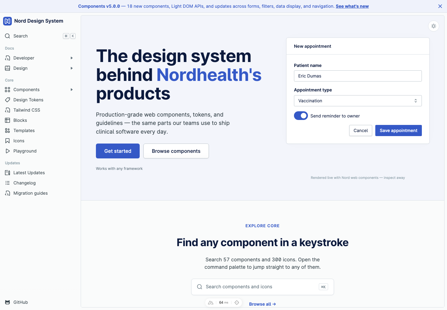
This release brings together two related pieces of work. The first is a redesigned documentation website that feels closer to the products built with Nord: persistent navigation, clear category browsing, full-site light and dark mode, a command-style search entry point, live component previews and quick template previews. The second is the component release itself, with new Light DOM components, refreshed guidance and Storybook-backed examples across the library.
For package-level release notes and exact version history, see the Web Components changelog. This article focuses on what changed from a product and documentation point of view.
At a glance:
- The docs website has a new application-style shell with persistent navigation, search, page outlines and light/dark mode throughout.
- The Components overview is now grouped by purpose, matching the way teams look for UI building blocks.
- Component pages combine guidance, Storybook-backed examples, accessibility notes and generated API reference.
- The new Blocks gallery provides copy-paste product patterns built from Nord components.
- The new Templates gallery lets teams quickly preview full-page layouts, copy their markup, or open them full screen.
- Nord 5 adds 18 new components made up of 56 individual component parts, plus updates to existing components, across the same groups used on the Components overview.
New website design
The new website is built around the way teams actually use a design system. Instead of treating the docs as a set of isolated reference pages, the redesigned site brings navigation, examples, status, search and release context into the same workspace.
The homepage now opens with a live product surface built from Nord components. It shows the design language in context before asking people to choose a package or read an API table. The release banner at the top points directly to the latest component work, so teams can discover what changed without digging through changelogs first.
The site shell also gives the docs more room to grow:
- Persistent sidebar navigation keeps components, design tokens, Tailwind CSS, blocks, templates, icons and updates close at hand.
- Light and dark mode throughout lets teams review documentation, components, blocks and templates in the same appearance modes their products support.
- Search entry points are always visible, with keyboard hints for people who move quickly through the docs.
- Right-side outlines make long component pages easier to scan, especially pages with examples, accessibility notes and generated API sections.
- Status badges show when a component is new, alpha, beta, deprecated, Light DOM based, or updated.
The goal is not only to make the website look newer. It is to make the documentation behave more like a working tool for product teams.
Browsing components by purpose
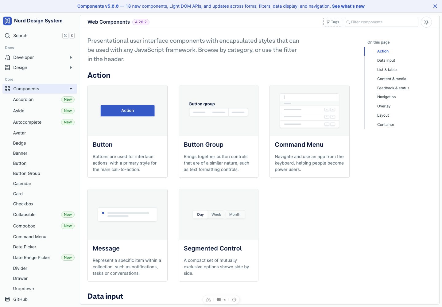
The Components overview now groups the library by the same categories used across the site:
- Action
- Data input
- List & table
- Content & media
- Feedback & status
- Navigation
- Overlay
- Layout
- Container
This makes the overview easier to scan than one long alphabetical list. You can still filter by name from the header, but the default view answers a more useful question: "What kind of UI am I trying to build?"
Each card pairs a component illustration with a short description and release status. New components are visible at a glance, deprecated components stay discoverable without being promoted, and Light DOM components are clearly marked. The sidebar also mirrors the component list, so people can jump directly into a component page without losing the larger category context.
Richer component pages
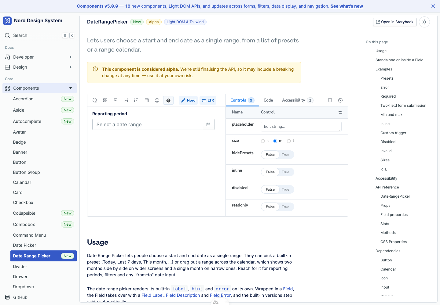
Component pages are now designed to teach usage before exposing the complete API reference. The top of a page gives the component description, status badges and a Storybook-backed example. From there, the page moves through usage guidance, composition notes, examples, accessibility guidance and generated API sections.
The embedded example viewer is the biggest shift. Instead of static screenshots or isolated snippets, examples now run as live stories with controls, code and accessibility tabs. This lets people test the component state before copying an implementation detail.
The page structure is consistent across new and existing components:
- Usage guidance explains when to reach for the component and how it fits with nearby patterns.
- Composition sections show how compound components and parts work together.
- Examples use Storybook stories, so the same source supports docs, testing and the standalone Storybook.
- Accessibility notes call out labeling, keyboard behavior and screen reader expectations.
- Generated API reference documents props, slots, methods, events, CSS custom properties, state attributes and dependencies from source metadata.
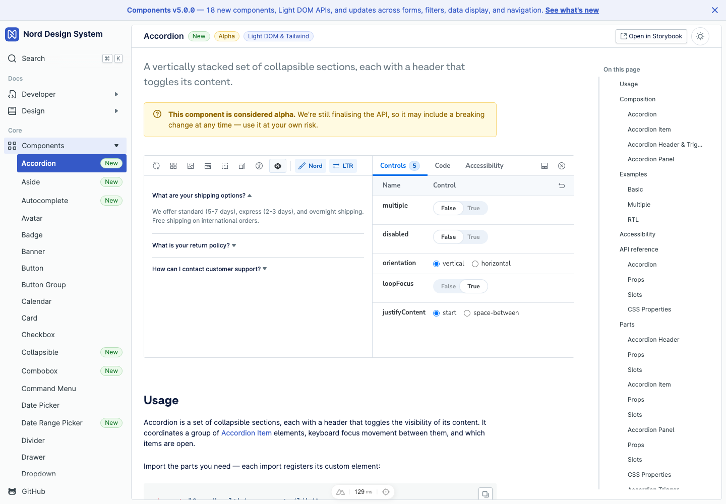
Compound components benefit the most from this format. Accordion, Field, Combobox and Pagination all rely on composition. The docs can now explain the model in prose, show a working example, and keep the generated API for the parent and parts on the same page.
Component model
The new components also establish the direction for future Nord APIs. They are designed to be easier to compose in product code and easier to document from source.
- Light DOM rendering for new components lets application CSS,
@nordhealth/cssutilities and global styles reach component internals without::part. Existing Shadow DOM components are unchanged. - Composition-first APIs split larger patterns into small parts that can be assembled to match the interface anatomy. Field, Item, Pagination, Accordion and Combobox are all examples of this approach.
- Shared behavior controllers keep focus management, open state, disabled state, transitions, roving focus and active descendant behavior consistent across component families.
This is why the release is bigger than a set of isolated tags. It gives product teams a more consistent way to build forms, filters, disclosure patterns, lists and navigation while keeping each part inspectable in the docs.
Component releases
Nord 5 is a broad component release, but the changes are not all the same kind of change. Some are brand new components, some are new component families, and others are updates to existing components so they work better with the new model.
The release follows the same grouping as the Components overview.
Action
Action components do not get a new standalone primitive in this release, but the redesigned docs make action patterns easier to evaluate. Button, Button Group, Command Menu, Message and Segmented Control now appear in the grouped overview with clearer illustrations and status context.
This also matters for blocks and templates, where action components usually appear as part of a larger workflow rather than as isolated examples.
Data input
Data input is the largest part of this release. It includes new form structure, richer picker controls and a complete filter family.
- Field, Field Group and Field Set provide composable form layout and labeling primitives.
- Existing form controls still work standalone, but can now be wrapped in Field when you need shared label, hint, error and required behavior.
- Combobox and Autocomplete add virtualized option lists, declarative options and groups, async patterns, clear buttons, slots, auto-highlight behavior, disabled items and creatable entries.
- Number Field adds formatted numeric input with parsing and formatting callbacks, currency and unit slots, and wheel and scrub interactions.
- OTP Field adds grouped one-time-code input with normalization, masking, form integration and right-to-left support.
- Date Range Picker adds a two-month range calendar, presets, inline mode, custom triggers, responsive single-month collapse, read-only styling and disabled/highlighted date callbacks.
- Filter Dropdown adds a chip trigger with selectable options, search, groups, tree selection, select-all, clearable and loading states.
- Filter Date Range brings the date-range picker pattern into the filter family.
- Calendar now supports native range selection, hover previews, multi-month display and date disabling/highlighting callbacks.
- Time Picker is a new native time field paired with a dropdown of selectable times at a configurable interval, with
round-to-intervalandhour-format. - Fieldset is deprecated in favor of the new Field family.
List & table
Item adds a composable row primitive for people, files, settings and other single pieces of content. It is useful anywhere a product surface needs a repeated row with leading media, primary content, metadata and trailing actions.
Item is intentionally small. It gives teams a consistent row anatomy without forcing every list or table-like surface into the same full table component.
Content & media
Kbd and Kbd Group add styled keyboard key and shortcut display. They are useful in docs, command menus, keyboard shortcut references and power-user workflows.
The new docs use keyboard hints in navigation and search, so these components also help document Nord itself with Nord components.
Truncate adds a primitive for shortening overflowing text with an accessible full-text fallback, useful in tables, cards and dense list rows where space is limited.
Feedback & status
Meter adds a static measurement display for values such as usage, battery, capacity or score. It gives teams a lighter-weight choice when they need to communicate a bounded value without implying task progress.
Existing feedback components also received updates:
- Banner adds an
actionsslot for trailing calls to action or dismiss buttons. - Toast groups render in the browser top layer above modals.
These changes make feedback patterns work better in complex application shells, where overlays, navigation and messages often appear at the same time.
Navigation
Navigation gains both new components and visual refinements.
- Outline adds an in-page table of contents with controlled and scroll-spy modes.
- Pagination adds a composed pagination model with loading, numbered, simple, icon-only, cursor and right-to-left examples.
- Tab Group now pre-selects the first asynchronously slotted tab in framework rendering.
- Navigation receives refreshed selected, active and hover treatments.
Overlay
Overlay components received updates that make them more predictable in composed product surfaces.
- Popout adds opt-in controlled mode.
- Tooltip stays in the top layer until its fade-out transition ends, preventing flashes behind layout navigation.
These changes are small from an API point of view, but important for reliability. Popouts and tooltips often sit inside dense tables, filters, modals and navigation shells, where layering bugs are especially visible.
Layout
Layout updates focus on application shell behavior and scrollable surfaces.
- Scroll Area is a new scroll container with custom, consistently-styled scrollbars, optional edge fades and
always-show-scrollbar. - Aside and Aside Trigger add a new right-side rail and drawer layout for surfacing secondary content alongside the main view.
- Layout aligns sticky footers to the live navigation width instead of a hardcoded size.
- Layout, Aside and Aside Trigger receive refreshed selected, active, hover and surface treatments.
The visual updates are most noticeable in larger screens where side navigation, content, headers and sticky footers need to feel like one coherent application frame.
Container
Container components add new ways to group and reveal content.
- Accordion adds stacked sections with single- or multi-open behavior.
- Collapsible adds a focused show/hide primitive for a single region.
Accordion is for related sets of sections. Collapsible is for one disclosure region. Having both keeps common disclosure patterns consistent without forcing teams to use a larger component than the interface needs.
Blocks and templates
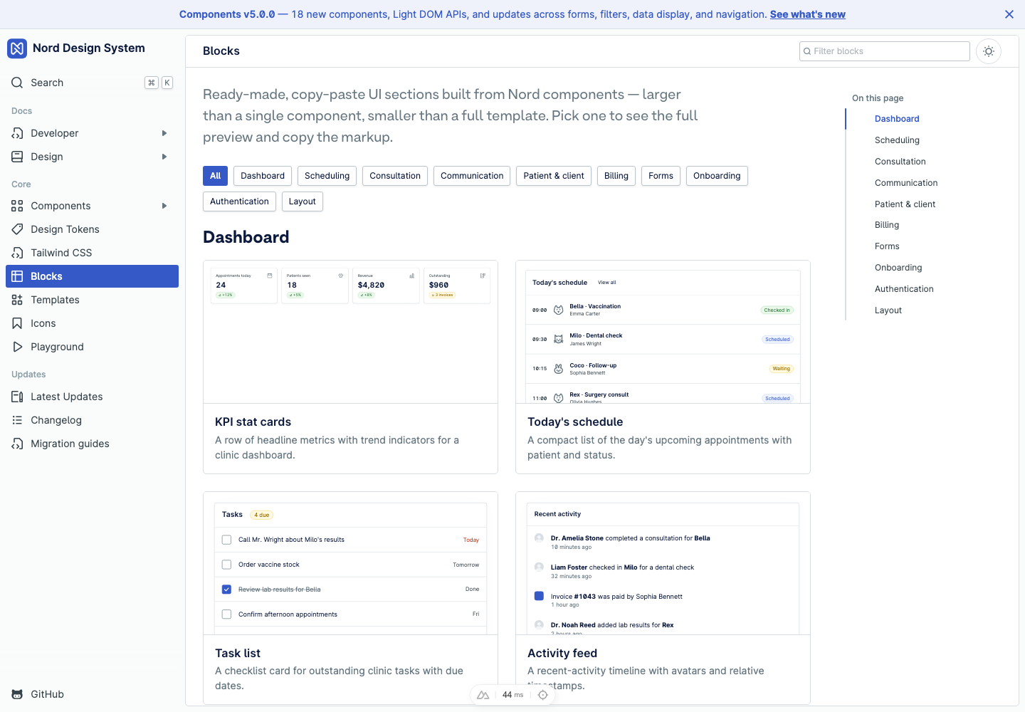
The new Blocks page shows copy-paste UI sections built from Nord components. Blocks sit between a single component and a full application template: they are small enough to reuse directly, but large enough to show how components work together in real product surfaces.
The first batch includes dashboard, scheduling, consultation, communication, patient and client, billing, form, onboarding, authentication and layout patterns. They are especially useful when you know the product pattern you need but do not want to start from a blank page.
Blocks are also a practical way to test component combinations. A component can look correct in isolation but still need adjustments once it appears beside filters, cards, tabs, actions, tables and empty states. The blocks gallery gives us a shared place to document those product-level combinations.
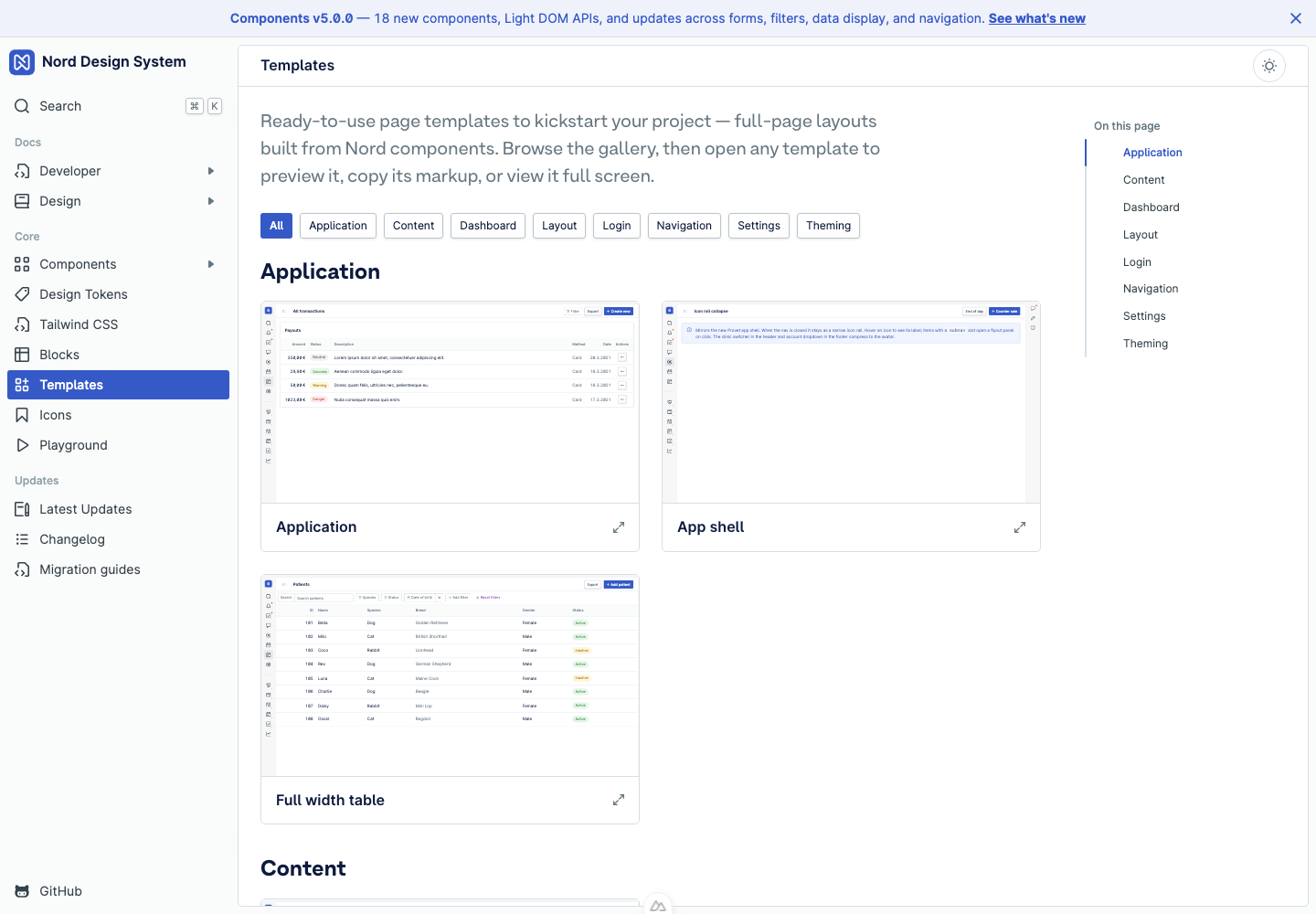
The Templates gallery takes the next step up from blocks. Templates are complete page layouts built from Nord components, grouped by use case such as application, dashboard, layout, login, navigation, settings and theming.
The important improvement is speed: you can browse the gallery, open a template in place, preview the live page, copy its markup, or view it full screen without leaving the flow. That makes templates useful both for starting a new screen and for quickly checking how components behave together in a realistic page shell.
What to try first
If you are reviewing the release, start with these areas:
- Open the Components overview and scan the new category groups.
- Try the Date Range Picker, Combobox and Accordion pages to see the new docs format.
- Toggle between light and dark mode while reviewing components, blocks and templates.
- Open the Blocks gallery and copy one pattern into a local prototype.
- Open the Templates gallery to quickly preview full-page layouts and view one full screen.
- Check your visual-regression baselines around navigation, layout, overlays, feedback and form controls.
- Read the Web Components changelog for exact package versions and release details.
What's next
This release is a foundation, not a finish line. A few areas we are actively working on:
- Graduating the alpha components. Several of the new components — Combobox, Autocomplete, Date Range Picker, Meter, Number Field, OTP Field, Time Picker and others — ship as alpha while we finalise their APIs. Expect those interfaces to settle and the alpha labels to drop as we gather feedback from real product use. If you are adopting them now, tell us where the API feels awkward.
- More blocks and templates. The first batch covers common product surfaces, but it is deliberately a starting point. We will keep adding patterns — and refining existing ones — as we see which combinations teams reach for most.
- Deeper composition. The composition-first direction behind Field, Accordion and Item continues. Next up, we plan to move Card, Modal and Dialog to the same small, slot-driven parts that compose cleanly rather than one-off wrappers, so there is less repeated product code to maintain.
- More components. We are exploring several new components, including Overflow List, Input Group, Timestamp and Resizable.
- Framework-agnostic foundations. We are exploring headless primitives so the same accessible behaviour can be shared beyond web components, making Nord easier to adopt across React, Vue and other stacks.
We will share specifics as they land — follow the Web Components changelog and Latest Updates for the next steps.
Upgrade notes
Existing component APIs are intended to remain compatible, so most applications do not need a code migration just to install Nord 5. The visual system has changed in places, especially around navigation, surfaces and newly documented component states, so visual-regression baselines should be regenerated after upgrading.
The most important adoption work is deciding where the new composition-first components should replace local patterns. Field, Combobox, Date Range Picker, Accordion, Pagination and Item are all designed to reduce repeated product code, but they are best introduced deliberately where they simplify real screens.
For exhaustive package notes and release dates, read the Web Components changelog.