Usage
Buttons trigger interface actions. Use the primary style once per section for the main call-to-action, and reach for the other variants for secondary or destructive actions. A button can also render as a link by giving it an href.
import "@nordhealth/components/lib/Button"
Examples
Variants
Set the variant attribute to change the button's emphasis: default, primary, dashed, plain or danger.
Sizes
The size attribute accepts s, m (default) and l, affecting font size and padding.
With icons
Use the start and end slots to place icons alongside the button text, or square for an icon-only button.
States
Use disabled to prevent interaction, loading to show a spinner during an async action, and expand to stretch the button to fill its container.
As a link
Give a button an href to render it as an anchor while keeping the button styling. target and download work as they do on a native link.
Single icon
Place one icon in the start or end slot to pair an icon with the button label.
Icon-only
Use the square attribute with an icon and no text for a compact icon-only button.
Loading
Set loading to show a spinner while an async action is in progress.
Loading interactivity
A loading button stays focusable but blocks repeat clicks until the action completes.
Expanded
Add expand to stretch the button to fill the width of its container.
Disabled
Set disabled to prevent interaction and convey an unavailable action.
Slots
Compose richer button content by placing markup in the default and icon slots.
Button with dropdown
Pair a button with a dropdown to expose a menu of related actions.
Button with dropdown, no caret
Hide the dropdown caret icon when the trigger already communicates the menu.
Custom background
Override the button background with a custom colour using CSS custom properties.
RTL
Buttons follow the document or container direction. Toggle the direction to see icon placement mirror.
Accessibility
- An icon-only
squarebutton has no visible text, so give itsnord-iconalabelto provide an accessible name. - When a button renders as a link (
href), it is exposed as a link to assistive technology rather than a button — use it for navigation, not for in-page actions. - Setting
loadingkeeps the button focusable but signals a busy state; avoid removing the button from the layout while loading so focus is not lost. - Keep the button label concise and action-oriented so its purpose is clear out of context.
API reference
Button
Buttons are used for interface actions. Primary style should be used only once per section for main call-to-action, while other styles can appear more frequently.
<nord-button></nord-button>Props
| Property | Attribute | Description | Type | Default |
|---|---|---|---|---|
variant | variant | The style variant of the button. | 'default' | 'primary' | 'dashed' | 'plain' | 'danger' | 'default' |
type | type | The type of the button. | 'button' | 'submit' | 'reset' | 'submit' |
size | size | The size of the button. This affects font-size and padding. | 's' | 'm' | 'l' | 'm' |
href | href | When provided, renders the button as a link, with its href attribute set to the given value. | string | undefined | — |
download | download | When provided together with a href property, the button will trigger a file download instead of a page visit. | boolean | false |
target | target | When provided together with a href property, determines where to open the linked URL. The keywords have special meanings for where to load the URL: “_self” means the current browsing context, “_blank” usually a new tab but users can configure browsers this to open a new window instead, “_parent” means the parent browsing context of the current one, but if no parent exists, behaves as _self, and finally “top” means the topmost browsing context. | '_self' | '_blank' | '_parent' | '_top' | '_self' |
rel | rel | When provided together with a href property, sets the relationship between the linked URL and the current document, e.g. “noopener noreferrer” when linking to untrusted content in a new tab. | string | undefined | — |
expand | expand | Controls whether the button expands to fill the width of its container. | boolean | false |
square | square | When provided, the button is rendered as a square button. Use this for icon only buttons. | boolean | false |
loading | loading | Controls whether the button is in loading state. Please note that the spinner is hidden from assistive technologies, so you need to make sure to announce the loading state to e.g. screen reader users. We also recommend disabling all user interactions on the button itself while in loading state. | boolean | false |
hideDropdownIcon | hide-dropdown-icon | Controls whether the interface-dropdown-small icon from Nordicons is hidden
in the end slot when used as a dropdown toggle. | boolean | false |
disabled | disabled | Makes the component disabled. This prevents users from being able to interact with the component, and conveys its inactive state to assistive technologies. | boolean | false |
name | name | The name of the form component. | string | undefined | — |
value | value | The value of the form component. | string | '' |
form | form | Gets the form, if any, associated with the form element. The setter accepts a string, which is the id of the form. | HTMLFormElement | null | — |
Slots
| Slot name | Description |
|---|---|
Default slot | The button content |
start | Used to place content at the start of button text. Typically used for icons. |
end | Used to place content at the end of button text. Typically used for icons. |
Methods
| Method name | Parameters | Description |
|---|---|---|
focus(options?: FocusOptions) => void | options: An object which controls aspects of the focusing process. | Programmatically move focus to the component. |
blur() => void | N/A | Programmatically remove focus from the component. |
click() => void | N/A | Programmatically simulates a click on the component. |
CSS Properties
CSS Custom Properties provide more fine grain control over component presentation. We advise utilizing existing properties on the component before using these.
| Property | Description | Default |
|---|---|---|
--n-button-border-radius | Controls the rounded corners of the button, using border radius tokens. | var(--n-border-radius-s) |
--n-button-gap | Controls the spacing between items within the button, using our spacing tokens. | var(--n-space-s) |
--n-button-gradient | Controls the overlayed gradient background on the button. | linear-gradient(to bottom, rgba(0, 0, 0, 0) 50%, rgba(0, 0, 0, 0.013) 100%)) |
--n-button-background-color | Controls the background color of the button, using our color tokens. | var(--n-color-button) |
--n-button-border-color | Controls the border color of the button, using our color tokens. | var(--n-color-border-strong) |
--n-button-text-align | Controls the text alignment for the text in the button. | center |
--n-button-box-shadow | Controls the surrounding shadow, using our box shadow tokens. | var(--n-box-shadow) |
--n-button-color | Controls the color of the text within the button, using our color tokens. | var(--n-color-text) |
--n-button-padding-inline | Controls the inline, or left and right, padding of the button. | calc(var(--n-space-m) / 1.2) |
--n-button-font-size | Controls the size of the text within the button, using our font tokens. | var(--n-font-size-m) |
--n-button-font-weight | Controls the weight of the text within the button, using our font tokens. | var(--n-font-weight) |
--n-button-min-block-size | Controls the minimum block size, or height, of the button using our spacing tokens. | var(--n-space-xl) |
--n-button-toggle-icon-color | Controls the color of toggle icon that gets rendered when the button is used as a Dropdown toggle. | var(--n-color-icon) |
--n-button-user-select | Controls the text selection behavior of the button text. | none |
Dependencies
This component is internally dependent on the following components:
Design guidelinesFor designers
Usage
This section includes guidelines for designers and developers about the usage of this component in different contexts.
Do
- Only use one primary button per section, as a main call-to-action.
- Use clear and accurate labels.
- Use established button colors appropriately. For example, only use a danger button style for an action that’s difficult or impossible to undo.
- Prioritize the most important actions. Too many buttons will cause confusion.
- Be consistent with positioning of buttons in the user interface.
- Use strong, actionable verbs in labels such as “Add”, “Close”, “Cancel”, or “Save”.
Don’t
- Don't use a primary button in every row of a table.
- Don’t use buttons to link to other pages. Use regular link or a plain style instead where necessary.
- Don’t use buttons for navigation where the link appears within or following a sentence.
- Don’t use labels such as “Read more”, “Click here” or “More”.
Content guidelines
Button labels should be clear, accurate and predictable. It should be possible for the user to understand what will happen when they click a button:
When writing button labels, always write them in sentence case, not title case. The first word should be capitalized and the rest lowercase (unless a proper noun):
Avoid unnecessary words and articles in button labels, such as “the”, “an” or “a”:
Variants
This section describes the different component variants, their purpose, and when to use each variant.
| Name | Purpose |
|---|---|
default | Default style is the most common button variant. Only switch to another variant if you need to adjust the visual weight of the element. |
primary | Primary style is reserved for main call-to-actions. Should be used only once per content area or panel, e.g. for a “Save” action. |
dashed | Dashed style should be used for actions that trigger filtering. |
danger | Danger style should be used for actions that delete data or otherwise make it hard to undo the action. |
plain | Used for less important or less common actions. Can be also used for linking to other pages. |
disabled | Used for actions that aren’t currently available or not available anymore. Also prevents users from being able to interact with the component, and conveys its inactive state to assistive technologies. |
Icon usage in button
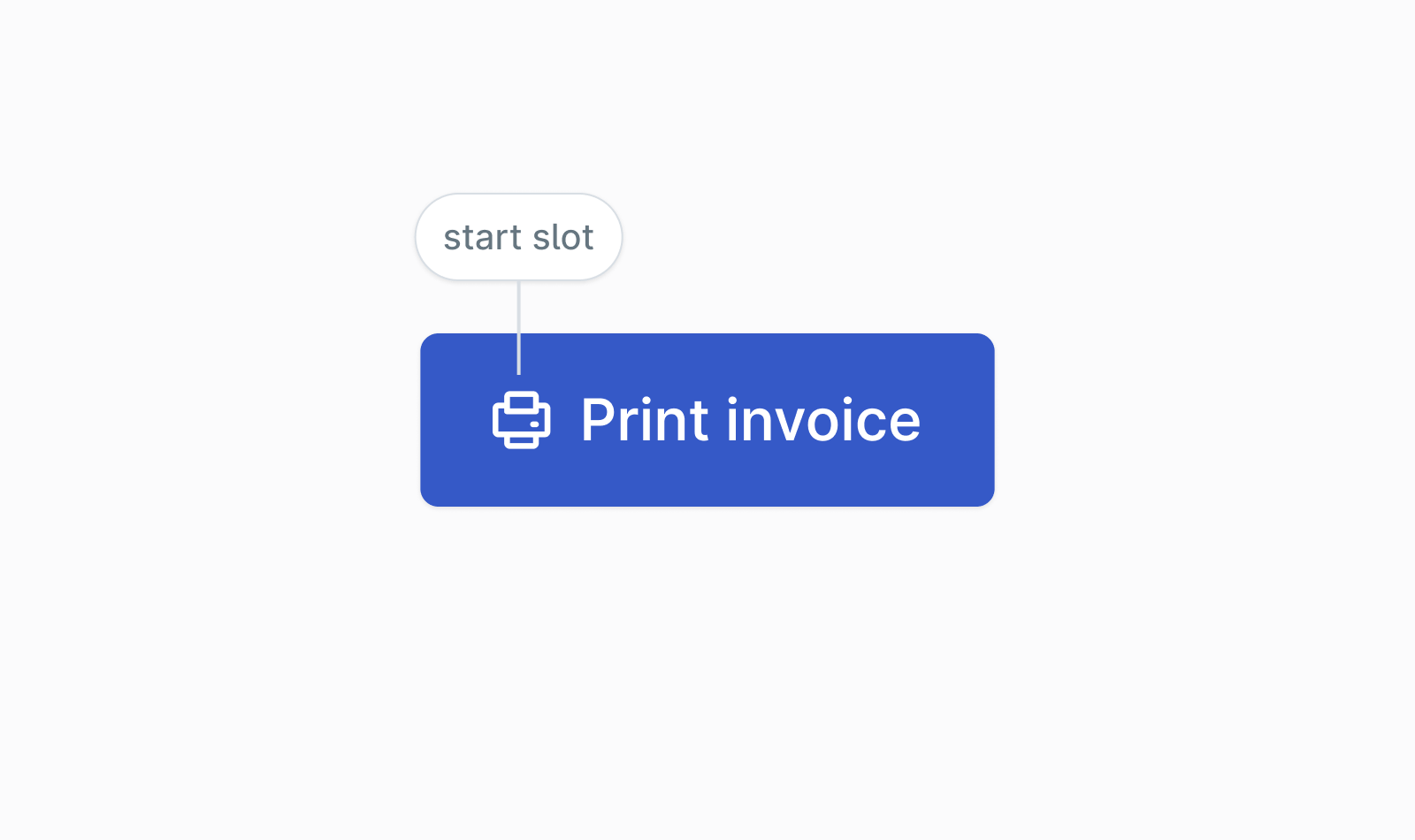
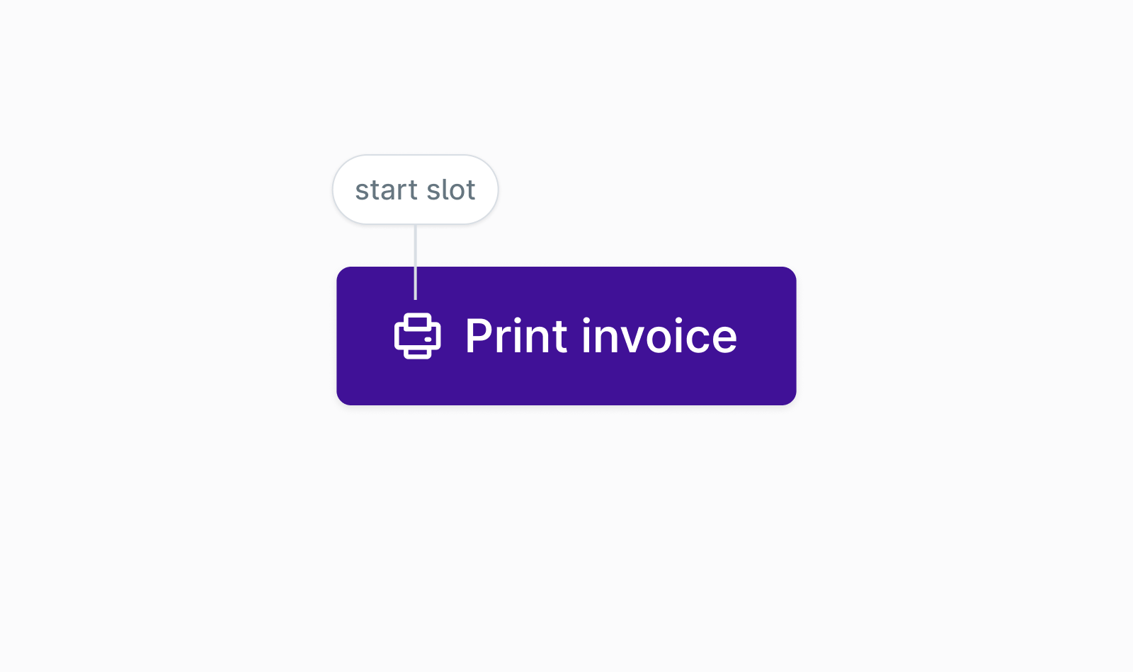
Illustrative icons should be always positioned in the start slot:
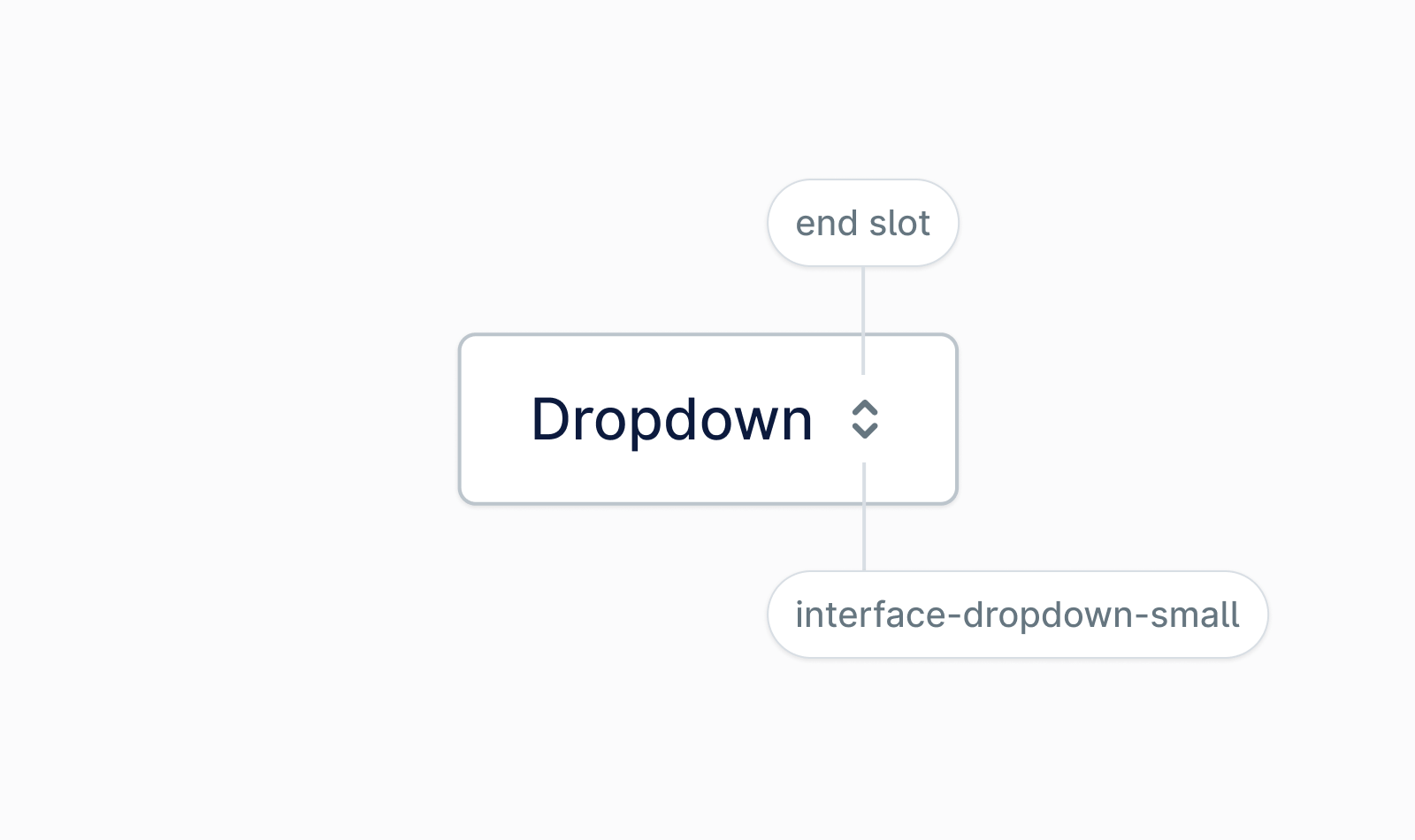
When a button is used as a dropdown toggle, the interface-dropdown-small icon from Nordicons is automatically placed in the end slot (you can use the hideDropdownIcon property to hide it):
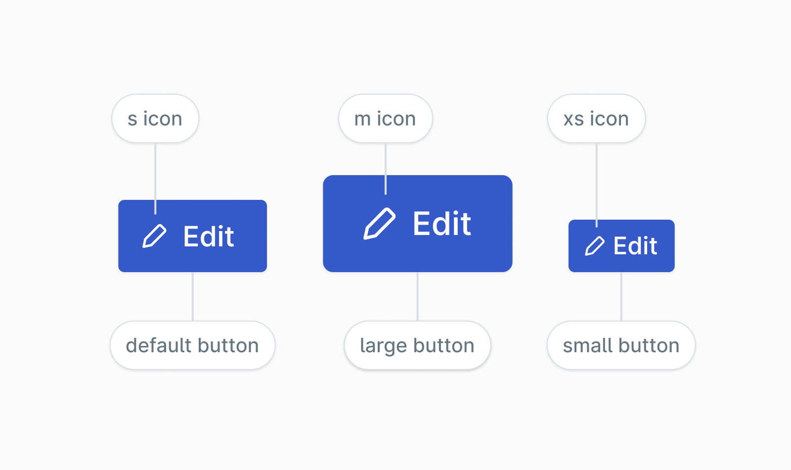
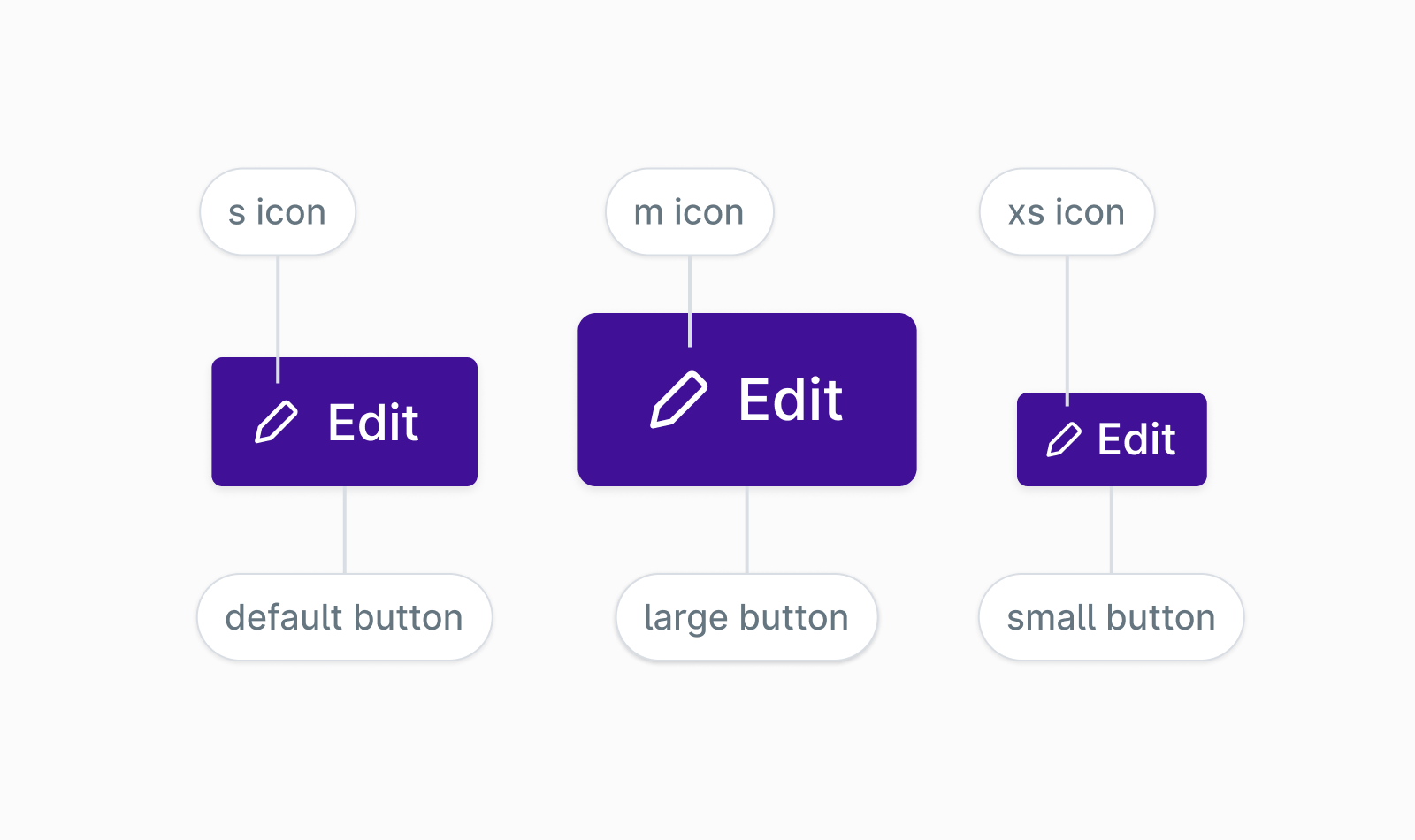
Each button size has a recommended icon size. The medium button uses the s icon size, the small button uses the xs icon size, and the large button uses the m icon size. The icon will adjust size automatically based on the button size, so you will get the correct behavior by default. However, this can be overridden by explicitly setting a size on the icon.
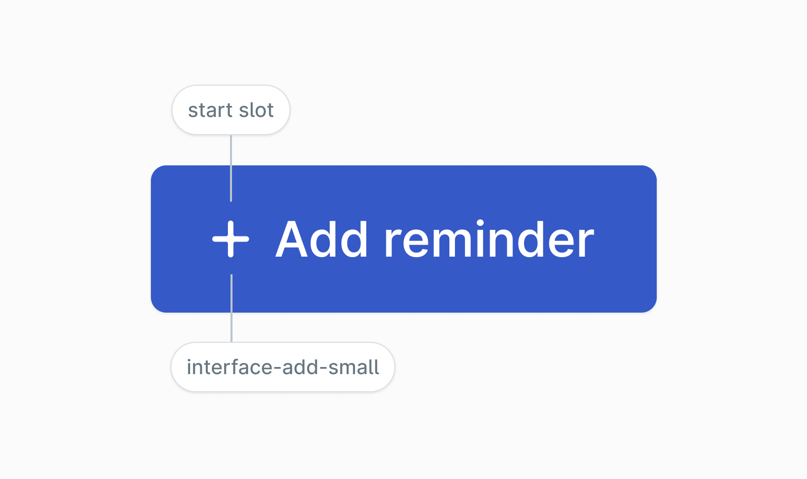
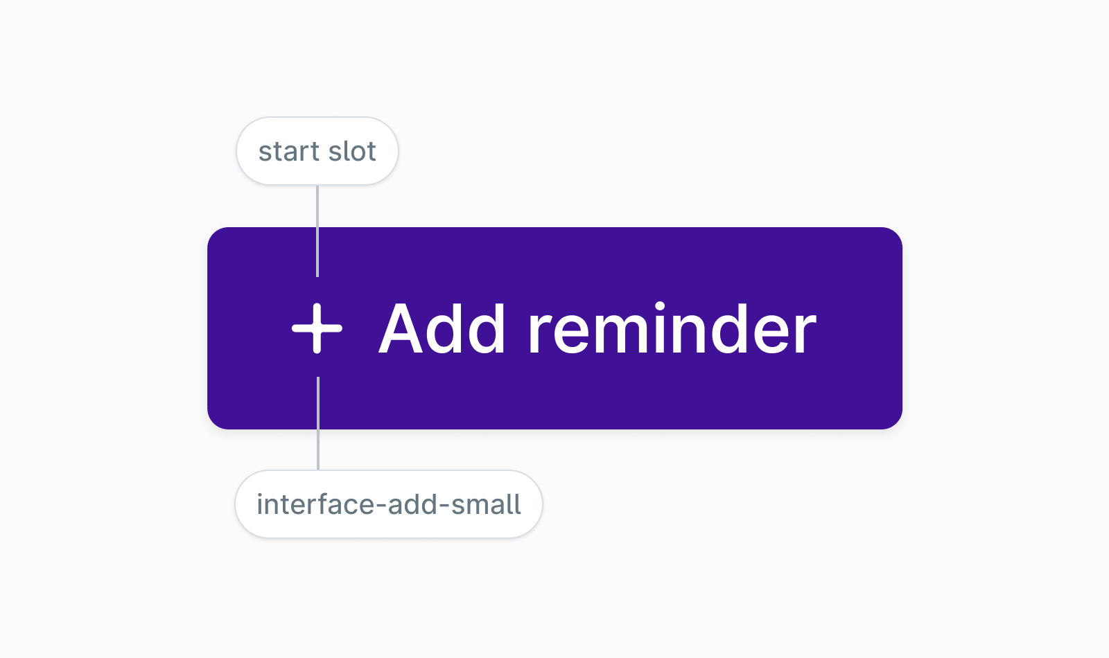
Use interface-add-small icon in the start slot for create/add type primary actions in the header:
Additional considerations
- Users of assistive technology expect a button to submit data or do an action. If you need the button to navigate into another view, use the
hrefproperty which will output<a>tag instead of a<button>. - When you need to disable a button, use
disabledproperty as it conveys this information correctly to assistive technologies like screen readers. - Button component provides 3 size variants; small, medium and large. The large size should only be used for marketing purposes or on areas such as an empty space/content notice.